rekindling... |
Resource Center Links
This Month's Contests | Hosts Looking for Hostees | Hostees looking for Hosts | BigBookofResources
Submission Guidelines

 May 31 2005, 04:57 PM May 31 2005, 04:57 PM
Post
#1
|
|
 I'm just a little bit crazy...  Group: Member Posts: 1,119 Joined: Jun 2004 Member No: 19,760 |
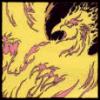
It's been a while since I actually even attempted at making a personal layout, but here goes.
Clickie here... it's not much, however it's a start. I'm also trying to get back into the game, so comments and suggestions are greatly accepted. |
|
|
|


 |
Replies
|
May 31 2005, 05:48 PM
Post
#2
|
|
 Senior Member Group: Member Posts: 507 Joined: Jan 2004 Member No: 832 |
//This looks messed up on higher resolutions. Have the text and profile tethered to the left. Right now if i move the window the text will move around.
// The radioblog looks really out of place since its so big and chunky. // I'm not so sure about the whole design, why put borders on the right but none of the left? It makes it feel very odd // What exactly is the border suppose to be? Its a wierd...vomit color that doesn't have anything to do with fire. // Overall its really plain and needs more color. |
|
|
|
Posts in this topic
 lilphoenix rekindling... May 31 2005, 04:57 PM
 aznraver396 i saw that picture of fire on google before. May 31 2005, 06:28 PM
 mysticalazxn look kinda blurry!
i like the bateria looking ... May 31 2005, 07:02 PM
mysticalazxn look kinda blurry!
i like the bateria looking ... May 31 2005, 07:02 PM |
1 User(s) are reading this topic (1 Guests and 0 Anonymous Users)
0 Members: