Kakashi |
Resource Center Links
This Month's Contests | Hosts Looking for Hostees | Hostees looking for Hosts | BigBookofResources
Submission Guidelines

 Jun 28 2005, 12:20 AM Jun 28 2005, 12:20 AM
Post
#1
|
|
|
Senior Member  Group: Member Posts: 1,989 Joined: Apr 2004 Member No: 10,691 |
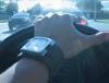
How does this look?
 Please remember to thumbnail images that stretch the board. This post has been edited by Azarel: Jan 17 2007, 03:12 AM |
|
|
|


 |
Replies
(1 - 21)
|
Jun 28 2005, 12:41 AM
Post
#2
|
|
 :hammer: Group: Staff Alumni Posts: 9,849 Joined: Mar 2004 Member No: 7,700 |
Whoa I don't know but it took me awhile to find out where his face was. Hrm, I think you should make his right arm stand out LESS in the picture because that's the first thing I saw and I was trying to decipher his face from it. o_O I think that's just me though. The text is a little plain, but I like the effects on the image and the glowiness. Yeah. Oh and I like the color too.
|
|
|
|

|
Jun 28 2005, 12:54 AM
Post
#3
|
|
|
Senior Member Group: Member Posts: 1,989 Joined: Apr 2004 Member No: 10,691 |
This is surely not my best but I felt like making a graphic because I was just simply in the mood for it. I agree with you that some of it isn't good but I'm going to improve soon.
|
|
|
|
|
Jun 28 2005, 12:56 AM
Post
#4
|
|
 biglamchops Group: Member Posts: 262 Joined: Jun 2005 Member No: 149,977 |
Nice! Kakashi kicks ass!
|
|
|
|
| *stephinika* |
Jun 28 2005, 01:07 AM
Post
#5
|
|
Guest |
QUOTE(x_angawhomps @ Jun 27 2005, 10:41 PM) Whoa I don't know but it took me awhile to find out where his face was. Hrm, I think you should make his right arm stand out LESS in the picture because that's the first thing I saw and I was trying to decipher his face from it. o_O I think that's just me though. The text is a little plain, but I like the effects on the image and the glowiness. Yeah. Oh and I like the color too.  hm, that exactly what i thought when i first saw it too. but otherwise, i really like it. the effects are nice and the colour is really great. |
|
|
|
|
Jun 28 2005, 01:09 AM
Post
#6
|
|
|
:hammer: Group: Staff Alumni Posts: 9,849 Joined: Mar 2004 Member No: 7,700 |
What the.. I thought this was in Digital Art. Well anyways, we have a new digital art forum now, so yeah. :]
Topic Moved to Digital Art (Webmasters' Corner > Digital Art) |
|
|
|
| *mzkandi* |
Jun 28 2005, 01:20 AM
Post
#7
|
|
Guest |
His hair is cool :o)
The text doesnt quite go with it. |
|
|
|
|
Jun 28 2005, 12:18 PM
Post
#8
|
|
 unify and defeat... divide and crumble Group: Member Posts: 2,759 Joined: Mar 2004 Member No: 6,379 |
it looks......good. kind of chaotic. I'd put more contrast into the person, so he stands out more. And maybe make him a bit more opaque so he doesn't blend into the background?
|
|
|
|
|
Jun 28 2005, 12:30 PM
Post
#9
|
|
 show me a garden thats bursting to life Group: Staff Alumni Posts: 12,303 Joined: Mar 2005 Member No: 115,987 |
Looks good. I had to stare @ it for a while to realize what it actually was but it looks good.
|
|
|
|


|
Jun 28 2005, 01:40 PM
Post
#10
|
|
|
Senior Member Group: Member Posts: 1,989 Joined: Apr 2004 Member No: 10,691 |
QUOTE(sprinkle-the-stars @ Jun 28 2005, 12:30 PM) Looks good. I had to stare @ it for a while to realize what it actually was but it looks good. Hah, I never realized how hard it was to realize where he was placed. |
|
|
|
|
Jun 28 2005, 03:43 PM
Post
#11
|
|
 What a hypocrite. Group: Member Posts: 2,754 Joined: Apr 2005 Member No: 128,150 |
Ooh, aah.
I love the diagonal scanlines, how you used a blue effect on the whole image, how the edges around Kakashi are pixelated, and how the font matches with the rest of the effects inside the banner to give it a lightning effect. |
|
|
|
|
Jun 28 2005, 08:18 PM
Post
#12
|
|
 Senior Member Group: Member Posts: 142 Joined: Sep 2004 Member No: 46,858 |
it looks GOOD

|
|
|
|
|
Jun 28 2005, 09:24 PM
Post
#13
|
|
 ;) Group: Staff Alumni Posts: 9,573 Joined: Feb 2005 Member No: 99,124 |
Ooh! I love the colors, and the font. His hair looks wayy cool.
|
|
|
|


|
Jun 28 2005, 10:45 PM
Post
#14
|
|
 Yawn Group: Staff Alumni Posts: 9,530 Joined: Nov 2004 Member No: 65,772 |
I love the colors you made it :) Two thumbs up on that. The face took me like a minute of staring to figure out where it was..the arm is what catches ur attention first lol...maybe a little less effects. But besides that i think it looks great. :)
|
|
|
|

|
Jun 28 2005, 10:55 PM
Post
#15
|
|
|
Senior Member Group: Member Posts: 1,989 Joined: Apr 2004 Member No: 10,691 |
QUOTE(KissMe2408 @ Jun 28 2005, 10:45 PM) I love the colors you made it :) Two thumbs up on that. The face took me like a minute of staring to figure out where it was..the arm is what catches ur attention first lol...maybe a little less effects. But besides that i think it looks great. :) I thought it was a good idea to make him blend more with the background. |
|
|
|
|
Jun 29 2005, 12:51 AM
Post
#16
|
|
|
Donna-chan Group: Member Posts: 1,183 Joined: Mar 2005 Member No: 120,389 |
it is good, but you have to make him stand out more, like what the others said, since i can't really see much of his face and hair. But i like alot. blue rocks when kakashi is in it!
|
|
|
|
|
Jun 29 2005, 07:47 PM
Post
#17
|
|
 dizzy me up. Group: Member Posts: 3,191 Joined: Apr 2004 Member No: 11,139 |
looks neat, and kakashi is such a hottie rofls
|
|
|
|
|
Jun 29 2005, 11:40 PM
Post
#18
|
|
 GREEENROCKS Group: Member Posts: 1,393 Joined: Apr 2004 Member No: 10,624 |
its cool, but i think the font looks weird. but awesome
|
|
|
|
|
Jun 29 2005, 11:43 PM
Post
#19
|
|
|
Mr. Hottie Group: Member Posts: 406 Joined: Feb 2005 Member No: 104,225 |
looks great. I like naruto a lot, and based on this image, it's the way on the ninja.

|
|
|
|
|
Jan 17 2007, 01:44 AM
Post
#20
|
|
 xXbernisXx Group: Member Posts: 493 Joined: Jul 2006 Member No: 433,317 |
i love kakashi!!!!!!
omg i didnt know there was such as naruto fans. here on CB lol. great!! job! man! my favorite one so far. dude you should of made it bigger for a wallpaper! =] |
|
|
|

|
Jan 18 2007, 02:58 PM
Post
#21
|
|
 Senior Member Group: Official Member Posts: 7,149 Joined: Aug 2005 Member No: 213,509 |
Like the colors and glowyness of it.
|
|
|
|

|
Jan 26 2007, 10:50 PM
Post
#22
|
|
 Two can keep a secret if one of them is dead. Group: Staff Alumni Posts: 2,682 Joined: Jun 2005 Member No: 156,187 |
QUOTE(x_angawhomps @ Jun 28 2005, 12:41 AM) Whoa I don't know but it took me awhile to find out where his face was. Hrm, I think you should make his right arm stand out LESS in the picture because that's the first thing I saw and I was trying to decipher his face from it. o_O I think that's just me though. The text is a little plain, but I like the effects on the image and the glowiness. Yeah. Oh and I like the color too. agree, although i like the effect, is there an original image? anyway the font looks nice.. more effects will be nice on the font |
|
|
|

 |
1 User(s) are reading this topic (1 Guests and 0 Anonymous Users)
0 Members: