Summer 2005, my first vector layout |
Resource Center Links
This Month's Contests | Hosts Looking for Hostees | Hostees looking for Hosts | BigBookofResources
Submission Guidelines

 May 10 2005, 09:15 PM May 10 2005, 09:15 PM
Post
#1
|
|
 Member  Group: Member Posts: 10 Joined: Oct 2004 Member No: 57,938 |
Hello.
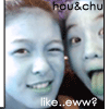
 Well, I made a new layout and I wanted some feedback. This was my first time making a vector graphic, so the picture is not perfect. Also, the layout slightly doesn't align in Firefox. I didn't know what to call this layout, so I just titled it "Summer 2005." I can't wait until summer break, which starts after about 11 school days for me. So what do you think? xanga |
|
|
|


 |
Replies
(1 - 20)
|
May 10 2005, 09:27 PM
Post
#2
|
|
 boogie down yo` Group: Member Posts: 710 Joined: Mar 2004 Member No: 9,271 |
wow..great job on the vector..and i love the summer-y look with the waves :)
|
|
|
|

|
May 10 2005, 09:33 PM
Post
#3
|
|
 crushed. Group: Staff Alumni Posts: 9,432 Joined: Jun 2004 Member No: 20,026 |
awesome! although I think the font should be smaller. you should think of submitting it.
|
|
|
|


| *XLilAznGrl592X* |
May 10 2005, 09:37 PM
Post
#4
|
|
Guest |
nice! though the font is pretty big... so big.. lol
|
|
|
|
|
May 10 2005, 11:03 PM
Post
#5
|
|
|
Senior Member Group: Member Posts: 289 Joined: Dec 2004 Member No: 73,959 |
the vexel is super nice,awsome job.
|
|
|
|
|
May 10 2005, 11:10 PM
Post
#6
|
|
 I come from East Oakland where the youngstas get hyphy! Group: Member Posts: 1,821 Joined: Feb 2005 Member No: 102,942 |
11 more school days so lucky. i have 25. but anyways i like it it looks like an advertisement.
|
|
|
|
|
May 10 2005, 11:25 PM
Post
#7
|
|
|
define our lives for us. Group: Staff Alumni Posts: 11,656 Joined: Aug 2004 Member No: 43,293 |
that's cute. i love the vector. It's bright. but I think there should be a little less on the width. =P that's all I gotta say!<3
|
|
|
|

|
May 10 2005, 11:31 PM
Post
#8
|
|
 Member Group: Member Posts: 10 Joined: May 2005 Member No: 136,899 |
awesome, wish i could vector... :-(, i'm learning tho!
|
|
|
|

|
May 11 2005, 04:32 PM
Post
#9
|
|
 ^ I might look scary but i'm the nicest person in cb! Group: Member Posts: 1,364 Joined: Feb 2004 Member No: 4,979 |
the vector look very clean,
a super skin to submit! |
|
|
|

|
May 11 2005, 10:35 PM
Post
#10
|
|
|
Senior Member Group: Member Posts: 254 Joined: Jan 2005 Member No: 91,811 |
Her nose doesn't come out from the rest fo her face much, and I thought it was blank at first. There's this orange border thing at the right, and it looks odd since most of the layout is blue.
|
|
|
|
|
May 12 2005, 04:41 PM
Post
#11
|
|
 something more Group: Member Posts: 2,468 Joined: Mar 2004 Member No: 8,808 |
Wow i love it!!! Its so pretty! Great job on the vector too!!
|
|
|
|
| *mona lisa* |
May 12 2005, 10:58 PM
Post
#12
|
|
Guest |
Ooh, that is super cute!
|
|
|
|
|
May 13 2005, 12:04 AM
Post
#13
|
|
 Um....Its meeee Group: Member Posts: 2,218 Joined: Mar 2004 Member No: 8,264 |
Oo that super hot! Looks really nice. I like the color. Feel so much like summer now hehe. Nice job.
|
|
|
|
|
May 13 2005, 04:37 AM
Post
#14
|
|
|
t-t-t-toyaaa Group: Official Member Posts: 19,821 Joined: Apr 2004 Member No: 11,270 |
thats amazing! great job

|
|
|
|

|
May 13 2005, 09:54 AM
Post
#15
|
|
|
Senior Member Group: Member Posts: 3,551 Joined: Feb 2005 Member No: 102,857 |
I like it good job on the vectoring but i kinda think the image is too big
|
|
|
|
|
May 17 2005, 09:11 PM
Post
#16
|
|
|
Member Group: Member Posts: 10 Joined: Oct 2004 Member No: 57,938 |
thanks everyone!
After reading everyone's comments, I changed the layout a little bit so that I could submit it to createblog. QUOTE Her nose doesn't come out from the rest fo her face much, and I thought it was blank at first. I know... I thought the face part was the hardest to vector. I didn't want to mess it up, so I left it like how it was.  And I was wondering what to do about the top. On my personal xanga, I used an ad remover to hide the white space, so this wasn't a problem. Now that I didn't use an ad remover on this xanga, the white space bothers me. Any opinions? So here is the xanga where the edited layout is... xanga |
|
|
|
|
May 18 2005, 05:32 AM
Post
#17
|
|
 yan lin♥ Group: Staff Alumni Posts: 14,129 Joined: Apr 2004 Member No: 13,627 |
the vector's nice. what's the credits for?
|
|
|
|

|
May 19 2005, 03:37 PM
Post
#18
|
|
 Senior Member Group: Member Posts: 218 Joined: Jan 2005 Member No: 83,398 |
thats awesome. my only suggestion is maybe make the image a little smaller? it's kinda wide. i agree,you should try and submit it.
|
|
|
|
|
May 20 2005, 07:53 PM
Post
#19
|
|
|
i <3 peter Group: Member Posts: 744 Joined: Apr 2005 Member No: 125,986 |
wow!! great job.. the vector is really good, but i think you should make the font smaller and make the scrollbar colored..
|
|
|
|
|
May 20 2005, 08:43 PM
Post
#20
|
|
 that heaven is overrated Group: Member Posts: 5,096 Joined: Oct 2004 Member No: 53,124 |
I love the vector! It's awesome.
But yeah..it seems a little too big, though. It's still amazing, nonetheless. 
|
|
|
|

|
May 20 2005, 08:49 PM
Post
#21
|
|
 goal: become friggen off. member again. argh. Group: Member Posts: 148 Joined: May 2005 Member No: 141,544 |
oo i think its cute.. but plain. i mean my xanga is plain too dont get me wrong....
the picture of the girl.. reminds me of myself... except with bigger lips. and a lifeguard thingy and a hat.... is she wearing a hat? XP  
|
|
|
|

 |
1 User(s) are reading this topic (1 Guests and 0 Anonymous Users)
0 Members: