beauty |
Resource Center Links
This Month's Contests | Hosts Looking for Hostees | Hostees looking for Hosts | BigBookofResources
Submission Guidelines

 Mar 12 2005, 04:11 AM Mar 12 2005, 04:11 AM
Post
#1
|
|
 yan lin♥  Group: Staff Alumni Posts: 14,129 Joined: Apr 2004 Member No: 13,627 |
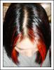
h'ok. so i just finished a new skin and i was wondering if i should submit it to cB or not.
 xanga.com/bitterswtxlove mind you, this is my "tester" xanga. constructive criticism please. |
|
|
|


 |
Replies
(1 - 37)
| *mzkandi* |
Mar 12 2005, 04:39 AM
Post
#2
|
|
Guest |
i like it, its pretty and simple
|
|
|
|
|
Mar 12 2005, 10:35 AM
Post
#3
|
|
 i am mrs. brock <3 Group: Member Posts: 19 Joined: Feb 2005 Member No: 106,456 |
yes...i like it!

|
|
|
|
|
Mar 12 2005, 11:42 AM
Post
#4
|
|
|
iiiiii'm a cucumber! Group: Member Posts: 202 Joined: Feb 2005 Member No: 101,556 |
Pretty, but simple. I like the picture.

|
|
|
|
| *StanleyThePanda* |
Mar 12 2005, 11:48 AM
Post
#5
|
|
Guest |
its pretty!
I like it |
|
|
|
|
Mar 12 2005, 12:01 PM
Post
#6
|
|
|
mood: content Group: Member Posts: 2,063 Joined: Aug 2004 Member No: 42,325 |
absolutely gorgeous in a simplistic way. :D [or is it simplictic? oh well] only suggestion would be to make the date centered or moved to the right. you could also make the links a deep shade of red matching the rose if you want.
|
|
|
|
|
Mar 12 2005, 05:45 PM
Post
#7
|
|
|
I'm a sexy beast Group: Member Posts: 410 Joined: Jan 2005 Member No: 78,103 |
I really like it; it looks old-fashoned. Very nice!
|
|
|
|
|
Mar 12 2005, 06:08 PM
Post
#8
|
|
 I love you more than sex appeal. Group: Member Posts: 3,045 Joined: Oct 2004 Member No: 52,932 |
it looks very nice
|
|
|
|
|
Mar 12 2005, 10:46 PM
Post
#9
|
|
|
yan lin♥ Group: Staff Alumni Posts: 14,129 Joined: Apr 2004 Member No: 13,627 |
QUOTE(mocassinsx29 @ Mar 13 2005, 1:01 AM) absolutely gorgeous in a simplistic way. :D [or is it simplictic? oh well] only suggestion would be to make the date centered or moved to the right. you could also make the links a deep shade of red matching the rose if you want.  hmm...should i make the font red as well? |
|
|
|
|
Mar 13 2005, 02:05 AM
Post
#10
|
|
 Happy Person Group: Member Posts: 1,729 Joined: Feb 2004 Member No: 4,674 |
It's simple and people probably won't have too many problems with using it. It's decent, good enough for the skin section I think.
|
|
|
|
|
Mar 13 2005, 04:12 AM
Post
#11
|
|
|
Tu es laid. Group: Official Member Posts: 3,913 Joined: Feb 2005 Member No: 106,675 |
looks nice its simple and organized not too much navigation.. good job overall a 9??
|
|
|
|
|
Mar 13 2005, 04:51 AM
Post
#12
|
|
 Nokturne. Group: Member Posts: 41 Joined: Jan 2005 Member No: 90,001 |
im loving the simplistic look of the page ^.^
|
|
|
|
|
Mar 13 2005, 09:31 PM
Post
#13
|
|
 Member Group: Member Posts: 14 Joined: Feb 2005 Member No: 106,605 |
Great layout... simple and pretty.
|
|
|
|
|
Mar 13 2005, 09:40 PM
Post
#14
|
|
 ♥ Group: Official Member Posts: 4,066 Joined: May 2004 Member No: 18,393 |
It's pretty! It's pretty!
 I love the flowers. <33 |
|
|
|

|
Mar 13 2005, 09:41 PM
Post
#15
|
|
 when we speak, we breathe Group: Member Posts: 1,635 Joined: Jan 2005 Member No: 91,760 |
It might be because I'm on firefox, but ... where is the text at? I don't see any text whatsoever :(
|
|
|
|


|
Mar 13 2005, 10:12 PM
Post
#16
|
|
|
t-t-t-toyaaa Group: Official Member Posts: 19,821 Joined: Apr 2004 Member No: 11,270 |
its simple and pretty(: nice job
|
|
|
|

|
Mar 13 2005, 11:10 PM
Post
#17
|
|
 Yea Yea. Group: Member Posts: 837 Joined: Jan 2005 Member No: 79,366 |
i like it!!
|
|
|
|

|
Mar 14 2005, 01:13 AM
Post
#18
|
|
 rawr. Group: Member Posts: 304 Joined: Jan 2004 Member No: 1,529 |
i like it! great picture, and simple :]
|
|
|
|
|
Mar 14 2005, 11:44 AM
Post
#19
|
|
 Im as fake as a widow's smile ;) Group: Member Posts: 1,045 Joined: Feb 2005 Member No: 97,851 |
it's very simple, which is exactly why i love it..awesome job
|
|
|
|
|
Mar 14 2005, 11:54 AM
Post
#20
|
|
 crushed. Group: Staff Alumni Posts: 9,432 Joined: Jun 2004 Member No: 20,026 |
yes, simplicity is key! I really like that picture..submit it=)
|
|
|
|

|
Mar 15 2005, 07:58 AM
Post
#21
|
|
|
yan lin♥ Group: Staff Alumni Posts: 14,129 Joined: Apr 2004 Member No: 13,627 |
haha thanks everyone. i think i'll submit it..but i was wondering, should i make all of the font the red-ish color i have or all of it black...or however?
|
|
|
|
|
Mar 15 2005, 01:33 PM
Post
#22
|
|
 x mar muffins *yuuuum Group: Member Posts: 874 Joined: Feb 2004 Member No: 5,620 |
it looks great ;D I love the picture you used <3
|
|
|
|
|
Mar 15 2005, 04:22 PM
Post
#23
|
|
 boa loyal fans 4eva!!!! Group: Member Posts: 533 Joined: Feb 2005 Member No: 100,738 |
simple and clean.
but maybe it jsut too simple for me. |
|
|
|
|
Mar 15 2005, 06:15 PM
Post
#24
|
|
 hello : ) Group: Official Member Posts: 4,227 Joined: Apr 2004 Member No: 13,139 |
I like that it's simple. Sometimes simple is best =) The picture is lovely too!
|
|
|
|

|
Mar 16 2005, 12:30 AM
Post
#25
|
|
 Um....Its meeee Group: Member Posts: 2,218 Joined: Mar 2004 Member No: 8,264 |
very pretty. It nice and simple. nice job
|
|
|
|
|
Mar 17 2005, 11:39 AM
Post
#26
|
|
 Member Group: Member Posts: 17 Joined: Aug 2004 Member No: 39,442 |
pretty, but too plain.
|
|
|
|
|
Mar 17 2005, 06:39 PM
Post
#27
|
|
 <33 Group: Member Posts: 2,745 Joined: Mar 2005 Member No: 114,234 |
I love it! The rose is so beautiful. Good work.
|
|
|
|

|
Mar 18 2005, 08:52 AM
Post
#28
|
|
|
yan lin♥ Group: Staff Alumni Posts: 14,129 Joined: Apr 2004 Member No: 13,627 |
QUOTE(alittleboicrazy @ Mar 18 2005, 12:39 AM) pretty, but too plain. it's supposed to be plain. and if you think that it's "too plain" maybe you should give suggestions on how to spice it up. |
|
|
|
|
Mar 19 2005, 05:34 AM
Post
#29
|
|
 boo Group: Member Posts: 5,512 Joined: Dec 2004 Member No: 71,765 |
I love it.
But where's the navigation? :angelic: |
|
|
|
|
Mar 20 2005, 01:35 AM
Post
#30
|
|
|
yan lin♥ Group: Staff Alumni Posts: 14,129 Joined: Apr 2004 Member No: 13,627 |
the navi's the small "x's" on the top left corner of the picture.
|
|
|
|
|
Mar 20 2005, 02:54 PM
Post
#31
|
|
|
Senior Member Group: Member Posts: 254 Joined: Jan 2005 Member No: 91,811 |
Eh buttonizing is kinda tacky. It would have been better with just a plain border, because when you're buttonizing, ur trying to make it stand out, 3dish like, but I don't see why you have to do so here.
The image is nice though, but links are kinda hidden and the blog is just like the bg. I suggest to add a textured bg, so it's simple but not too simple, and the blog area can be distinguished from it. |
|
|
|
|
Mar 20 2005, 03:46 PM
Post
#32
|
|
 that heaven is overrated Group: Member Posts: 5,096 Joined: Oct 2004 Member No: 53,124 |
It's cute and simple. Good job. =]
|
|
|
|

|
Mar 21 2005, 06:40 PM
Post
#33
|
|
 insanitys contagious. Group: Official Member Posts: 4,210 Joined: Feb 2005 Member No: 99,707 |
pretty simple but I like.
|
|
|
|
|
Mar 21 2005, 06:44 PM
Post
#34
|
|
 lalala.. Group: Member Posts: 669 Joined: Jan 2005 Member No: 86,094 |
pretty and simple... nice!
|
|
|
|
|
Mar 22 2005, 03:28 PM
Post
#35
|
|
 Senior Member Group: Member Posts: 636 Joined: Nov 2004 Member No: 59,646 |
its very nice and simple. =]
|
|
|
|
|
Mar 22 2005, 08:08 PM
Post
#36
|
|
 sometimes people care too much... i think its called love Group: Member Posts: 112 Joined: Jan 2005 Member No: 89,643 |
i like it
|
|
|
|

|
Mar 22 2005, 09:43 PM
Post
#37
|
|
 most definitely. Group: Member Posts: 284 Joined: Feb 2005 Member No: 103,416 |
it`s beautiful..i`d go for it.
|
|
|
|
|
Mar 27 2005, 08:25 AM
Post
#38
|
|
|
yan lin♥ Group: Staff Alumni Posts: 14,129 Joined: Apr 2004 Member No: 13,627 |
QUOTE(sociallydsoryntd @ Mar 21 2005, 3:54 AM) Eh buttonizing is kinda tacky. It would have been better with just a plain border, because when you're buttonizing, ur trying to make it stand out, 3dish like, but I don't see why you have to do so here. The image is nice though, but links are kinda hidden and the blog is just like the bg. I suggest to add a textured bg, so it's simple but not too simple, and the blog area can be distinguished from it. so do you think i should change the navi? |
|
|
|
 |
1 User(s) are reading this topic (1 Guests and 0 Anonymous Users)
0 Members: