Breakaway ft Kelly Clarkson |
Resource Center Links
This Month's Contests | Hosts Looking for Hostees | Hostees looking for Hosts | BigBookofResources
Submission Guidelines

 Feb 15 2005, 07:45 PM Feb 15 2005, 07:45 PM
Post
#1
|
|
|
To Live is to Dance  Group: Member Posts: 791 Joined: Dec 2004 Member No: 70,074 |
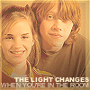
i made a new layout for my design page since my personal page has a new layout so yeah lol . let me know what you think, please be respectfull :) thanks
Breakaway ft. Kelly Clarkson |
|
|
|


 |
Replies
(1 - 12)
|
Feb 15 2005, 07:56 PM
Post
#2
|
|
|
Senior Member Group: Member Posts: 775 Joined: Sep 2004 Member No: 45,754 |
i like the color
|
|
|
|
|
Feb 15 2005, 07:59 PM
Post
#3
|
|
 Member Group: Member Posts: 20 Joined: Feb 2005 Member No: 100,243 |
it looks nice but i think you should place it in the middle.....not to the side........
|
|
|
|

|
Feb 15 2005, 10:16 PM
Post
#4
|
|
|
Senior Member Group: Member Posts: 63 Joined: Jul 2004 Member No: 32,353 |
hm .. i think it's a little too pink .. lol don't get me wrong .. it's a pretty good layout .. but yea .. oh and it doesn't work at all in 1024x768 .. or any other resolution besides 800x600 ..
buh i like the butterfly 
|
|
|
|
|
Feb 16 2005, 06:42 AM
Post
#5
|
|
|
I'm a sexy beast Group: Member Posts: 410 Joined: Jan 2005 Member No: 78,103 |
Oh, you aligned it to the middle, very cool. I'm not so big on the bright pink. I think it would have looked a little better if it was lighter or darker, but not so bright. Hmm, or maybe even more than one shade of pink. Well, good job.
|
|
|
|
|
Feb 16 2005, 06:49 PM
Post
#6
|
|
 boa loyal fans 4eva!!!! Group: Member Posts: 533 Joined: Feb 2005 Member No: 100,738 |
make the banner the same size as the blog. OR u can just get rid of the left column and add a navigating system on the img or <a href=""></a>
|
|
|
|
|
Feb 16 2005, 07:02 PM
Post
#7
|
|
 Im as fake as a widow's smile ;) Group: Member Posts: 1,045 Joined: Feb 2005 Member No: 97,851 |
I like it!

|
|
|
|
|
Feb 16 2005, 07:06 PM
Post
#8
|
|
|
define our lives for us. Group: Staff Alumni Posts: 11,656 Joined: Aug 2004 Member No: 43,293 |
Change the width of the outside blog.. looks stretched.
|
|
|
|

|
Feb 16 2005, 07:08 PM
Post
#9
|
|
|
mood: content Group: Member Posts: 2,063 Joined: Aug 2004 Member No: 42,325 |
QUOTE(Spiritedfreak @ Feb 16 2005, 7:06 PM) Change the width of the outside blog.. looks stretched.  Yup. But otherwise, nice job! |
|
|
|
| *StanleyThePanda* |
Feb 16 2005, 08:23 PM
Post
#10
|
|
Guest |
^^ agreed
um its really pink but its nice |
|
|
|
|
Feb 16 2005, 08:33 PM
Post
#11
|
|
 aka babiebubblez03 :o) Group: Member Posts: 203 Joined: Oct 2004 Member No: 53,478 |
^^ agreed for a second time...
But its a bit bright pink :) good job though lol is it just me, or does she look kinda chubby in the second picture? |
|
|
|
|
Feb 17 2005, 01:06 AM
Post
#12
|
|
|
t-t-t-toyaaa Group: Official Member Posts: 19,821 Joined: Apr 2004 Member No: 11,270 |
i also agree
i like the pink
|
|
|
|


|
Feb 17 2005, 01:15 AM
Post
#13
|
|
|
Senior Member Group: Member Posts: 55 Joined: Feb 2005 Member No: 98,738 |
the navigation is kind of plain.... >.<
I think she looks kind of chubby on the picture on the right... not the middle |
|
|
|
 |
1 User(s) are reading this topic (1 Guests and 0 Anonymous Users)
0 Members: