+// sexy shin hye sung v1.0 |
Resource Center Links
This Month's Contests | Hosts Looking for Hostees | Hostees looking for Hosts | BigBookofResources
Submission Guidelines

 Dec 23 2004, 05:07 AM Dec 23 2004, 05:07 AM
Post
#1
|
|
 Senior Member  Group: Member Posts: 43 Joined: Jan 2004 Member No: 996 |
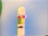
i have no idea why but it took me 3 hours to do this =_= actually i think i do have a few ideas. i had to remake the image for the image map many times so that i did not have to scroll at all (it's imperfect but shh! nobody will know right? =_+) also the whole div episode drove me crazy. anyway it's quite simple but comments are appreciated nonetheless. thank you ^^
+::+ sexy shin hyesung v1.0 +::+ |
|
|
|


 |
Replies
(1 - 15)
|
Dec 23 2004, 09:37 AM
Post
#2
|
|
 This bitch better work! Group: Staff Alumni Posts: 13,681 Joined: Jul 2004 Member No: 28,095 |
what is the font of the dates and navi? i don't really like it.
but good job. 
|
|
|
|


|
Dec 23 2004, 11:33 AM
Post
#3
|
|
|
questions make me blue. Group: Member Posts: 2,608 Joined: Feb 2004 Member No: 3,796 |
AHH!! HYE SUNG!! HOT!!!
it`s pretty simple. all you did was put some white effect on his pic (you could still see where his pic stops at the bottom. WRONG!) and then you put a bg color for the blog and added a navigation. WRONG AGAIN! too simple. you should`ve done more. oh, and the font you used only looks good when it`s small because it`s a pixel font, right? |
|
|
|
|
Dec 23 2004, 01:01 PM
Post
#4
|
|
 mmm hmmm Group: Member Posts: 1,591 Joined: Sep 2004 Member No: 47,325 |
Simple. Maybe you should add more stuff on the bottom of the music bar.
|
|
|
|
|
Dec 23 2004, 01:33 PM
Post
#5
|
|
 Senior Member Group: Member Posts: 384 Joined: Jul 2004 Member No: 32,595 |
its nice. the only thing that looks funny is the blog is kinda short alongside his pic. overall .. 8/10
|
|
|
|

|
Dec 23 2004, 01:44 PM
Post
#6
|
|
 Senior Member Group: Member Posts: 429 Joined: Nov 2004 Member No: 66,993 |
oohh XD i like the picture you used =] nice but kinda plain but i like it XD
|
|
|
|
|
Dec 23 2004, 03:15 PM
Post
#7
|
|
 XOTY*06 :D Group: Member Posts: 2,635 Joined: Mar 2004 Member No: 6,747 |
wow nice!

|
|
|
|

|
Dec 23 2004, 04:37 PM
Post
#8
|
|
 Change Gon Come Group: Member Posts: 2,286 Joined: May 2004 Member No: 18,822 |
that's hyesung? i can't really tell because of the hair in his face..
simple = awesome |
|
|
|
|
Dec 23 2004, 04:39 PM
Post
#9
|
|
 Happy Person Group: Member Posts: 1,729 Joined: Feb 2004 Member No: 4,674 |
dunno bout the others but methinks pixel font is good ^^
|
|
|
|
|
Dec 23 2004, 06:37 PM
Post
#10
|
|
 Senior Member Group: Member Posts: 2,137 Joined: Nov 2004 Member No: 62,193 |
ooh thats very nice and simple, good job

|
|
|
|


|
Dec 24 2004, 05:47 PM
Post
#11
|
|
 silver bullet Group: Member Posts: 130 Joined: Jan 2004 Member No: 1,806 |
I love the picture! But you might want to romve the border around the blog and hide the music bar... but that's just me. You did a good job!
|
|
|
|

|
Dec 25 2004, 06:58 PM
Post
#12
|
|
 ^ I might look scary but i'm the nicest person in cb! Group: Member Posts: 1,364 Joined: Feb 2004 Member No: 4,979 |
look awesome.
color matched. |
|
|
|

|
Dec 25 2004, 10:03 PM
Post
#13
|
|
 DANG forgot to add a border XD Group: Member Posts: 324 Joined: Nov 2004 Member No: 66,973 |
hmm a little too plain n simple but i dunno i still kinda like it
|
|
|
|
|
Dec 25 2004, 10:03 PM
Post
#14
|
|
 mosh. Group: Member Posts: 1,841 Joined: Dec 2004 Member No: 73,114 |
its ok... maybe feather the bottom a little more.. but good job!
|
|
|
|
|
Dec 25 2004, 10:44 PM
Post
#15
|
|
 ©shesdiztinQtive Group: Member Posts: 562 Joined: Oct 2004 Member No: 56,389 |
oh yes, pretty hott. everything looks good except i'm not really liking the pixelated font for the navigation.
|
|
|
|

|
Dec 25 2004, 10:59 PM
Post
#16
|
|
 skaters gonna skate. Group: Official Member Posts: 6,861 Joined: Mar 2004 Member No: 6,336 |
He's sexy. GJ on the layout.
|
|
|
|

 |
1 User(s) are reading this topic (1 Guests and 0 Anonymous Users)
0 Members: