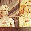
Swan, traditional piece |
Resource Center Links
This Month's Contests | Hosts Looking for Hostees | Hostees looking for Hosts | BigBookofResources
Submission Guidelines
 Jun 21 2009, 07:55 PM Jun 21 2009, 07:55 PM
Post
#1
|
|
 i like boobies, yes I do. I like boobies - how 'bout you?      Group: Member Posts: 620 Joined: Jun 2008 Member No: 662,457 |
FINALLY got around to scanning in an impressionist watercolour piece I did for school. The scan is HORRIBLE haha but that's because the piece is slightly (read; like 8 inches) wider than my scanner and I wasn't too excited about having to scan it (no camera). The final product is 18.5"w by 11"t on 16"w by 18"t. Some of the colours didn't transfer very well when I scanned, so please ignore the random spots of ick.
The original (click for the dA account credit) and my watercolour. So anyway. The whole point of this is that I was wondering if anyone would be interested in seeing it digital? I sort of want to remix the watercolour to a vector in Illustrator, just to see what happens. Good idea? Bad idea, leave it traditional? PS: I know. I forgot her eyebrow, and the jaw is whacked up. T-T |
|
|
|
 |
Replies
(1 - 3)
 Jun 22 2009, 03:06 AM Jun 22 2009, 03:06 AM
Post
#2
|
|
 Mel Blanc was allergic to carrots.        Group: Official Designer Posts: 6,371 Joined: Aug 2008 Member No: 676,291 |
I think it looks pretty good. However, it's just that I've always been bothered by seeing yellow skin like that in a painting. I don't know why, it just irks me.
|
|
|
|
 Jun 22 2009, 10:50 AM Jun 22 2009, 10:50 AM
Post
#3
|
|
 Senior Member       Group: Staff Alumni Posts: 2,435 Joined: Feb 2007 Member No: 506,205 |
You should definately do it in vector. And I love the colors you used, even the yellow for the skin. I like when people use colors that aren't necessarily natural but look so anyway? Yeah. :D
|
|
|
|
 Jun 22 2009, 06:44 PM Jun 22 2009, 06:44 PM
Post
#4
|
|
 Senior Member        Group: Administrator Posts: 8,629 Joined: Jan 2007 Member No: 498,468 |
I can see why you say you don't really like the yellow, Mike, but then when I look at it, I think it fits because they (sorry, I dk your gender) weren't really going for the traditional colors and wanted to be different. Amirite? But I think it's really cool and came out nicely. Kind of reminds me of.. Rogue, I think, from X-Men. I say make a vector out of it!
|
|
|
|
  |
1 User(s) are reading this topic (1 Guests and 0 Anonymous Users)
0 Members:


