new! :D |
Rating


|
Resource Center Links
This Month's Contests | Hosts Looking for Hostees | Hostees looking for Hosts | BigBookofResources
Submission Guidelines
 Jun 18 2009, 10:09 AM Jun 18 2009, 10:09 AM
Post
#1
|
|
 Senior Member  Group: Member Posts: 113 Joined: Jan 2009 Member No: 712,185 |
here's some new stuff i made...plez give me some c&c..(sorry if the colors are to bright..the computer i'm using makes everything look dark)
i know this ones kinda weird looking but its just a rough beginning of something i'm trying to make with pictures i take..
Reason for edit: Please thumb large images. Thanks :) -Nat
|
|
|
|


 |
Replies
(1 - 24)
|
Jun 18 2009, 03:24 PM
Post
#2
|
|
 Senior Member Group: Official Member Posts: 2,936 Joined: Sep 2008 Member No: 683,235 |
Not feeling the 1st or the 3rd ones. The others are pretty nice, and I seriously like the last one.
|
|
|
|


|
Jun 18 2009, 03:42 PM
Post
#3
|
|
 Mel Blanc was allergic to carrots. Group: Official Designer Posts: 6,371 Joined: Aug 2008 Member No: 676,291 |
Yeah, the 1st and 3rd aren't too great but they're alright. I think the 2nd one is prob the best of the four.

|
|
|
|


|
Jun 18 2009, 06:56 PM
Post
#4
|
|
 Senior Member Group: Member Posts: 944 Joined: Jul 2008 Member No: 663,413 |
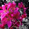
I love the flowers one. Looks like it would be on a wedding invitation or something like that. -minus the font. :)
|
|
|
|

|
Jun 18 2009, 09:56 PM
Post
#5
|
|
 Senior Member Group: Administrator Posts: 8,629 Joined: Jan 2007 Member No: 498,468 |
1) I dk, it could use some work, tbh. I don't really like the incorrect spelling and all those textures. Cute idea, I suppose.
2) Low image quality. Concept's good though. 3) Pretty. 4) I think it's too much, tbh. I'd take away the lowered opacity ones and make the font smaller. |
|
|
|

|
Jun 21 2009, 07:08 PM
Post
#6
|
|
 i like boobies, yes I do. I like boobies - how 'bout you? Group: Member Posts: 620 Joined: Jun 2008 Member No: 662,457 |
Two is okay, I like 4 but also agree with ^'s suggestions on it.
|
|
|
|

|
Jun 27 2009, 09:24 PM
Post
#7
|
|
|
Senior Member Group: Member Posts: 113 Joined: Jan 2009 Member No: 712,185 |
thats for all your input..i'll work on all that....here's a new one i made..i was bored so i decided to make twilight banners i know on the second one its kinda low quality but its a movie still so its gona be fuzzy..but other then that let me know watcha think : D
 
|
|
|
|
|
Jun 27 2009, 09:34 PM
Post
#8
|
|
|
Mel Blanc was allergic to carrots. Group: Official Designer Posts: 6,371 Joined: Aug 2008 Member No: 676,291 |
The first one is pretty good but the second one wasn't really a good choice of pictures. It seems a bit too boring. :\
|
|
|
|
|
Jun 27 2009, 09:38 PM
Post
#9
|
|
 show me a garden thats bursting to life Group: Staff Alumni Posts: 12,303 Joined: Mar 2005 Member No: 115,987 |
I think, over all, you need to experiment more. Learn more techniques. Learn some other blending and manipulating ways.
And then post! We love progress. :D |
|
|
|

|
Jun 27 2009, 09:46 PM
Post
#10
|
|
 kthxbai Group: Official Designer Posts: 2,832 Joined: Feb 2008 Member No: 621,203 |
1) Too bright for me.
2) I like this one a lot. It kind of bugs me, though, when I see brushes covering up people. I think it would look better if you erased the brushes that are on top of those people. 3) I think you should clean it up a ton. There are countless spots where the color is going outside the lines. The word doesn't exactly match the picture o.O 4) I think it would look a zillion times better if you increased the people's opacities to like 80% or something. Right now the headshots on top of them are very distracting, imo. It may even look better without them (?) It would be plain, but I think it would be better than what it is now. 5)I love the colors in both pictures. The contrast of colors is really pretty. I think you should use a different font, though, because you had to use a black line just to get it to fit :/ I don't like the black line. I think the border shouldn't be so thick. 6) The picture is very out of focus and bad quality, which isn't your fault, but it will be bad quality regardless of what you do to it >.< |
|
|
|

|
Jun 28 2009, 07:54 PM
Post
#11
|
|
|
Senior Member Group: Administrator Posts: 8,629 Joined: Jan 2007 Member No: 498,468 |
Yeah for sure learn some blending techniques. The whole point of blending is to take two or more pictures and merge them into one. The first one isn't so hot, tbh. Blending isn't good. Make sure to use pictures that are similar. As for the second one, it's okay I guess. Just low in quality.
|
|
|
|
|
Jun 29 2009, 11:59 AM
Post
#12
|
|
|
Senior Member Group: Member Posts: 113 Joined: Jan 2009 Member No: 712,185 |
mmk....so yeah the second one i know is low quality and that actually isn't a blend blend the back ground was different on the first half of the picture so i just coloned the whole second picture with the first... and yeah and could you show my some tutorials or some things that can show me different ways to do stuff...i've did all the tuts on here so if you know of anything good plez send them too me
|
|
|
|
|
Jun 29 2009, 03:55 PM
Post
#13
|
|
|
Senior Member Group: Administrator Posts: 8,629 Joined: Jan 2007 Member No: 498,468 |
Sure. What program do you use?
|
|
|
|
|
Jun 29 2009, 04:04 PM
Post
#14
|
|
 AIDS at RAVES. Group: Official Designer Posts: 2,386 Joined: Dec 2007 Member No: 598,878 |
The first one shows cool color techniques but the font dosent seem to match
I think the extraction of the subject in the first and second photos are really good, but then again the font seems to be too basic and The Maine one is just too busy and the filters or opacity used takes away from the appeal of the image |
|
|
|

|
Jun 29 2009, 06:04 PM
Post
#15
|
|
|
Senior Member Group: Member Posts: 113 Joined: Jan 2009 Member No: 712,185 |
kk...i use gimp
|
|
|
|
|
Jun 29 2009, 06:41 PM
Post
#16
|
|
|
Senior Member Group: Administrator Posts: 8,629 Joined: Jan 2007 Member No: 498,468 |
I don't use gimp so I found some on Google for you:
http://www.gimp.org/tutorials/Blending_Exposures/ http://boitblog.blogspot.com/2007/07/blend...-with-gimp.html |
|
|
|
|
Jun 30 2009, 02:31 PM
Post
#17
|
|
|
Senior Member Group: Member Posts: 113 Joined: Jan 2009 Member No: 712,185 |
okay..so today i've been doing bunches of tuts on coloring and lighting and stuff....and this is a picture i took a little wile ago and i thought it would be a good picture to do some coloring and lighting stuff to soo plez let me know whatcha think!..i know the text isn't very good but..i just wanted to put it in their :]
before after QUOTE(manny-the-dino @ Jun 29 2009, 07:41 PM)  I don't use gimp so I found some on Google for you: http://www.gimp.org/tutorials/Blending_Exposures/ http://boitblog.blogspot.com/2007/07/blend...-with-gimp.html thanks! :D |
|
|
|


|
Jun 30 2009, 02:42 PM
Post
#18
|
|
|
Senior Member Group: Administrator Posts: 8,629 Joined: Jan 2007 Member No: 498,468 |
^Please don't double post. Also thumb large images. (I did that all for you)
I think the sky looks pretty cool but the grass looks weird. Like at the bottom of the picture. It looks like flash went off or something. And the font effects give off a different vibe than from what you're aiming for. But that's just how I see it. |
|
|
|
|
Jun 30 2009, 02:48 PM
Post
#19
|
|
|
Senior Member Group: Member Posts: 113 Joined: Jan 2009 Member No: 712,185 |
sorry about the double posting :[ and yeah the grass is lighter then the sky...cuz the other day there was a big storm comming and i was outside and i noticed the skys so dark but all around us was really light..so i found that kinda cool so i tryed to kinda put that into the picture...and yeah i know that font doesn't really go with it..i couldn't find one that i really liked with it so i just went with that one..
|
|
|
|
|
Jul 1 2009, 10:35 PM
Post
#20
|
|
|
Senior Member Group: Member Posts: 113 Joined: Jan 2009 Member No: 712,185 |
okay heres some more lighting and coloring stuff i've did to some pictures i've taken let me know whatcha think! :D and they look much better if you look at them in full size
   
|
|
|
|
|
Jul 1 2009, 11:47 PM
Post
#21
|
|
|
Mel Blanc was allergic to carrots. Group: Official Designer Posts: 6,371 Joined: Aug 2008 Member No: 676,291 |
You double posted again.
 I think the coloring looks alright. :p |
|
|
|
|
Jul 2 2009, 12:03 PM
Post
#22
|
|
|
Senior Member Group: Member Posts: 113 Joined: Jan 2009 Member No: 712,185 |
ahh sorry! :[ so do you have any suggestions on how to make it better?
|
|
|
|
|
Jul 2 2009, 06:57 PM
Post
#23
|
|
|
Senior Member Group: Administrator Posts: 8,629 Joined: Jan 2007 Member No: 498,468 |
Actually that's not really double post. IMO. Mainly because he was just updating his thread.
I think the coloring looks better on the first one because in the second it kind of washes out the clouds too much. |
|
|
|
|
Jul 3 2009, 10:52 AM
Post
#24
|
|
|
Senior Member Group: Member Posts: 113 Joined: Jan 2009 Member No: 712,185 |
okay i tried to lower the contrast a little bit to make the clouds come back a little..is this any better?
 updated: heres another new coloring experiment with a picture of me  
|
|
|
|
|
Jul 3 2009, 04:13 PM
Post
#25
|
|
|
Senior Member Group: Member Posts: 113 Joined: Jan 2009 Member No: 712,185 |
ahh sorry about this double post but my computers being gay and won't let me edit my other post!!! but heres one i'm that i was trying to do more lighting to..some c&c would be nice : ]
  |
|
|
|
 |
1 User(s) are reading this topic (1 Guests and 0 Anonymous Users)
0 Members: