j3 magazine redesign pt. 2 |
Resource Center Links
This Month's Contests | Hosts Looking for Hostees | Hostees looking for Hosts | BigBookofResources
Submission Guidelines

 May 29 2009, 10:27 PM May 29 2009, 10:27 PM
Post
#1
|
|
 talent on another level  Group: Member Posts: 746 Joined: Oct 2006 Member No: 475,735 |
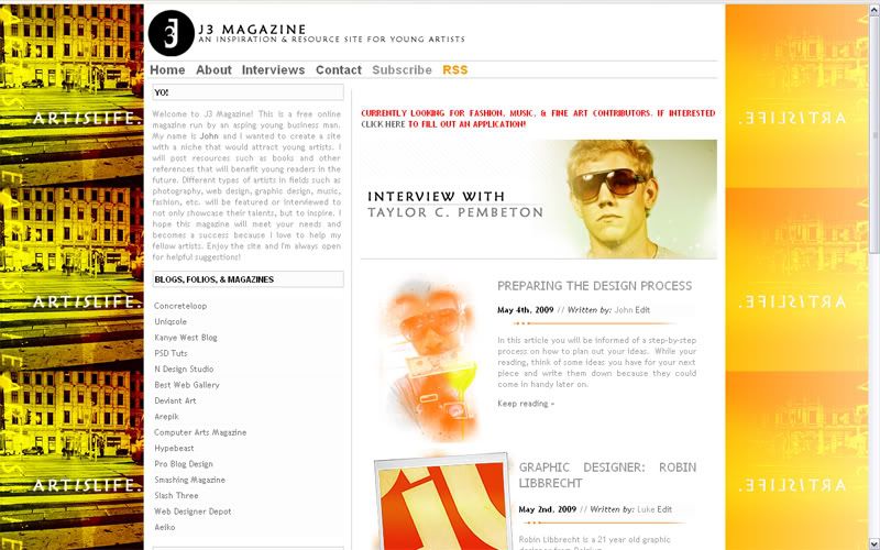
I redesigned the web design for J3 Magazine. I used the old template and added some more features and better organization. So what do you think? I still have some things to edit. If anyone could tell me how to move the right side up more to match with the left, let me know please.
J3 Magazine link |
|
|
|


 |
Replies
(1 - 5)
|
May 29 2009, 10:45 PM
Post
#2
|
|
 Mel Blanc was allergic to carrots. Group: Official Designer Posts: 6,371 Joined: Aug 2008 Member No: 676,291 |
I think it looks pretty good but the only thing that bothers me is the background. It seems pretty busy to me for some reason. Anyways, I'm not really sure how to move the right side up some. Is it a Wordpress template that you made the css for yourself? If so, try seeing where the class for the right side is and move it up a couple pixels by adjusting the margin-top: or the top: properties. You could also try using a padding: property but I'm not sure if it'll work. If not, then try actually making your own css for the template. See if you could move down the left side if you don't have a way of moving up the right side. The padding: property could be pretty helpful in that situation.

|
|
|
|


|
May 29 2009, 10:48 PM
Post
#3
|
|
|
talent on another level Group: Member Posts: 746 Joined: Oct 2006 Member No: 475,735 |
QUOTE(Mikeplyts @ May 29 2009, 10:45 PM)  I think it looks pretty good but the only thing that bothers me is the background. It seems pretty busy to me for some reason. Anyways, I'm not really sure how to move the right side up some. Is it a Wordpress template that you made the css for yourself? If so, try seeing where the class for the right side is and move it up a couple pixels by adjusting the margin-top: or the top: properties. You could also try using a padding: property but I'm not sure if it'll work. If not, then try actually making your own css for the template. See if you could move down the left side if you don't have a way of moving up the right side. The padding: property could be pretty helpful in that situation. thanks for the comment. i made this whole layout from scratch, nothing downloaded except the scripts  . i'll keep playing with the css. . i'll keep playing with the css.
|
|
|
|
|
May 29 2009, 11:32 PM
Post
#4
|
|
 Senior Member Group: Administrator Posts: 8,629 Joined: Jan 2007 Member No: 498,468 |
Ooh the banner's cool. I'm not really feeling the background either. I personally don't like titled backgrounds. But everything else looks nice

|
|
|
|


|
May 30 2009, 06:49 AM
Post
#5
|
|
|
talent on another level Group: Member Posts: 746 Joined: Oct 2006 Member No: 475,735 |
thanks, ill keep that in mind.
|
|
|
|
|
Jun 1 2009, 07:47 PM
Post
#6
|
|
|
talent on another level Group: Member Posts: 746 Joined: Oct 2006 Member No: 475,735 |
|
|
|
|


 |
1 User(s) are reading this topic (1 Guests and 0 Anonymous Users)
0 Members: