Pin up girls, Layout? I think so... |
Resource Center Links
This Month's Contests | Hosts Looking for Hostees | Hostees looking for Hosts | BigBookofResources
Submission Guidelines

 May 26 2009, 02:14 PM May 26 2009, 02:14 PM
Post
#1
|
|
 Senior Member  Group: Member Posts: 75 Joined: Feb 2009 Member No: 717,000 |
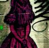
I've recently fallen in love with the work of Rolf Armstrong, and so I've decided to make a layout out of some of his work. I'm really not so sure about it... there's parts of it I'm crazy about, and parts of it I think might make me barf. I'm horrible when it comes to criticizing my own work though, so I'm here
 . I was originally going with a sort of seamstress feel to it, with the bows, lace, ruler, and the middle pin up girl is sitting on a spool of thread... although it looks like that isn't coming across as well as I had hoped for. I'm really not sure about the grayish parts on the girls. I was trying to go for an old, grungy, sort of feel. Maybe to make it seem like tape had ripped or faded the pictures a little bit. So I'm not sure. . I was originally going with a sort of seamstress feel to it, with the bows, lace, ruler, and the middle pin up girl is sitting on a spool of thread... although it looks like that isn't coming across as well as I had hoped for. I'm really not sure about the grayish parts on the girls. I was trying to go for an old, grungy, sort of feel. Maybe to make it seem like tape had ripped or faded the pictures a little bit. So I'm not sure.I'll be adding text eventually, I'm just not sure what. I think I might use this for a personal sight so probably something to do with that. So yea, any suggestions or criticism would be greatly appreciated  |
|
|
|


 |
Replies
(1 - 6)
|
May 26 2009, 02:44 PM
Post
#2
|
|
 Ley <3 Group: Member Posts: 579 Joined: Jul 2008 Member No: 664,894 |
To me it just kind of looks like a bunch of images stacked on each other. I dont love the colors either.
|
|
|
|

|
May 26 2009, 04:00 PM
Post
#3
|
|
 Senior Member Group: Staff Alumni Posts: 2,435 Joined: Feb 2007 Member No: 506,205 |
The images are really low quality, and they just kinda looked pasted together. The bows definately look out of place. It's a cute idea, but the bright pink doesn't match the more orangey color of everything else.
|
|
|
|


|
May 26 2009, 04:49 PM
Post
#4
|
|
 Mel Blanc was allergic to carrots. Group: Official Designer Posts: 6,371 Joined: Aug 2008 Member No: 676,291 |
I pretty much agree with Gabi (schizo). I like the concept though and I guess it could make for a good layout.
|
|
|
|


|
May 26 2009, 05:13 PM
Post
#5
|
|
 I'm Jc Group: Mentor Posts: 13,619 Joined: Jul 2006 Member No: 437,556 |
i agree about the bright pink. i mean the main girl in the middle is wearing pink pretty much, so if the bows were that color it would probably be ok. they look new and shiny and the rest looks vintage. besides that, i don't get a seamstress theme at all from it so the ruler looks really random. i wouldn't even really put the ruler unless you can make it more clear what the theme is. if you're dead set on having a ruler, you'd be better off using the kinda of tape measure that's actually used in sewing. this kind automatically makes people think of sewing, a wooden straight foot ruler, not so much.
|
|
|
|


|
May 26 2009, 05:19 PM
Post
#6
|
|
 Senior Member Group: Member Posts: 786 Joined: Dec 2006 Member No: 488,341 |
Agree with what everyone has said. And I think there are too many girls in it, like I get that you're focusing on pin up girls but a MAIN focus is better than all of those scattered on there.
|
|
|
|

|
May 26 2009, 06:32 PM
Post
#7
|
|
 Senior Member Group: Administrator Posts: 8,629 Joined: Jan 2007 Member No: 498,468 |
I agree with what everyone has said. The low image quality was the first thing I noticed. Honestly I think you should start over again. I mean the idea's cute but yeah. :/
|
|
|
|

 |
1 User(s) are reading this topic (1 Guests and 0 Anonymous Users)
0 Members: