First infographic |
Resource Center Links
This Month's Contests | Hosts Looking for Hostees | Hostees looking for Hosts | BigBookofResources
Submission Guidelines

 May 25 2009, 06:01 PM May 25 2009, 06:01 PM
Post
#1
|
|
 Senior Member  Group: Official Designer Posts: 339 Joined: Mar 2009 Member No: 721,527 |
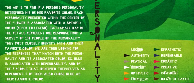
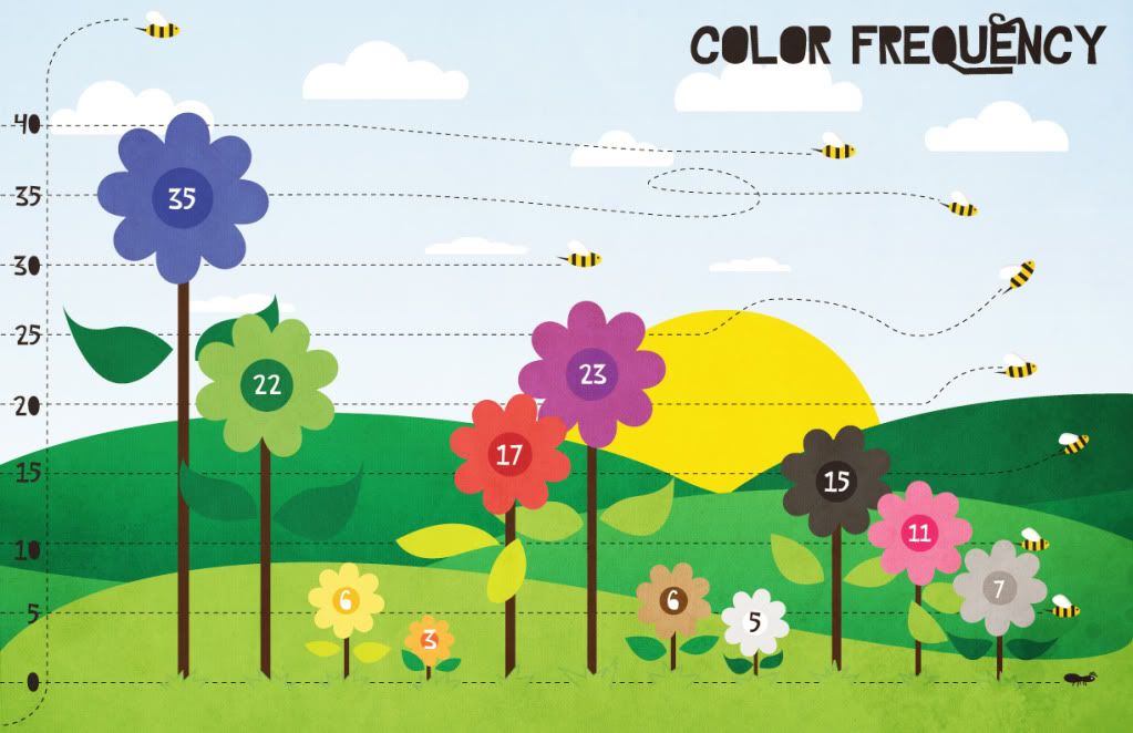
This is for my statistics final project of sorts. Basically we have to make a survey of our own and the topic my group wanted to do was... to see if a person's favorite color determines their personality.
So each small bar represents one person and the color that they chose to be their favorite color, lined up with the personality that they chose to most closely represent them. I want to try to keep the elaborations to a minimum because I want to see if a fresh set of eyes looking at it for the first time would understand it without any explanations. 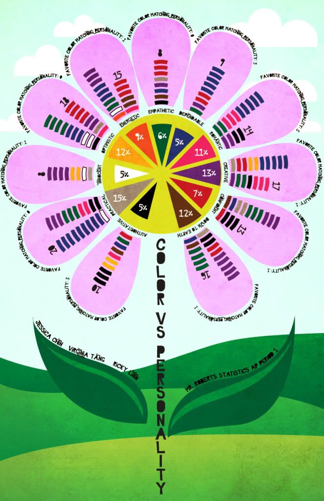
|
|
|
|


 |
Replies
(1 - 24)
|
May 25 2009, 07:11 PM
Post
#2
|
|
 poison Group: Official Member Posts: 4,806 Joined: Mar 2008 Member No: 629,020 |
i like it a lot. My one thing is that its kinda hard to read the font thats on the leafs and around the pedals.
|
|
|
|


|
May 25 2009, 08:14 PM
Post
#3
|
|
|
Adobe Addict Group: Staff Alumni Posts: 1,237 Joined: Mar 2005 Member No: 113,043 |
This is awesome!!! I really don't have much to say, except for suggesting that you try to use less color in the petals/sky to emphasize the small bar colors in your graph. I was a overwhelmed at first. But this is so cool. Props to you!
|
|
|
|

|
May 25 2009, 08:15 PM
Post
#4
|
|
 Senior Member Group: Official Designer Posts: 5,880 Joined: Nov 2007 Member No: 593,382 |
QUOTE(Tomates @ May 25 2009, 07:11 PM)  i like it a lot. My one thing is that its kinda hard to read the font thats on the leafs and around the pedals. I agree. Make it a little more functional. I think you should make a...a...those things on maps. Like to mak it easier to read, so you dont have to tilt your head, put like a brown box and do equals and the percentage there. |
|
|
|

|
May 25 2009, 09:51 PM
Post
#5
|
|
 Sex, Blood, & RocknRoll Group: People Staff Posts: 5,305 Joined: Nov 2007 Member No: 596,480 |
The only thing I think you should change is the font for the black text, except the text for the stem it's big enough to be readable.
|
|
|
|

|
May 25 2009, 10:09 PM
Post
#6
|
|
 Senior Member Group: Head Staff Posts: 18,173 Joined: Mar 2005 Member No: 108,478 |
Interesting. I like the idea of putting the bars on flower petals.
|
|
|
|

|
May 25 2009, 10:42 PM
Post
#7
|
|
 Senior Member Group: Staff Alumni Posts: 2,435 Joined: Feb 2007 Member No: 506,205 |
It looks fantastic, as usual. I kinda agree about the font being hard to read, though. I mean, I could pretty much figure out what everything says, just not instantly.
|
|
|
|

|
May 26 2009, 12:30 AM
Post
#8
|
|
|
Senior Member Group: Official Designer Posts: 339 Joined: Mar 2009 Member No: 721,527 |
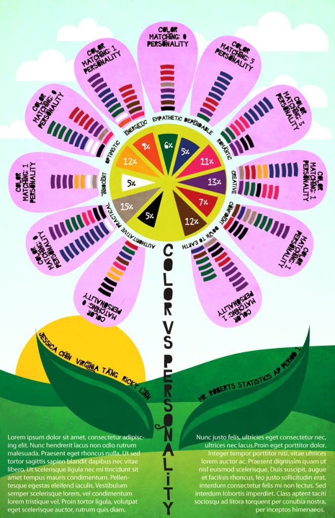
Thanks for the feedback. I'll bring the font size up a few points.
Everyone understood the data though right? |
|
|
|
|
May 26 2009, 01:33 AM
Post
#9
|
|
 Senior Member Group: Administrator Posts: 8,629 Joined: Jan 2007 Member No: 498,468 |
Oh my gosh this is such a cute idea! I like it a lot. But yeah the only thing I would change is the font to make it easier on the eyes. But great job! :D
|
|
|
|

|
May 26 2009, 02:42 AM
Post
#10
|
|
|
Senior Member Group: Official Designer Posts: 339 Joined: Mar 2009 Member No: 721,527 |
Update:
|
|
|
|
|
May 26 2009, 12:07 PM
Post
#11
|
|
 Senior Member Group: Official Member Posts: 1,801 Joined: Aug 2007 Member No: 568,102 |
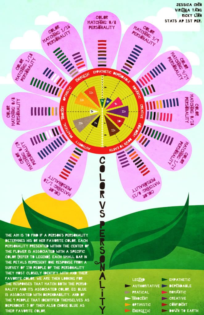
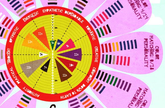
Better, but the black words on the petals crowd the design. I say keep the number, but don't include the same text over and over. Rather create a key somewhere in the design that explains what the numbers mean. That's just my opinion. Otherwise, it looks really good. I love the colors.
|
|
|
|

|
May 26 2009, 04:52 PM
Post
#12
|
|
 Mel Blanc was allergic to carrots. Group: Official Designer Posts: 6,371 Joined: Aug 2008 Member No: 676,291 |
It looks great as usual, but it's still a bit hard to instantly read the data as Gabi (schizo) mentioned. Otherwise, excellent job!

|
|
|
|

|
May 26 2009, 05:21 PM
Post
#13
|
|
 Senior Member Group: Member Posts: 786 Joined: Dec 2006 Member No: 488,341 |
Actually I was a bit confused reading it...maybe I'm just slow but it's cute.
|
|
|
|

|
May 26 2009, 05:46 PM
Post
#14
|
|
|
Senior Member Group: Administrator Posts: 8,629 Joined: Jan 2007 Member No: 498,468 |
It looks crowded, imo. I think I liked your first version better because the text warp or whatever it's called looked cool.
|
|
|
|
|
May 26 2009, 06:08 PM
Post
#15
|
|
|
Sex, Blood, & RocknRoll Group: People Staff Posts: 5,305 Joined: Nov 2007 Member No: 596,480 |
I think maybe if the white text was justified it would look a little more neater.
|
|
|
|
|
May 27 2009, 09:23 PM
Post
#16
|
|
|
Senior Member Group: Official Designer Posts: 339 Joined: Mar 2009 Member No: 721,527 |
Update:
|
|
|
|
|
May 27 2009, 11:25 PM
Post
#17
|
|
|
Senior Member Group: Administrator Posts: 8,629 Joined: Jan 2007 Member No: 498,468 |
Hmm I think it's cute. I can't really find anything to comment on.

|
|
|
|
|
May 27 2009, 11:46 PM
Post
#18
|
|
|
Sex, Blood, & RocknRoll Group: People Staff Posts: 5,305 Joined: Nov 2007 Member No: 596,480 |
I think it's great. Is everyone in the class making theirs as fancy? lol I don't think I would ever spend that much time on something for a statics class.
|
|
|
|
|
May 28 2009, 05:25 PM
Post
#19
|
|
|
Senior Member Group: Official Designer Posts: 339 Joined: Mar 2009 Member No: 721,527 |
Nah, it's just me, because I'm not good at math and I didn't learn any statistics for the entire year because I'm always sleeping, I just thought I overdo the visuals since I didn't want to be the dead weight in my group. Plus I'm hoping for the extra credit since I need that too :P (horrible student).
It's funny the mixed responses I'm getting. Over at the Graphic Design Forum I get a lot of negative critiques but over here I get positive responses. I wonder if its just the demography of the two boards... |
|
|
|
|
May 28 2009, 09:39 PM
Post
#20
|
|
|
Senior Member Group: Official Designer Posts: 339 Joined: Mar 2009 Member No: 721,527 |
|
|
|
|
|
May 28 2009, 09:48 PM
Post
#21
|
|
|
Senior Member Group: Official Member Posts: 1,028 Joined: Sep 2007 Member No: 579,129 |
These are all too pretty :x -Jealous-
The bee line thingies are really neat. I has nothing bad to say. |
|
|
|

|
May 28 2009, 09:50 PM
Post
#22
|
|
|
Senior Member Group: Official Designer Posts: 339 Joined: Mar 2009 Member No: 721,527 |
why do i see so many boobies avatars from that girl in snsd.
|
|
|
|
|
May 28 2009, 09:53 PM
Post
#23
|
|
|
Sex, Blood, & RocknRoll Group: People Staff Posts: 5,305 Joined: Nov 2007 Member No: 596,480 |
lol I had it because I like the word boobies, she made the avatar, and I don't know why the other guy has it.
The bee idea is soooo cute! |
|
|
|
|
May 28 2009, 10:02 PM
Post
#24
|
|
|
Senior Member Group: Official Designer Posts: 339 Joined: Mar 2009 Member No: 721,527 |
i like boobies too. i mean the word. lol.
|
|
|
|
|
May 28 2009, 10:57 PM
Post
#25
|
|
|
Senior Member Group: Staff Alumni Posts: 2,435 Joined: Feb 2007 Member No: 506,205 |
QUOTE(rickysaurus @ May 28 2009, 05:25 PM) It's funny the mixed responses I'm getting. Over at the Graphic Design Forum I get a lot of negative critiques but over here I get positive responses. I wonder if its just the demography of the two boards... What kind of things are they saying? It's probably different here because most of us aren't extremely stuffy art aficionados. I see the site as mostly a place for people to learn, so insignificant details and all that jazz don't matter much....if that makes sense. The graphic you just posted looks fantastic, by the way. |
|
|
|
 |
1 User(s) are reading this topic (1 Guests and 0 Anonymous Users)
0 Members: