Late night createtions... |
Resource Center Links
This Month's Contests | Hosts Looking for Hostees | Hostees looking for Hosts | BigBookofResources
Submission Guidelines
 Feb 13 2009, 01:01 AM Feb 13 2009, 01:01 AM
Post
#1
|
|
 Senior Member        Group: Official Designer Posts: 5,880 Joined: Nov 2007 Member No: 593,382 |
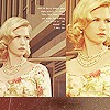
I just made this in like 10 mins in gimp and i htink it looks pretty cool:
 What do you think? And this which I made the other day but wasnt sure if it was cool/creative or just weird and stupid looking. (also I know the swirl is pixelated ill fix that later)  And last but not least: I realize the actual character looks weird and deformed but does it look googd to you? And I thought about showing my cb logo for the contest cause I could use the cc but I dont want to show it. |
|
|
|
 |
Replies
(1 - 6)
 Feb 13 2009, 01:57 AM Feb 13 2009, 01:57 AM
Post
#2
|
|
 sang loves hayden.        Group: Staff Alumni Posts: 3,373 Joined: Feb 2004 Member No: 5,687 |
The first image looks good. It looks sleek and nice.
The second, not much a fan. The lines seems to be jagged (the swirl). The third, yeah the person looks kind of funky. It looks like one eyeball is blurry or 3d'ish than the other one. But nice work on GIMP though. |
|
|
|
 Feb 14 2009, 10:23 AM Feb 14 2009, 10:23 AM
Post
#3
|
|
 (′ ・ω・`)        Group: Official Designer Posts: 6,179 Joined: Dec 2004 Member No: 72,477 |
third one is creepy
|
|
|
|
 Feb 14 2009, 11:35 AM Feb 14 2009, 11:35 AM
Post
#4
|
|
 Senior Member       Group: Staff Alumni Posts: 2,435 Joined: Feb 2007 Member No: 506,205 |
1. Looks nice, but way too basic.
2. Might be okay if the edges weren't choppy and that fuzzy black stuff wasn't there. 3. That is kinda gross...design and execution. No offense. |
|
|
|
 Feb 14 2009, 12:03 PM Feb 14 2009, 12:03 PM
Post
#5
|
|
 Mel Blanc was allergic to carrots.        Group: Official Designer Posts: 6,371 Joined: Aug 2008 Member No: 676,291 |
1. Looks good, but like Gabi said, too basic.
2. Could look better without the black thing and a smoother swirl. 3. I don't really like it because like the edges look choppy and so does the hair. Also, it's like some parts are 3-d and some parts are just flat. |
|
|
|
 Feb 14 2009, 12:03 PM Feb 14 2009, 12:03 PM
Post
#6
|
|
 Sex, Blood, & RocknRoll        Group: People Staff Posts: 5,305 Joined: Nov 2007 Member No: 596,480 |
The last one should be wiped of the face of the earth. The other two are just to basic for me.
|
|
|
|
 Feb 14 2009, 05:58 PM Feb 14 2009, 05:58 PM
Post
#7
|
|
 사랑해 ~ 我愛你 ♥      Group: Design Staff Posts: 825 Joined: Jan 2007 Member No: 492,587 |
the swirl in the second one throws me off. smooth out the edge. and basically what they said. i think it's a good start though (:
|
|
|
|
  |
1 User(s) are reading this topic (1 Guests and 0 Anonymous Users)
0 Members:


