Graphic/Quote Signs, Help? xD |
Resource Center Links
This Month's Contests | Hosts Looking for Hostees | Hostees looking for Hosts | BigBookofResources
Submission Guidelines

 Jul 10 2008, 12:56 PM Jul 10 2008, 12:56 PM
Post
#1
|
|
 Liz  Group: Member Posts: 77 Joined: May 2008 Member No: 646,940  |
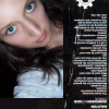
So the other day I started working on a sign (new category) for my website and I was wondering what you guys think so far hehe. I only have one so far lol.
Also, anyone know any good quote site? :S 
|
|
|
|


 |
Replies
(1 - 5)
|
Jul 10 2008, 01:27 PM
Post
#2
|
|
 Senior Member Group: Member Posts: 72 Joined: Apr 2008 Member No: 643,801 |
I think its purty!!! really i do... keep it up. the only problem is the transparency of the letters... it kind of hard to read.
|
|
|
|


|
Jul 10 2008, 02:05 PM
Post
#3
|
|
 Senior Member Group: Member Posts: 786 Joined: Dec 2006 Member No: 488,341 |
Cute. But I agree, it's hard to read.
|
|
|
|

|
Jul 10 2008, 02:54 PM
Post
#4
|
|
|
Liz Group: Member Posts: 77 Joined: May 2008 Member No: 646,940 |
hehe thanks (: as for the transparency, it doesn't have one hehe, thats the way the font is xD cause its all circles lol
|
|
|
|
|
Jul 10 2008, 11:23 PM
Post
#5
|
|
 Cornflakes :D Group: Staff Alumni Posts: 4,541 Joined: Dec 2005 Member No: 322,923 |
A really big rule for me is when you're making a graphic you shouldn't use more than I'd say around 2 fonts. Depending of the size and such, I'd say 2 is a good number. I think for the whole 'Please don't stop the music' it should all be in the Fortuna Dot font. I think the transparency issue would be gone and it may even look better. As for the use of shapes/brushes/& or vectors, they all look nice.

|
|
|
|

|
Jul 12 2008, 12:01 AM
Post
#6
|
|
 torn Group: Official Designer Posts: 953 Joined: Oct 2004 Member No: 55,718 |
A black drop shadow set on soft light or overlay might also help (for "Please don't"). Unless you already have that? I can see drop shadows on the other text, but it's a bit hard to tell on the first line.
I really love the colors and the effects and shapes. Looks amazing. :] |
|
|
|

 |
1 User(s) are reading this topic (1 Guests and 0 Anonymous Users)
0 Members: