i want to improve., Something i made and i really want to improve & i really need advi |
Resource Center Links
This Month's Contests | Hosts Looking for Hostees | Hostees looking for Hosts | BigBookofResources
Submission Guidelines

 Jun 14 2008, 10:43 PM Jun 14 2008, 10:43 PM
Post
#1
|
|
 Newbie  Group: Member Posts: 9 Joined: Jun 2008 Member No: 658,474 |
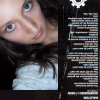
Some of you may remember me. I took your advice & changed from Chewy Productions to Chewy Surprises. It sounds cuter, i think. Anyways, I'm in that stage where I make things that aren't as professional as you guys. Everyone here is pretty much my idol(= Anyways, this is a new site layout I'm putting up soon & i want some advice & opinions before I put it up. I really love the honesty here(=
well here it is. Well it's big so click here! |
|
|
|


 |
Replies
(1 - 11)
| *absinthe* |
Jun 15 2008, 01:02 AM
Post
#2
|
|
Guest |
It's really cute. I think it seems a bit clumped together, though. Spacing some of the things out might work, imo. Also, at first glance, it becomes difficult to tell what's navigational and what isn't. Maybe using different fonts? I don't know, that's just me.
I like the colors though. 
|
|
|
|
|
Jun 15 2008, 01:39 AM
Post
#3
|
|
 sang loves hayden. Group: Staff Alumni Posts: 3,373 Joined: Feb 2004 Member No: 5,687 |
IMO, when I look at this. I see "cute-sy" (including fonts) not professionalism even though you weren't going for it. It's the fact that you used brushes and blobs of text than using other photoshop/psp techniques for a layout. Try experimenting with your program and you might end up with better results than blobs of text/brushes.
As a whole, it's decent for a first. It's best if you have the navigation user-friendly than having someone trying to find the navigation and looking for "clickable" title. |
|
|
|

|
Jun 15 2008, 08:58 PM
Post
#4
|
|
|
Newbie Group: Member Posts: 9 Joined: Jun 2008 Member No: 658,474 |
thanks for all of the advice.
Yea, I guess it's really unprofessional. & I use Imageready instead of Photoshop because my photoshop trial ended. And the filters & Plugins have problems. :[ Now that I think about it, it looks messy and stuff. BLEH fixing it up right now(= |
|
|
|
|
Jun 15 2008, 09:32 PM
Post
#5
|
|
|
Newbie Group: Member Posts: 9 Joined: Jun 2008 Member No: 658,474 |
I changed the whole image from 600 x 600 to 700 x 700.
I changed the fonts. It doesn't help with the telling the links apart from everything else though :[ but I just thought the other one was boring. I made some of the boxes bigger. Click Here I'm not 100% sure about the fonts. I'm definitely not good at choosing fonts. |
|
|
|
|
Jun 15 2008, 09:36 PM
Post
#6
|
|
 Cornflakes :D Group: Staff Alumni Posts: 4,541 Joined: Dec 2005 Member No: 322,923 |
I mean its cute, but its extremely busy. The last update you made is a lot better, the words are spaced out and it doesn't seem like theres a ton of things coming at me. The cursive font is a little strange, and the only other thing that I would really really recommend changing is the stroke around the text in the bottom right box.. the links I'm guessing.
|
|
|
|


|
Jun 15 2008, 09:59 PM
Post
#7
|
|
|
Newbie Group: Member Posts: 9 Joined: Jun 2008 Member No: 658,474 |
I didn't change much in this one except the stroking like you said and I got rid of the cursive (x
Hows This? |
|
|
|
| *absinthe* |
Jun 16 2008, 01:13 AM
Post
#8
|
|
Guest |
It's better, but i still feel like each part is screaming READ ME all at once.
|
|
|
|
|
Jun 16 2008, 11:56 AM
Post
#9
|
|
 Naomi loves you. Y'all may call me NaNa Group: Official Designer Posts: 2,925 Joined: Jun 2006 Member No: 427,774 |
This looks too much of a myspace layout unless that's what it's for. I think you should code the text where it's easy to change and edit, just in case you have to add one more rule or something and fix the words you have clump together like you have "ifiask", it's hard to read that. I think it's really cute but it seems like something is missing.
|
|
|
|

|
Jun 17 2008, 09:58 AM
Post
#10
|
|
|
Newbie Group: Member Posts: 9 Joined: Jun 2008 Member No: 658,474 |
Actually it is a myspace layout. I'll fix the words clumped together(=
I think i'll just make another layout if i have to add anything. |
|
|
|
|
Jun 17 2008, 08:10 PM
Post
#11
|
|
 Liz Group: Member Posts: 77 Joined: May 2008 Member No: 646,940 |
I think it looks cool^^ unique style too (:
|
|
|
|

|
Jun 18 2008, 03:27 AM
Post
#12
|
|
 i've never wanted anything rationale. Group: Staff Alumni Posts: 8,449 Joined: May 2004 Member No: 19,045 |
I think it still looks unprofessional because of a) the color scheme and b) the lined paper background. Now it is cute, but it's still really busy and cluttered. Doesn't look too user friendly.
|
|
|
|

 |
1 User(s) are reading this topic (1 Guests and 0 Anonymous Users)
0 Members: