Marilyn Monroe Banner, tell me what you think! |
Resource Center Links
This Month's Contests | Hosts Looking for Hostees | Hostees looking for Hosts | BigBookofResources
Submission Guidelines

 Apr 21 2008, 08:24 PM Apr 21 2008, 08:24 PM
Post
#1
|
|
 Carpe Noctem  Group: Official Designer Posts: 183 Joined: Nov 2007 Member No: 592,657 |
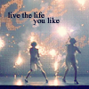
Tell me what you think of my new banner Constructive feedback would be wonderful :D  |
|
|
|


 |
Replies
(1 - 16)
|
Apr 21 2008, 09:07 PM
Post
#2
|
|
 Senior Member Group: Official Member Posts: 1,288 Joined: Oct 2007 Member No: 585,380 |
I like it! i think it could of been better without the colored lipstick thing, but i still like it =)
|
|
|
|

|
Apr 21 2008, 09:26 PM
Post
#3
|
|
 sang loves hayden. Group: Staff Alumni Posts: 3,373 Joined: Feb 2004 Member No: 5,687 |
Not bad. I like the way there are scratches making it seem like the oldies.
Although, the background is disturbing IMO. The film strips are just bleh, and completely over-used. Yeah, Marilyn Monroe was in films but somehow, the filmstrips that are portrayed doesn't seem nicely done. There are other ways to make it look creative and eye-catchy without the spam of film strip brushes. |
|
|
|


|
Apr 21 2008, 09:38 PM
Post
#4
|
|
 DDR \\ I'm Dee :) Group: Mentor Posts: 8,662 Joined: Mar 2006 Member No: 384,020 |
I agree with you, Sang. The editting itself is nicely done, but the background just looks like one brush that was used a lot.
|
|
|
|


|
Apr 21 2008, 10:37 PM
Post
#5
|
|
 Senior Member Group: Staff Alumni Posts: 1,815 Joined: Jun 2006 Member No: 423,396 |
I like it. I'm kinda also a fan of the grunges.
|
|
|
|

|
Apr 21 2008, 11:05 PM
Post
#6
|
|
 Senior Member Group: Member Posts: 113 Joined: Sep 2005 Member No: 221,897 |
I like it. I like the idea of the lipstick as a pop of color but I would have chosen red, this is Marilyn Monroe after all.
 Normally, I'd agree about the excessive use of filmstrips but I think it works here considering the theme. |
|
|
|
|
Apr 22 2008, 10:37 AM
Post
#7
|
|
 <(^_^<) DANCE!(>^_^)> Group: Official Member Posts: 1,304 Joined: Nov 2007 Member No: 586,621 |
i like it. the retro/vintage look it has is adorable. and the quote just fits. very nicely done.

|
|
|
|

|
Apr 22 2008, 11:02 AM
Post
#8
|
|
 Melieized Group: Official Designer Posts: 1,372 Joined: Nov 2006 Member No: 478,715 |
very nicely done! great job!
|
|
|
|

|
Apr 22 2008, 12:46 PM
Post
#9
|
|
 crushed. Group: Staff Alumni Posts: 9,432 Joined: Jun 2004 Member No: 20,026 |
i like the vintage-y feel of it, but i do agree with the others about the over usage of the film strip brushes.
and ADD A BORDER please! |
|
|
|

|
Apr 22 2008, 04:27 PM
Post
#10
|
|
 yo yo yiggidy yo. Group: Official Member Posts: 1,606 Joined: Mar 2005 Member No: 108,591 |
QUOTE(Teesa @ Apr 22 2008, 01:46 PM)  i like the vintage-y feel of it, but i do agree with the others about the over usage of the film strip brushes. and ADD A BORDER please! she basically said what i was thinking. lol. i love the scratches. |
|
|
|

|
Apr 22 2008, 05:04 PM
Post
#11
|
|
 awestinnn Group: Member Posts: 624 Joined: Aug 2006 Member No: 460,069 |
Definitely a border :)
I really don't think the filmstrip brushes are too bad. They tend to get overused a lot but it just fits with the whole banner. I really like it :) |
|
|
|

|
Apr 22 2008, 05:06 PM
Post
#12
|
|
|
Senior Member Group: Official Member Posts: 1,288 Joined: Oct 2007 Member No: 585,380 |
QUOTE(austinoutloud @ Apr 22 2008, 06:04 PM) I really don't think the filmstrip brushes are too bad. They tend to get overused a lot but it just fits with the whole banner. I really like it :)
|
|
|
|
|
Apr 22 2008, 07:48 PM
Post
#13
|
|
|
Carpe Noctem Group: Official Designer Posts: 183 Joined: Nov 2007 Member No: 592,657 |
Thanks everyone for your wonderful feedback
:D And I do see the whole film strip thing could get distracting, but it was something kind of last second. I didn't want the background to be just plain-jane so I grabbed that brush and went to town. hahaha |
|
|
|
|
Apr 22 2008, 09:15 PM
Post
#14
|
|
 `Senta Group: Member Posts: 56 Joined: Jan 2008 Member No: 607,411 |
I really like it, :]
but for some reason, the picture on the right kinda.. I don't know, irritates me. XD. I don't know why, though. Good job anyways. |
|
|
|

|
Apr 22 2008, 09:22 PM
Post
#15
|
|
 cake or DEATH Group: Staff Alumni Posts: 631 Joined: Sep 2005 Member No: 223,586 |
i like the coloring and i think the film strip brushes work here, considering the theme. i just think you could've had more of a variety of brushes in there.
but if you have the time to edit, experiment with floral or grungy brushes. see what results you get. |
|
|
|

|
Apr 22 2008, 10:26 PM
Post
#16
|
|
 Oh Wow ... Group: Official Designer Posts: 688 Joined: Sep 2006 Member No: 468,522 |
i like the whole theme to it. I just like it overall :D
|
|
|
|

|
Apr 22 2008, 10:31 PM
Post
#17
|
|
 Fellatio. Group: Official Member Posts: 2,122 Joined: Mar 2007 Member No: 511,775 |
Pretty Damn Good.
|
|
|
|

 |
1 User(s) are reading this topic (1 Guests and 0 Anonymous Users)
0 Members: