first vector. |
Resource Center Links
This Month's Contests | Hosts Looking for Hostees | Hostees looking for Hosts | BigBookofResources
Submission Guidelines

 Apr 18 2008, 08:20 PM Apr 18 2008, 08:20 PM
Post
#1
|
|
|
AKA RockIt Studios  Group: Official Member Posts: 2,286 Joined: Jun 2006 Member No: 421,809 |
obviously, i'm no pro, and it's not the greatest in the world, but i'm proud. this is my first vector, so constructive criticism would really be appreciated.
keep in mind i have no clue what's expected from a vector, let alone your first. also, i've been trying to get my hands on a decent quality picture, so i could add more detail in the eyes/lips/hair. for now, i just worked with what i have. Jackson Rathbone, AKA Jasper Hale. 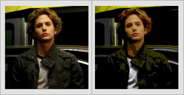
|
|
|
|


 |
Replies
(1 - 6)
|
Apr 18 2008, 08:23 PM
Post
#2
|
|
 yo yo yiggidy yo. Group: Official Member Posts: 1,606 Joined: Mar 2005 Member No: 108,591 |
not bad for your first try. i don't think its bad. at least the vector looks somewhat like the original. i probably wouldn't have the patience to vector.
 that area around his neck came out really dark though, almost too dark; as well as a lot of dark spots on his jacket. that area around his neck came out really dark though, almost too dark; as well as a lot of dark spots on his jacket.
|
|
|
|

|
Apr 18 2008, 09:54 PM
Post
#3
|
|
|
AKA RockIt Studios Group: Official Member Posts: 2,286 Joined: Jun 2006 Member No: 421,809 |
thanksss! I know about the dark colors, I wanted a really drastic change between certain areas, to create depth.
|
|
|
|
|
Apr 18 2008, 11:49 PM
Post
#4
|
|
 crushed. Group: Staff Alumni Posts: 9,432 Joined: Jun 2004 Member No: 20,026 |
the shading and layering looks pretty good, but next time you should definitely choose a much bigger picture that doesn't have a somewhat blurry quality. it's kind of hard to critique it since it's kind of small.
|
|
|
|

|
Apr 18 2008, 11:57 PM
Post
#5
|
|
|
yo yo yiggidy yo. Group: Official Member Posts: 1,606 Joined: Mar 2005 Member No: 108,591 |
QUOTE(Teesa @ Apr 19 2008, 12:49 AM)  the shading and layering looks pretty good, but next time you should definitely choose a much bigger picture that doesn't have a somewhat blurry quality. it's kind of hard to critique it since it's kind of small. teesa's right. i think the best pictures to vector are the ones that are big, of course, but simple. like if there's too much going on in a photo, it'll make it harder and you have to make sure there isn't too many shadows like the one you used. |
|
|
|
|
Apr 19 2008, 01:15 AM
Post
#6
|
|
 Senior Member Group: Staff Alumni Posts: 1,815 Joined: Jun 2006 Member No: 423,396 |
Not bad for a first. If you're going for a smooth style, don't follow the posterization too much, since that usually results in lumpy shapes with extra, unnecessary curves. But yeah, work with a larger picture, especially since you're just starting out.
|
|
|
|


|
Apr 19 2008, 10:22 AM
Post
#7
|
|
|
AKA RockIt Studios Group: Official Member Posts: 2,286 Joined: Jun 2006 Member No: 421,809 |
the image was a screenshot from an interview with MTV, hence the poor quality and small size. :]
|
|
|
|
 |
1 User(s) are reading this topic (1 Guests and 0 Anonymous Users)
0 Members: