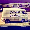
ehh?, ya like it? what does it need? |
Resource Center Links
This Month's Contests | Hosts Looking for Hostees | Hostees looking for Hosts | BigBookofResources
Submission Guidelines

 Mar 17 2008, 07:46 PM Mar 17 2008, 07:46 PM
Post
#1
|
|
 Marissaaaaa!  Group: Member Posts: 188 Joined: Jan 2008 Member No: 612,652 |
 Yeahh, those lyrics aren't from Rookie. but whatever. any sugestions? And this, it feel it needs something  any suggestions? |
|
|
|


 |
Replies
(1 - 5)
|
Mar 17 2008, 07:49 PM
Post
#2
|
|
 Melieized Group: Official Designer Posts: 1,372 Joined: Nov 2006 Member No: 478,715 |
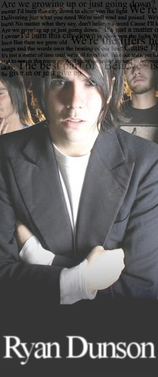
the person's name in both of them are a little blurry for me.
the first one, you should try and do masking with the lyrics so it can like fade out over his head and face the second one, if you wanted the neon to go on in the back, then it should go behind the bandmembers too. for some reason if they were removed, then the neon would be great by itself in the back. also, see if you can add some filtering to his face so it doesn't look like a light was directly in his face...but also have a small blast of light in the bg. but that's my opinion. |
|
|
|

|
Mar 17 2008, 08:45 PM
Post
#3
|
|
 DDR \\ I'm Dee :) Group: Mentor Posts: 8,662 Joined: Mar 2006 Member No: 384,020 |
They're both odd shapes. Also, the people in the background are just abrubtly cut off. Make the text so that it's easier to read.
|
|
|
|


|
Mar 17 2008, 08:52 PM
Post
#4
|
|
 kthxbai Group: Official Designer Posts: 2,832 Joined: Feb 2008 Member No: 621,203 |
QUOTE(Angeline @ Mar 17 2008, 08:23 PM)  This is my honest opinion. Throw the whole image away. Find a new one, that's doesn't make someone want to cringe when they see the size. Try doing more than adding text and colors. :) agreed. To put it nicely: the image is shaped strangely; because of that, few people will like it. The neon in the 2nd image looks bad because it covers the back two people; In fact, the back two people kill the shot. The lyrics in the first image look very off. The text in both images is very blurry. The first image is dull in color. |
|
|
|


|
Mar 17 2008, 08:58 PM
Post
#5
|
|
|
Marissaaaaa! Group: Member Posts: 188 Joined: Jan 2008 Member No: 612,652 |
Thanks for the advice! :D
|
|
|
|
|
Mar 17 2008, 10:26 PM
Post
#6
|
|
|
t-t-t-toyaaa Group: Official Member Posts: 19,821 Joined: Apr 2004 Member No: 11,270 |
First one looks weird because it's so light. Second looks weird because of the brushes you used. And I agree about the image too.
|
|
|
|

 |
1 User(s) are reading this topic (1 Guests and 0 Anonymous Users)
0 Members: