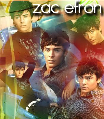
zac efron., blend. |
Resource Center Links
This Month's Contests | Hosts Looking for Hostees | Hostees looking for Hosts | BigBookofResources
Submission Guidelines

 Jul 22 2007, 10:45 PM Jul 22 2007, 10:45 PM
Post
#1
|
|
|
Senior Member  Group: Member Posts: 125 Joined: Aug 2006 Member No: 455,453 |
  |
|
|
|


 |
Replies
(1 - 12)
|
Jul 22 2007, 10:54 PM
Post
#2
|
|
 Oh Wow ... Group: Official Designer Posts: 688 Joined: Sep 2006 Member No: 468,522 |
Not a fan of the guy but the blend looks really nice. All the images go and I love all the different colors. Nice blend.
|
|
|
|

| *SinfullySweet* |
Jul 22 2007, 11:00 PM
Post
#3
|
|
Guest |
I think they look really nifty
 Great job Great job 
|
|
|
|
|
Jul 22 2007, 11:02 PM
Post
#4
|
|
 This bitch better work! Group: Staff Alumni Posts: 13,681 Joined: Jul 2004 Member No: 28,095 |
LOVE THE FIRST ONE.
great colors and blending. 
|
|
|
|


|
Jul 23 2007, 07:22 AM
Post
#5
|
|
 Senior Member Group: Official Member Posts: 7,149 Joined: Aug 2005 Member No: 213,509 |
Uhm....I like the pictures you used. If I would choose which I like best, second maybeish...
|
|
|
|

| *IVIike* |
Jul 23 2007, 02:37 PM
Post
#6
|
|
Guest |
i think it could be blended a little better, but i really like it for the most part
|
|
|
|
| *alovesopure* |
Jul 23 2007, 04:30 PM
Post
#7
|
|
Guest |
WOW, you have improved a lot!
The first looks great, I love the colors.
|
|
|
|
|
Jul 23 2007, 10:29 PM
Post
#8
|
|
 ;) Group: Staff Alumni Posts: 9,573 Joined: Feb 2005 Member No: 99,124 |
The first one is my favorite, but I wish it were larger in width than it is right now.
|
|
|
|

|
Jul 24 2007, 02:03 AM
Post
#9
|
|
 ^ I might look scary but i'm the nicest person in cb! Group: Member Posts: 1,364 Joined: Feb 2004 Member No: 4,979 |
i like the 2nd one more. overall i love the blend.
|
|
|
|

|
Jul 24 2007, 04:24 AM
Post
#10
|
|
 Love at first sight Group: Member Posts: 72 Joined: Jan 2006 Member No: 365,246 |
It's good, don't get me wrong, but there's something I can't really put my finger on that kinda bothers me. I think it might be that there are a few awkward bits of the blending that show through into the other parts of the blend which, in turn, throw off the balance? Maybe? I also think it would have improved the entire look of the piece if you'd used pictures that were all from the same shoot, as opposed to using two different types of stock. Like the Shia one in your signature. On the whole though, very good.
|
|
|
|
|
Jul 24 2007, 12:18 PM
Post
#11
|
|
 Senior Member Group: Member Posts: 1,011 Joined: Jun 2007 Member No: 533,410 |
Not bad. really good with the first one
the colors are the best (he looks weird with black hair..eeek) |
|
|
|

|
Jul 25 2007, 05:10 PM
Post
#12
|
|
 d@niel Group: Member Posts: 1,267 Joined: Jan 2005 Member No: 91,453 |
the second looks better cause of his hair being black and the blend is darker...the first one with green/red/etc. doesnt looks as good
|
|
|
|

|
Jul 26 2007, 12:58 AM
Post
#13
|
|
 sang loves hayden. Group: Staff Alumni Posts: 3,373 Joined: Feb 2004 Member No: 5,687 |
I like the 2nd one better. The 1st one kind of reminds me of rainbow snowcones. (x
|
|
|
|

 |
1 User(s) are reading this topic (1 Guests and 0 Anonymous Users)
0 Members: