Billie Joe Armstrong Banner, =] |
Resource Center Links
This Month's Contests | Hosts Looking for Hostees | Hostees looking for Hosts | BigBookofResources
Submission Guidelines

 Feb 4 2007, 07:25 PM Feb 4 2007, 07:25 PM
Post
#1
|
|
|
hardxcore.  Group: Member Posts: 1,223 Joined: Nov 2006 Member No: 479,494 |
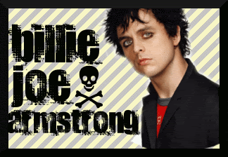
I'm not really sure what you could call it, but I made it on GIMP 2.2 when I was terribly bored. What do you guys think?
|
|
|
|


 |
Replies
(1 - 4)
|
Feb 4 2007, 07:53 PM
Post
#2
|
|
 Senior Member Group: Official Member Posts: 7,149 Joined: Aug 2005 Member No: 213,509 |
Picute is bad quialty and text is a bit weird, but I do like the background
|
|
|
|

|
Feb 4 2007, 08:36 PM
Post
#3
|
|
|
hardxcore. Group: Member Posts: 1,223 Joined: Nov 2006 Member No: 479,494 |
QUOTE(Jeng @ Feb 4 2007, 7:53 PM)  Picute is bad quialty and text is a bit weird, but I do like the background I knew I should've picked another one. And yes, I agree. I should've chosen a different text also. I think I'll re-do it.  [e.]Is this one any better? 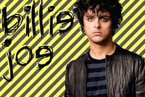
|
|
|
|
|
Feb 4 2007, 11:30 PM
Post
#4
|
|
 Sing to Me Group: Member Posts: 1,825 Joined: Apr 2004 Member No: 10,808 |
it's slightly better than the first. i think the font is cute. the background seems out of place though. the image is still bad quality and i can see white spots that you missed from cropping.
|
|
|
|

|
Feb 8 2007, 04:53 PM
Post
#5
|
|
|
I'm Cattt. :] Group: Validating Posts: 1,722 Joined: Apr 2005 Member No: 130,831 |
I don't like the background. I don't like the yellow or the diagonals.
Maybe a simple white background and a thick black border with the same font except center the text, please, will help. And the cropping. |
|
|
|
 |
1 User(s) are reading this topic (1 Guests and 0 Anonymous Users)
0 Members: