Red Matrix background div |
Resource Center Links
This Month's Contests | Hosts Looking for Hostees | Hostees looking for Hosts | BigBookofResources
Submission Guidelines

 Jan 19 2007, 08:00 PM Jan 19 2007, 08:00 PM
Post
#1
|
|
|
Newbie  Group: Member Posts: 4 Joined: Jan 2007 Member No: 496,589 |
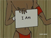
This is my very first div layout. I kept it simple because I just wanted to get the basics down. I haven't put it on my main profile because I can't get it from looking distorted in firefox. It looks fine in IE but in firefox it looks a little bunched together. Does anyone know what I would need to do in order to get the layout to look ok in firefox?
the background I got from reddragondesigns. I'm all for constructive criticism. Here's the link: http://www.myspace.com/teeshadiv Thanks! |
|
|
|


 |
Replies
(1 - 8)
|
Jan 23 2007, 11:59 AM
Post
#2
|
|
 Two can keep a secret if one of them is dead. Group: Staff Alumni Posts: 2,682 Joined: Jun 2005 Member No: 156,187 |
um... u might want to work on this layout more
|
|
|
|


| *StanleyThePanda* |
Jan 24 2007, 11:58 AM
Post
#3
|
|
Guest |
Uh, It okay. The actual DIV looks like a generated layout, but the background is pretty good.
|
|
|
|
|
Jan 25 2007, 11:45 AM
Post
#4
|
|
|
Newbie Group: Member Posts: 4 Joined: Jan 2007 Member No: 496,589 |
It's not a generated div. I did the coding myself. I'm still learning so I kept it really simple. I don't know all the advanced CSS yet. I'm still doing tutorials and trying to get it down. I didn't use a generator. I didn't even know they exist lol. So you're saying you can create a div by using a generator. I didn't know that.
I said in the original post that this is my very first layout. I just recently learned how to do a basic div. I don't plan on keeping this one. It was practice to get the basics down. Once the basics become second nature to me then I'll probably build upon this one. |
|
|
|
| *mzkandi* |
Jan 25 2007, 10:46 PM
Post
#5
|
|
Guest |
For this being your first layout it's a pretty good attempt. It seems like you got the coding done, now you just need a little more in the design area.
So for some constructive criticism I'm going to start with the font. You're layout sends out a futuristic vibe but the use of script font for your "About Me" doesn't go with it. You need more of a sci-fi font to go along with the layout. I reccomend checking out the sci-fi font collection on dafont.com. Next, I don't really care for the scrolling marquee at the top of your page. I think a really nice banner would have really made your layout more eye catching, right now that really adds nothing to your layout. The white background used for the buttons "Add, Message, and Block" should probably be red to blend in with the layout. And a sci-fi font for those buttons would have been really nice as well. I hope all of this was helpful.  Since this is your first time, with more practice and experimentation I sure you will get better and better. |
|
|
|
| *StanleyThePanda* |
Jan 25 2007, 11:42 PM
Post
#6
|
|
Guest |
QUOTE(nakcol27 @ Jan 25 2007, 11:45 AM)  It's not a generated div. I did the coding myself. I'm still learning so I kept it really simple. I don't know all the advanced CSS yet. I'm still doing tutorials and trying to get it down. I didn't use a generator. I didn't even know they exist lol. So you're saying you can create a div by using a generator. I didn't know that. I didn't accuse you of using one, I just said it looked like one.  But it is pretty good for a first. 
|
|
|
|
|
Jan 31 2007, 08:18 AM
Post
#7
|
|
|
Newbie Group: Member Posts: 4 Joined: Jan 2007 Member No: 496,589 |
QUOTE(mzkandi @ Jan 25 2007, 9:46 PM) For this being your first layout it's a pretty good attempt. It seems like you got the coding done, now you just need a little more in the design area. So for some constructive criticism I'm going to start with the font. You're layout sends out a futuristic vibe but the use of script font for your "About Me" doesn't go with it. You need more of a sci-fi font to go along with the layout. I reccomend checking out the sci-fi font collection on dafont.com. Next, I don't really care for the scrolling marquee at the top of your page. I think a really nice banner would have really made your layout more eye catching, right now that really adds nothing to your layout. The white background used for the buttons "Add, Message, and Block" should probably be red to blend in with the layout. And a sci-fi font for those buttons would have been really nice as well. I hope all of this was helpful. Since this is your first time, with more practice and experimentation I sure you will get better and better. Thanks for all your suggestions! I'm going to take what you suggested here and work on applying it to the layout. I appreciate the Font link!!!! Thanks again for the critique:) |
|
|
|
|
Feb 1 2007, 11:59 AM
Post
#8
|
|
 Newbie Group: Member Posts: 8 Joined: Oct 2006 Member No: 468,928 |
ummm its alright but you could have done alittle bit more to it to make it interesting.
|
|
|
|
|
Feb 5 2007, 05:00 AM
Post
#9
|
|
|
Senior Member Group: Member Posts: 156 Joined: Jan 2007 Member No: 495,508 |
I think you could really improve the design aspect of the profile by using some brushes on the div overlay pic. And on just a personal basis, i like to make my layouts simple and to the point. So i like to have the whole thing veiwable without scrolling. This catches the veiwers eye. They see the whole design. It puts things into prespective.
For tips on making a div pic with brushes. - obviously get your self some brushes for photoshop. - Start off with a basic shape that you want you layout to be. - Make the text and picture areas in your div. uses brushes around the edges of your shape and give it that extra edge on the plain shapes. - You can also put brushes in the corners of you page. Heres one i made today, which follows what i have said. But also concider that this is my style and you will probably form your own. 
|
|
|
|
 |
1 User(s) are reading this topic (1 Guests and 0 Anonymous Users)
0 Members: