Fantasy, ft. Mariah Carey |
Resource Center Links
This Month's Contests | Hosts Looking for Hostees | Hostees looking for Hosts | BigBookofResources
Submission Guidelines

 Jan 7 2007, 06:59 PM Jan 7 2007, 06:59 PM
Post
#1
|
|
 Senior Member  Group: Member Posts: 125 Joined: Aug 2006 Member No: 455,453  |
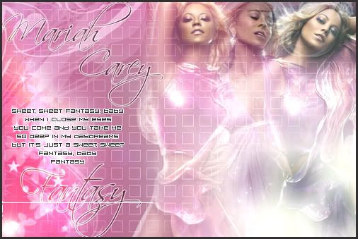
how do u feel about it?
|
|
|
|




 |
Replies
(1 - 8)
| *x1227x* |
Jan 7 2007, 07:08 PM
Post
#2
|
|
Guest |
I really like it! Thie colors & the photo just matches great together. So does the fonts! I dont really like the square patterns, though.
|
|
|
|
|
Jan 7 2007, 07:24 PM
Post
#3
|
|
 Photoshop Mii Life(;* Group: Member Posts: 236 Joined: Dec 2006 Member No: 489,110 |
That is such a pretty combination of brushes, fonts, and blending!! you have skills!!

|
|
|
|
|
Jan 7 2007, 07:29 PM
Post
#4
|
|
 Senior Member Group: Official Member Posts: 7,149 Joined: Aug 2005 Member No: 213,509 |
It's a bit on the bright side. Maybe lower the opacity of the square pattern/texture. In my opinion, don't make her fade away that much.
But other than that, nice. |
|
|
|

|
Jan 7 2007, 07:31 PM
Post
#5
|
|
|
RJL<3 Group: Member Posts: 1,194 Joined: Dec 2004 Member No: 71,019 |
the colors are pretty! i agree with x1227x about the squares though.
|
|
|
|

|
Jan 7 2007, 11:46 PM
Post
#6
|
|
|
Senior Member Group: Member Posts: 34 Joined: Jan 2007 Member No: 492,866 |
Great blend.
Please, please dont use that font ever again. Sorry, but it is a tacky font...and those square patterns, and the lyrics. Its very distracting and makes the whole thing look very tacky. The blend and colours are great though! |
|
|
|
|
Jan 7 2007, 11:53 PM
Post
#7
|
|
 Pocketful of Sunshine Group: Staff Alumni Posts: 8,690 Joined: Nov 2005 Member No: 289,004 |
^ It is sooo not a tacky font. It's my favorite newb font, yo.
Okay, anyways. It looks cute, but I'm not diggin' the squares. And lower the opacity a bit. Good job. |
|
|
|


| *mzkandi* |
Jan 8 2007, 10:32 AM
Post
#8
|
|
Guest |
Can't say I'm really impressed with this piece. Needs a more orginal typeface and the typeface you used for "Sweet, sweet fantasty" doesn't flow well with the Script typeface. The square pattern, in my opinion, doesn't really bring anyting to the piece. I really like the glow of your colors . Just keep working at it!
|
|
|
|
|
Jan 15 2007, 03:46 AM
Post
#9
|
|
 chinky Group: Official Designer Posts: 2,566 Joined: Jul 2006 Member No: 434,437 |
 ! I love it! ! I love it!
|
|
|
|

 |
1 User(s) are reading this topic (1 Guests and 0 Anonymous Users)
0 Members: