Bera server at Maplestory |
Resource Center Links
This Month's Contests | Hosts Looking for Hostees | Hostees looking for Hosts | BigBookofResources
Submission Guidelines

 Oct 14 2006, 01:18 PM Oct 14 2006, 01:18 PM
Post
#1
|
|
|
i'm susan  Group: Official Member Posts: 13,875 Joined: Feb 2004 Member No: 5,029 |
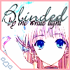
Mmm... I was bored, so I made "Maple Story" layout... those characters that you'll see are like me, my boyfriend, and my friends :]
theres this one girl with sunflower weapon, shes from kms :] Um... I don't need criticsm really. Just rating ^_^;; Thats all =] And the song that is playing is: "The Rising Fighting Spirit" by Naruto" and the brushes... i don't remember where i got it from o_o;; sorry =x and the words about my profile are hard to read cause i made it like that :] MY XANGA I'll probably make more maplestory layouts <_<;; |
|
|
|


 |
Replies
(1 - 6)
|
Oct 15 2006, 12:16 PM
Post
#2
|
|
 Senior Member Group: Staff Alumni Posts: 7,025 Joined: Feb 2004 Member No: 4,051 |
3/10
You really need to smooth our your text. It's a bit busy but boring at the same time. |
|
|
|

|
Oct 15 2006, 10:54 PM
Post
#3
|
|
 ;) Group: Staff Alumni Posts: 9,573 Joined: Feb 2005 Member No: 99,124 |
I'll give it a 5/10, I just don't like how the blog space overlaps the left side module.
|
|
|
|


|
Oct 19 2006, 09:04 PM
Post
#4
|
|
|
Justified true belief. Group: Member Posts: 72 Joined: Jul 2004 Member No: 33,687 |
4/10. Quick thoughts. Make it look a little more organized, the MS characters look cute haha ^.^;;
|
|
|
|

|
Oct 21 2006, 09:24 AM
Post
#5
|
|
 Smile because your worth it. =D Group: Member Posts: 61 Joined: Jan 2006 Member No: 351,587 |
Uhm...6/10 It's a bit plain but plain can be good and I luffles plain layouts! The text is kinda a bit...uhmm I can't really find the word, it's not pixely but kind of rough on the edges but if it's how it was intended to be then it's perfectly fine with me!. And the text on the side kind of looks a bit squished but if that's how you wanted it to be then it's perfectly fine with me as well. >< The maple story characters on the bottom are really cute! And the good thing is that the colorfulness~ XD of the characters doesn't unbalance the black and white of the layout.
|
|
|
|
|
Oct 23 2006, 12:46 AM
Post
#6
|
|
|
i'm susan Group: Official Member Posts: 13,875 Joined: Feb 2004 Member No: 5,029 |
QUOTE(angel-roh @ Oct 14 2006, 11:18 AM)  Mmm... I was bored, so I made "Maple Story" layout... those characters that you'll see are like me, my boyfriend, and my friends :] theres this one girl with sunflower weapon, shes from kms :] Um... I don't need criticsm really. Just rating ^_^;; Thats all =] And the song that is playing is: "The Rising Fighting Spirit" by Naruto" and the brushes... i don't remember where i got it from o_o;; sorry =x and the words about my profile are hard to read cause i made it like that :] MY XANGA I'll probably make more maplestory layouts <_<;; and the words about my profile are hard to read cause i made it like that :] did you guys not read that -_-;;; |
|
|
|
|
Oct 26 2006, 11:11 PM
Post
#7
|
|
 sang loves hayden. Group: Staff Alumni Posts: 3,373 Joined: Feb 2004 Member No: 5,687 |
^But if you make it like that, than no one wouldn't read it or like the layout?
I give it about 4/10. I think it's a bad choice to choose that font as the title, too edgy look. Need to soften it or sharpen it. Too simple and it looks quite plain. Just characters of maplestory. *Off topic I really never thought someone would make MS layout, lolz. I hate MS, so boring. (x |
|
|
|

 |
1 User(s) are reading this topic (1 Guests and 0 Anonymous Users)
0 Members: