FFAC |
Resource Center Links
This Month's Contests | Hosts Looking for Hostees | Hostees looking for Hosts | BigBookofResources
Submission Guidelines

 Sep 28 2006, 11:04 PM Sep 28 2006, 11:04 PM
Post
#1
|
|
|
-Lost in the void-  Group: Member Posts: 103 Joined: Aug 2006 Member No: 452,563 |
-Layout is currently undering construction- Layout: Here Best View: IE Status: Almost complete. Background areas still need work. [Edit:]I got the background made just have to fix the glitch I'm getting with firefox on the background positoin. Theme: Kadaj/Sephiroth & Cloud from Final Fantasy VII: Advent Children [Edit:] I decided to go and mimic the adventchildren website and added in all the other characters. Don't like it?: O well  Preview: Here  [Edit:] Feedback would be cool :) This post has been edited by ximonolithix: Oct 3 2006, 09:54 PM |
|
|
|


 |
Replies
(1 - 22)
| *afflict.x* |
Sep 29 2006, 07:16 PM
Post
#2
|
|
Guest |
oh shiet. that's an awesome myspace.. where did you find those kind of graphics.? I've been looking for a place that has good quality images of FF7: AC.
|
|
|
|
|
Sep 29 2006, 07:24 PM
Post
#3
|
|
|
-Lost in the void- Group: Member Posts: 103 Joined: Aug 2006 Member No: 452,563 |
the images on the outsides are just cuts from screen caps of the movie... the background i made and the top image of sephiroth and cloud i made >_> so pretty much u can make it with photoshop and the original film xD
|
|
|
|
| *afflict.x* |
Sep 29 2006, 11:27 PM
Post
#4
|
|
Guest |
oh just screenshots from the movie (on your computer i am guessing.) i dont bother cause i am very lazy. but great job.. i would suggest a few stuff but i forgot it as i was posting around.
|
|
|
|
| *Infinite.* |
Sep 30 2006, 12:26 AM
Post
#5
|
|
Guest |
Well, I think its quite simple and it was done nicely. I don't see any really big faults. Everything matches which is nice, although on the right div it has a vertical scroll bar perhaps make the comment box height a little bit shorter so then it won't have that, I think it would look better.
Looks good though, nicely done once again 
|
|
|
|
|
Sep 30 2006, 11:40 AM
Post
#6
|
|
 Funny ol` world innit? Group: Member Posts: 133 Joined: May 2005 Member No: 144,657 |
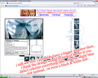
It's really cute! But on higher resolutions it's mis-aligned. Just letting you know. n_n
|
|
|
|
|
Oct 1 2006, 01:41 AM
Post
#7
|
|
|
-Lost in the void- Group: Member Posts: 103 Joined: Aug 2006 Member No: 452,563 |
QUOTE(x_nova @ Sep 30 2006, 12:40 PM)  It's really cute! But on higher resolutions it's mis-aligned. Just letting you know. n_n i just tried it on 800x600, 1024x768 (my standard) and 4~5 others and it looked fine to me :-" |
|
|
|
|
Oct 1 2006, 01:52 AM
Post
#8
|
|
|
-Lost in the void- Group: Member Posts: 103 Joined: Aug 2006 Member No: 452,563 |
Double post yeah I know.
Anyways mod could you delete this post along with my other :-" Taking a break from here myspace. ~> For good. Ciao Kids 
|
|
|
|
|
Oct 1 2006, 01:30 PM
Post
#9
|
|
 Home is where your rump rests! Group: Staff Alumni Posts: 4,235 Joined: Aug 2006 Member No: 451,969 |
It's really cute! The navigation is nifty and everything is aligned. No critique here.

|
|
|
|

|
Oct 1 2006, 02:43 PM
Post
#10
|
|
|
Senior Member Group: Staff Alumni Posts: 1,188 Joined: Jan 2006 Member No: 364,198 |
This is the most excellent design I've ever viewed.
 |
|
|
|


| *[2]Nekked* |
Oct 1 2006, 07:19 PM
Post
#11
|
|
Guest |
OH JEEZ. WHY THE BLUE? OH IM SORRY, IS THAT A POINTLESS QUESTION? OH WELL, I'LL ASK IT IF I WANT. GET OVER IT
mods, in case you were wondering, yes this is spam, and yes this is a retaliation to the mind numbing observation of a point already made in my thread. |
|
|
|
|
Oct 2 2006, 12:24 AM
Post
#12
|
|
|
Funny ol` world innit? Group: Member Posts: 133 Joined: May 2005 Member No: 144,657 |
QUOTE(ximonolithix @ Sep 30 2006, 11:41 PM) i just tried it on 800x600, 1024x768 (my standard) and 4~5 others and it looked fine to me :-" 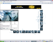 I'm just imagining things then. 
|
|
|
|
|
Oct 2 2006, 06:34 PM
Post
#13
|
|
|
-Lost in the void- Group: Member Posts: 103 Joined: Aug 2006 Member No: 452,563 |
QUOTE Nekked' date='Oct 1 2006, 8:19 PM' post='2303560'] OH JEEZ. WHY THE BLUE? OH IM SORRY, IS THAT A POINTLESS QUESTION? OH WELL, I'LL ASK IT IF I WANT. GET OVER IT mods, in case you were wondering, yes this is spam, and yes this is a retaliation to the mind numbing observation of a point already made in my thread. awww how cute i luv the spam makes me warm inside |
|
|
|
|
Oct 2 2006, 06:58 PM
Post
#14
|
|
|
-Lost in the void- Group: Member Posts: 103 Joined: Aug 2006 Member No: 452,563 |
QUOTE(x_nova @ Oct 2 2006, 1:24 AM) I'm just imagining things then. well this is what i see on both firefox and ie on 5 different resolutions  800x600   1024x768   1152x864   1080x960   1280x1024  
|
|
|
|
|
Oct 3 2006, 12:59 AM
Post
#15
|
|
|
Funny ol` world innit? Group: Member Posts: 133 Joined: May 2005 Member No: 144,657 |
 1280x1024 |
|
|
|
|
Oct 3 2006, 09:18 AM
Post
#16
|
|
|
-Lost in the void- Group: Member Posts: 103 Joined: Aug 2006 Member No: 452,563 |
QUOTE(x_nova @ Oct 3 2006, 1:59 AM) 1280x1024 Monitor size really wouldn't matter... what browser are you using? I only use firefox and IE. If your using opera or some off brand it could be why. Playing with IE and Firefox padding etc is enough for me I don't deal with anything else. CODE CSS for that part:
.holder { background-color: transparent; border: 0px solid; border-color: black; overflow:auto; position:absolute; z-index:2; left:50%; top:0%; height: 700px; margin-left: -245px; margin-top:150px; text-align:center; visibility:visible !important; } |
|
|
|
|
Oct 3 2006, 11:54 AM
Post
#17
|
|
|
Funny ol` world innit? Group: Member Posts: 133 Joined: May 2005 Member No: 144,657 |
IE7.
ehh, I don't really care anymore.. |
|
|
|
|
Oct 3 2006, 01:40 PM
Post
#18
|
|
|
-Lost in the void- Group: Member Posts: 103 Joined: Aug 2006 Member No: 452,563 |
QUOTE(x_nova @ Oct 3 2006, 12:54 PM) IE7. ehh, I don't really care anymore.. same, your the only one to complain about misaligned so far so it's probably just you |
|
|
|
|
Oct 4 2006, 09:58 PM
Post
#19
|
|
 sang loves hayden. Group: Staff Alumni Posts: 3,373 Joined: Feb 2004 Member No: 5,687 |
Wow, I see it without problems. It looks NICE. I like the way you blend the images, looks well done.
I also noticed you added more tables, looks good still. |
|
|
|

|
Oct 5 2006, 08:29 AM
Post
#20
|
|
|
-Lost in the void- Group: Member Posts: 103 Joined: Aug 2006 Member No: 452,563 |
rawr i got sloppy making it so i'm redoing all the coding

|
|
|
|
|
Oct 12 2006, 02:40 PM
Post
#21
|
|
|
-Lost in the void- Group: Member Posts: 103 Joined: Aug 2006 Member No: 452,563 |
Can't decide on how to set up the tables any suggestions?
|
|
|
|
|
Oct 19 2006, 05:41 AM
Post
#22
|
|
 I be Deea. Group: Member Posts: 102 Joined: Oct 2006 Member No: 471,373 |
Looks really nice.
Though Explorer and Firefox will never agree on layouts. :( I've noticed that ages ago, Explorer has some stupid filters and such, and it makes things move around the page. It's idiotic. |
|
|
|
|
Oct 19 2006, 03:55 PM
Post
#23
|
|
|
-Lost in the void- Group: Member Posts: 103 Joined: Aug 2006 Member No: 452,563 |
Redoing it once again T_T will put up v2 in awhile
|
|
|
|
 |
1 User(s) are reading this topic (1 Guests and 0 Anonymous Users)
0 Members: