Hermionie, humm .. |
Resource Center Links
This Month's Contests | Hosts Looking for Hostees | Hostees looking for Hosts | BigBookofResources
Submission Guidelines

 Aug 2 2006, 07:22 PM Aug 2 2006, 07:22 PM
Post
#1
|
|
|
I<3ps7  Group: Member Posts: 300 Joined: Jul 2006 Member No: 432,240 |
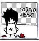
I was very bored so i made this i know it isn't great but it's k ryy ?
 Tell Me what yhu think `bout it . |
|
|
|


 |
Replies
(1 - 14)
|
Aug 2 2006, 07:28 PM
Post
#2
|
|
 Senior Member Group: Official Member Posts: 7,149 Joined: Aug 2005 Member No: 213,509 |
its ok, im not a fan of the white space in the middle,i think you shuold of just blended both togeether,but its okay..
|
|
|
|

|
Aug 2 2006, 07:28 PM
Post
#3
|
|
 Pocketful of Sunshine Group: Staff Alumni Posts: 8,690 Joined: Nov 2005 Member No: 289,004 |
Did you basically put a picture over a picture and just add all the white over it and some brushes and text?
 It seems like that's basically what you did. The brushes look okay, but the white kinda ruins it. I think it would look better if you just took it off. It seems like that's basically what you did. The brushes look okay, but the white kinda ruins it. I think it would look better if you just took it off.
|
|
|
|


|
Aug 2 2006, 07:30 PM
Post
#4
|
|
 Senior Member Group: Member Posts: 253 Joined: Jul 2006 Member No: 444,287 |
It looks like there is a blue spot on her head [picture on the right]. The white annoys me. Agreed with everyone else you should have just blended it together. I like the brushes though.
|
|
|
|
|
Aug 2 2006, 07:30 PM
Post
#5
|
|
 Krista. Group: Official Member Posts: 4,380 Joined: Apr 2006 Member No: 391,319 |
The pictures need to look more blended. I don't like the white space down the middle. The brushes are ok, though.
|
|
|
|

|
Aug 2 2006, 07:33 PM
Post
#6
|
|
 I intend to live forever-so far, so good. Group: Member Posts: 2,820 Joined: Mar 2005 Member No: 115,137 |
Agreed with Tic Tac
Overlap the pictures more, then erase away =) it will look much better |
|
|
|

|
Aug 2 2006, 08:06 PM
Post
#7
|
|
 When the sun sleeps. Group: Member Posts: 532 Joined: Nov 2005 Member No: 289,628 |
Sorry i just dont like the big white space
|
|
|
|
| *Uronacid* |
Aug 2 2006, 08:24 PM
Post
#8
|
|
Guest |
yeah, same thing as everyone else... the white looks to un-professional... It looks like you just lowered the hardness on your eraser tool, and ran it down the middle of the page...
|
|
|
|
|
Aug 2 2006, 08:26 PM
Post
#9
|
|
 fizzy and fun Group: Member Posts: 405 Joined: Aug 2004 Member No: 41,469 |
basically what everyone said.
i like your font though. and the brushes are cute. what'd you use? |
|
|
|
| *This Confession* |
Aug 2 2006, 10:12 PM
Post
#10
|
|
Guest |
yea i think it looks fine honestly, the white space isn't all the great. But its nice. Theres a blue spot on her head though, and it makes it look a little odd since the picture on the right has a vivid colors unlike the other one.
|
|
|
|
|
Aug 2 2006, 10:23 PM
Post
#11
|
|
|
I<3ps7 Group: Member Posts: 300 Joined: Jul 2006 Member No: 432,240 |
Thx for the reply & ill redo it and see if yhu guys like my next one .
& RCcola if yhu want the brushes just pm me . |
|
|
|
| *StanleyThePanda* |
Aug 3 2006, 12:15 AM
Post
#12
|
|
Guest |
I agree with everyone, also the picture on the right is so much more vibrant than the left one, maybe try making the left one more vibrant?
|
|
|
|
|
Aug 3 2006, 03:56 AM
Post
#13
|
|
 the name is ada. Group: Official Member Posts: 4,688 Joined: Dec 2005 Member No: 334,608 |
Its too bright to me.Maybe you should of overlapped the pictures and then had the white spot somewhere else..like the right side.
|
|
|
|
|
Aug 3 2006, 07:27 PM
Post
#14
|
|
|
mood: content Group: Member Posts: 2,063 Joined: Aug 2004 Member No: 42,325 |
Agree with everyone about white gap, blending, etc. But the lil circle brush is cute with the images you picked. (And your signature is really nice.)
|
|
|
|
|
Aug 4 2006, 06:35 PM
Post
#15
|
|
|
I<3ps7 Group: Member Posts: 300 Joined: Jul 2006 Member No: 432,240 |
The New And Improved Banner .
 Like It? |
|
|
|
 |
1 User(s) are reading this topic (1 Guests and 0 Anonymous Users)
0 Members: