Two new, works. |
Resource Center Links
This Month's Contests | Hosts Looking for Hostees | Hostees looking for Hosts | BigBookofResources
Submission Guidelines

 Jul 31 2006, 09:42 PM Jul 31 2006, 09:42 PM
Post
#1
|
|
 When the sun sleeps.  Group: Member Posts: 532 Joined: Nov 2005 Member No: 289,628 |
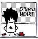
Two photo manipulations.
No brushes used so k thanx.  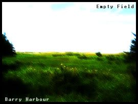
|
|
|
|


 |
Replies
(1 - 17)
|
Jul 31 2006, 09:55 PM
Post
#2
|
|
 the name is ada. Group: Official Member Posts: 4,688 Joined: Dec 2005 Member No: 334,608 |
Ouu I like the first one alot..how theres a shiney yellow effect.
|
|
|
|
|
Jul 31 2006, 09:57 PM
Post
#3
|
|
|
When the sun sleeps. Group: Member Posts: 532 Joined: Nov 2005 Member No: 289,628 |
Ahh thanx =]
|
|
|
|
|
Jul 31 2006, 11:27 PM
Post
#4
|
|
 & my dreams fall down Group: Member Posts: 1,173 Joined: Nov 2005 Member No: 291,336 |
don't really like it...

|
|
|
|

|
Aug 1 2006, 01:55 AM
Post
#5
|
|
 Hello My Name Is INSERT HERE Group: Member Posts: 1,372 Joined: Apr 2006 Member No: 394,903 |
meh they're alright :|
|
|
|
|
|
Aug 1 2006, 06:40 AM
Post
#6
|
|
 Senior Member Group: Official Member Posts: 7,149 Joined: Aug 2005 Member No: 213,509 |
i dont like the texture on the first one.but i think it goes with the theme,if there is one -.-,the second one, its nice, but a bit blurry.
|
|
|
|

|
Aug 1 2006, 11:43 AM
Post
#7
|
|
|
When the sun sleeps. Group: Member Posts: 532 Joined: Nov 2005 Member No: 289,628 |
I was going for the blurryness on the second one and on the first one, i couldnt find a good cracked texture.
|
|
|
|
|
Aug 1 2006, 12:08 PM
Post
#8
|
|
 Bada-bing, bada-boom. Group: Member Posts: 452 Joined: Jan 2005 Member No: 86,111 |
I like the second one, colorful but sad. The first one I don't really like, your message doesn't quite come across and the texture doesn't work. But nice try. (:
|
|
|
|
| *Uronacid* |
Aug 1 2006, 12:11 PM
Post
#9
|
|
Guest |
I love the second one... It has the feel of a painting
|
|
|
|
|
Aug 1 2006, 12:13 PM
Post
#10
|
|
|
When the sun sleeps. Group: Member Posts: 532 Joined: Nov 2005 Member No: 289,628 |
Thanx
The first one is Hmm beautiful but ugly? Is expressing that her personality isnt so great but you can tell she is pretty from the outside. |
|
|
|
| *Uronacid* |
Aug 1 2006, 06:19 PM
Post
#11
|
|
Guest |
yeah, i guess you just need to work on the crax
|
|
|
|
| *This Confession* |
Aug 1 2006, 10:45 PM
Post
#12
|
|
Guest |
I like the second one a lot more than the first. If you didn't have that other photo on top of you/girl I think it would look fine. It just makes it look bad to me.
The font doesn't match either I suppose. Something else would have looked better anyway. Second one is very nice though, just really small. |
|
|
|
| *Kathleen* |
Aug 2 2006, 12:48 AM
Post
#13
|
|
Guest |
I really like the second one. I think I know the filter you used.

|
|
|
|
|
Aug 2 2006, 11:32 AM
Post
#14
|
|
|
When the sun sleeps. Group: Member Posts: 532 Joined: Nov 2005 Member No: 289,628 |
^ I didnt use any filters.
|
|
|
|
|
Aug 2 2006, 06:34 PM
Post
#15
|
|
 I intend to live forever-so far, so good. Group: Member Posts: 2,820 Joined: Mar 2005 Member No: 115,137 |
The second has that 'filter' look^ but whatever
The first one.. didn't really work out IMO The font on both of them don't really match You really tried to achieve the look that you were going for, but I wouldn't have done it in that way. The halftones on low opacity don't match. You should have picked a picture of her where she is acting pretty. I also wish the colors weren't so faded looking. And yeah, as said, you need a better texture. Google probably has lots |
|
|
|

|
Aug 2 2006, 07:31 PM
Post
#16
|
|
 Senior Member Group: Member Posts: 253 Joined: Jul 2006 Member No: 444,287 |
The second one is pretty but the cracks on the first one scare me.
|
|
|
|
|
Aug 3 2006, 01:48 AM
Post
#17
|
|
|
t-t-t-toyaaa Group: Official Member Posts: 19,821 Joined: Apr 2004 Member No: 11,270 |
The first one is alright, I just think its overdone.
The second one is really nice. |
|
|
|


|
Aug 4 2006, 10:42 AM
Post
#18
|
|
 Senior Member Group: Staff Alumni Posts: 7,025 Joined: Feb 2004 Member No: 4,051 |
the first one doesn't look realistic, but I know what you are going for. Try to match up the texture and the image. If the image is crisp and clear, the cracked texture should be too but if the image is blurry, the crack should be a bit blurry as well. Next time do the cracked texture first, then add the blurry effects.
I like the second one, but I wish it was bigger. |
|
|
|

 |
1 User(s) are reading this topic (1 Guests and 0 Anonymous Users)
0 Members: