Shoes Div |
Resource Center Links
This Month's Contests | Hosts Looking for Hostees | Hostees looking for Hosts | BigBookofResources
Submission Guidelines

 Jul 30 2006, 10:51 PM Jul 30 2006, 10:51 PM
Post
#1
|
|
 J0@nna<3  Group: Member Posts: 203 Joined: Feb 2006 Member No: 378,818 |
|
|
|
|


 |
Replies
(1 - 11)
| *This Confession* |
Jul 30 2006, 10:57 PM
Post
#2
|
|
Guest |
really simple.
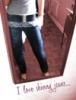
Its nice, although the background stripes killed it. It made me get a headache really quick. now i'm dizzy well i'm going to go get tylenol now. PS- I don't think the effect you put on the friend picture really matches also. |
|
|
|
|
Jul 30 2006, 10:59 PM
Post
#3
|
|
|
J0@nna<3 Group: Member Posts: 203 Joined: Feb 2006 Member No: 378,818 |
QUOTE(This Confession @ Jul 31 2006, 11:57 AM)  really simple. Its nice, although the background stripes killed it. It made me get a headache really quick. now i'm dizzy well i'm going to go get tylenol now. awww.  Im sorry |
|
|
|
|
Jul 30 2006, 10:59 PM
Post
#4
|
|
 skaters gonna skate. Group: Official Member Posts: 6,861 Joined: Mar 2004 Member No: 6,336 |
Yeah, maybe different color stripes.
|
|
|
|


|
Jul 30 2006, 11:01 PM
Post
#5
|
|
|
J0@nna<3 Group: Member Posts: 203 Joined: Feb 2006 Member No: 378,818 |
QUOTE(ANGEEZY. @ Jul 31 2006, 11:59 AM) Yeah, maybe different color stripes. what colors do you suggest? |
|
|
|
|
Jul 31 2006, 02:14 AM
Post
#6
|
|
 rorhinna Group: Member Posts: 331 Joined: Jul 2006 Member No: 432,214 |
um...it's alright, but I'm gunna have to agree
with This Confession. I think the stripes are too busy and the friend's pic affect doesn't match however, I like the layout and style of it. maybe you could change the background altogether?? and then a different effect for the pics. but um, if you like the stripes, lighter colors or maybe a transparency, would make them less bothersome to the eyes... |
|
|
|

|
Jul 31 2006, 08:46 AM
Post
#7
|
|
 Connor Group: Member Posts: 189 Joined: Jun 2005 Member No: 147,913 |
its pretty simple..
it sorta looks like the navigation buttons, that image looks like it was squished together. oh andlike this confession said the effect that you put on the friend images doesnt really blend in to well. but ive seen alot worse so dont let us make you feel bad |
|
|
|


|
Jul 31 2006, 11:00 AM
Post
#8
|
|
|
J0@nna<3 Group: Member Posts: 203 Joined: Feb 2006 Member No: 378,818 |
thanks for all the feedback.
I'll try doing better next time. But right now, i think im guna stick to it. Cos im too lazy to fix them all up. 
|
|
|
|
|
Aug 1 2006, 09:12 PM
Post
#9
|
|
 Two can keep a secret if one of them is dead. Group: Staff Alumni Posts: 2,682 Joined: Jun 2005 Member No: 156,187 |
simple.. has no info... but i like the links on the side... creative
|
|
|
|

| *Kathleen* |
Aug 2 2006, 02:41 AM
Post
#10
|
|
Guest |
Way to be supportive of a pretty decent MySpace, Holly. I didn't know making people feel horrible about their design skills was part of the MySpace Staff job description.
 Okay, now to comment on your layout. I really like it (maybe it's because I'm a stripes person myself). I think the comment box is a bit too little, though. The brushes are cute. I think the picture might stand out too much. Okay, now to comment on your layout. I really like it (maybe it's because I'm a stripes person myself). I think the comment box is a bit too little, though. The brushes are cute. I think the picture might stand out too much.  I also don't like the poster filter you used. But I definitely see potential. I also don't like the poster filter you used. But I definitely see potential.
|
|
|
|
|
Aug 2 2006, 03:52 AM
Post
#11
|
|
|
J0@nna<3 Group: Member Posts: 203 Joined: Feb 2006 Member No: 378,818 |
QUOTE(blaqheartedstar @ Aug 2 2006, 10:12 AM) simple.. has no info... but i like the links on the side... creative Thanks.  QUOTE(Kathleen @ Aug 2 2006, 3:41 PM) Way to be supportive of a pretty decent MySpace, Holly. I didn't know making people feel horrible about their design skills was part of the MySpace Staff job description. Okay, now to comment on your layout. I really like it (maybe it's because I'm a stripes person myself). I think the comment box is a bit too little, though. The brushes are cute. I think the picture might stand out too much. I also don't like the poster filter you used. But I definitely see potential.yea your right. the comment box is too small. But i just felt like fitting it in there. And yea. I'll do better on the upcoming layouts. specially on the photo filters. and thanks. stripes are awesome. :) |
|
|
|
|
Aug 3 2006, 07:08 PM
Post
#12
|
|
 sang loves hayden. Group: Staff Alumni Posts: 3,373 Joined: Feb 2004 Member No: 5,687 |
The layout looks alright. The only thing I don't like about it, is the friend's image. It looks kind of weird ( Which I think you're ment to do that ), I think it's the fact it's black&white and it doesn't match with the layout.
|
|
|
|

 |
1 User(s) are reading this topic (1 Guests and 0 Anonymous Users)
0 Members: