lions tigers bears Oh My RIDE, Tokyo Drift |
Resource Center Links
This Month's Contests | Hosts Looking for Hostees | Hostees looking for Hosts | BigBookofResources
Submission Guidelines

| *digital.fragrance* |
 Jul 27 2006, 03:54 PM Jul 27 2006, 03:54 PM
Post
#1
|
|
Guest |
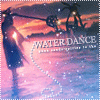
Oh yes.
Import and Hot Rod goodness  Click here Still to do... 1. place the music equalizer graphic above the playlist (100% complete) 2. fix the comment box colors (100% complete) 3. figure out the best font color combos (100% complete) 4. personalize everything (100% complete) Edits so far - background image has been altered from the original rainbowed skyline. blue/pink details added. |
|
|
|

 |
Replies
(1 - 42)
|
Jul 27 2006, 04:36 PM
Post
#2
|
|
|
Senior Member  Group: Member Posts: 71 Joined: May 2006 Member No: 406,332 |
It's okay I guess. I don't like how the city is all rainbowish. And the boxes are kinda bland and it looks like you just put them there just for the hell of it. 7.5/10
|
|
|
|


| *digital.fragrance* |
Jul 27 2006, 05:07 PM
Post
#3
|
|
Guest |
^ oh, don't worry - I'm not done yet :)
|
|
|
|
|
Jul 27 2006, 06:24 PM
Post
#4
|
|
 Senior Member Group: Posts: 8,274 Joined: Mar 2004 Member No: 8,001 |
;O pretty
|
|
|
|
|
Jul 27 2006, 07:54 PM
Post
#5
|
|
 Senior Member Group: Member Posts: 253 Joined: Jul 2006 Member No: 444,287 |
Ahh. That song is sweet hahah ;]
I really like this. nicee. 
|
|
|
|
|
Jul 27 2006, 09:19 PM
Post
#6
|
|
 rorhinna Group: Member Posts: 331 Joined: Jul 2006 Member No: 432,214 |
Wow
I think its awesome |
|
|
|


| *digital.fragrance* |
Jul 27 2006, 09:35 PM
Post
#7
|
|
Guest |
Thanks guys - I added texture backgrounds to two of the boxes.
|
|
|
|
| *This Confession* |
Jul 27 2006, 09:38 PM
Post
#8
|
|
Guest |
took to long to load. lol, i'm on broadband internet.
But its neat, although the building colors are like really bright compared to all the other stuff and sort of clash in my opinion to the other color grey and black. Maybe it just sticks out a lot to me. the building at the bottom are that weird font, i don't think it looks right.. Maybe if your were to take the buildings like the top ones and just like outline them and make them all black it would look better? looks really neat though good job |
|
|
|
|
Jul 27 2006, 09:42 PM
Post
#9
|
|
 Funny ol` world innit? Group: Member Posts: 133 Joined: May 2005 Member No: 144,657 |
That song is awesome. <3
Maybe you should take off the pattern bg were there is text.. it makes it hard to read.. @__@ Have you tried using the eyedropper tool on photoshop? Click over the rainbow colors so you can get the exact color and change up the bolded css or the scroll bar. :] |
|
|
|
|
Jul 27 2006, 10:02 PM
Post
#10
|
|
|
Senior Member Group: Staff Alumni Posts: 1,188 Joined: Jan 2006 Member No: 364,198 |
I like it very much,but the background table texture makes the font hard to read. It's an awesome layout altogether though.
 |
|
|
|


| *digital.fragrance* |
Jul 27 2006, 10:32 PM
Post
#11
|
|
Guest |
QUOTE(x_nova @ Jul 27 2006, 10:42 PM)  That song is awesome. <3 Maybe you should take off the pattern bg were there is text.. it makes it hard to read.. @__@ Have you tried using the eyedropper tool on photoshop? Click over the rainbow colors so you can get the exact color and change up the bolded css or the scroll bar. :] The texture is off - I agree I use Paint Shop Pro - and I do use a tool ike that, I just haven't had time yet X) Thanks guys! |
|
|
|
| *StanleyThePanda* |
Jul 27 2006, 10:33 PM
Post
#12
|
|
Guest |
Deffinately change the buildings, so they arent rainbow-y.
But other than that I like it.
|
|
|
|
| *digital.fragrance* |
Jul 28 2006, 08:41 AM
Post
#13
|
|
Guest |
Okie dokie - xenro and Kara... I've done something different. However, myspace is stupid again, and won't let me login. So I'll have to put it up later... but you can see what the background image is going to be - click
|
|
|
|
| *StanleyThePanda* |
Jul 28 2006, 02:30 PM
Post
#14
|
|
Guest |
^ Oh yes, I like that a lot better.
|
|
|
|
| *digital.fragrance* |
Jul 28 2006, 08:24 PM
Post
#15
|
|
Guest |
^ I thank ye greatly Kara
Okay, so Myspace is fine now... crap - I hope I don't jinx it. SO ANYWAY, I updated the background image, and finally got the correct color scheme. I think I'm finished... then again, someone will probably point something out. Oh well 
|
|
|
|
|
Jul 29 2006, 12:55 AM
Post
#16
|
|
 sang loves hayden. Group: Staff Alumni Posts: 3,373 Joined: Feb 2004 Member No: 5,687 |
It looks good. I like the color scheme. I was going to make F2F Tokyo Drift layout as well, but didn't. I like the way you put everything. I have that song on my iPod, Tokyo Drift from Teriyaki Boys. (x
|
|
|
|

| *digital.fragrance* |
Jul 30 2006, 01:03 PM
Post
#17
|
|
Guest |
^ Tokyo Drift was the best! I loved the part where the 67 Mustang races the Skyline - I'm a Mustang fan, and it made my day

|
|
|
|
|
Jul 30 2006, 02:22 PM
Post
#18
|
|
|
Funny ol` world innit? Group: Member Posts: 133 Joined: May 2005 Member No: 144,657 |
Haha, I just saw this movie last night.
It was AWESOME. O____O;; -drool- now I wanna make a layout.. haha. |
|
|
|
| *digital.fragrance* |
Jul 31 2006, 04:26 PM
Post
#19
|
|
Guest |
^ I saw it with a bunch of guy friends and my boyfriend. Oh man, that was interesting. I mean, I'm in to cars and all, but... one guy literally sat on the edge of his seat for half the movie - chin in his hands... I wonder if he was drooling. Then again, that could have been because of the cars and the "hot asian chicks." ... haha... I'm glad my boyfriend was next to me...
|
|
|
|
|
Aug 1 2006, 06:20 PM
Post
#20
|
|
 Two can keep a secret if one of them is dead. Group: Staff Alumni Posts: 2,682 Joined: Jun 2005 Member No: 156,187 |
um.. from what i can see now, i love it!!!!! ur always uber creative, love the music too, um.. the marquee on ur other layouts is a bit odd... not aligned, um.. and theres a huge white box off to the right...
other than that i love the graphics!!!! |
|
|
|

|
Aug 1 2006, 08:04 PM
Post
#21
|
|
 Bada-bing, bada-boom. Group: Member Posts: 452 Joined: Jan 2005 Member No: 86,111 |
I like muuuuucho, great colors and placement and coding. :]
|
|
|
|
| *digital.fragrance* |
Aug 1 2006, 08:45 PM
Post
#22
|
|
Guest |
QUOTE(blaqheartedstar @ Aug 1 2006, 7:20 PM) um.. from what i can see now, i love it!!!!! ur always uber creative, love the music too, um.. the marquee on ur other layouts is a bit odd... not aligned, um.. and theres a huge white box off to the right... other than that i love the graphics!!!! What browser and resolution do you use? That way I can correct it
|
|
|
|
| *Kathleen* |
Aug 2 2006, 02:31 AM
Post
#23
|
|
Guest |
THIS LAYOUT PWNS HARDCORE.
 I'm so voting for you with MySpace of the Month! I'm so voting for you with MySpace of the Month!
|
|
|
|
|
Aug 2 2006, 04:46 AM
Post
#24
|
|
|
Senior Member Group: Member Posts: 359 Joined: Feb 2005 Member No: 101,275 |
Alright before I sum this layout up, be sure not to be offended by anything that I say, I respect you as a designer as you respect me, its just a summary of what I think could be better.
Bleh, the whole city scene just looks cheezy, maybe a original stock image from sxc.hu of tokyo would of done better. The black swirls in the back come out of knowere and are just some random thing they is popping out of the layout. The pink blue and dark blue was a good idea, but it would of been better if it looked like it was back tracking from the car, not coming out of the exhaust all over the city wall. The font is really simple, and sorta of "noobish" I know theres a point when simple font is good, this wasnt it. The music equalizer graphic doesnt really go with the layout at all? Ive seen some light grey ones that might work better. The orbs in the modules are somewhat random, maybe some bars of some sort would have looked better. To top things off theres a horizontal scrollbar and a giant gap missing in firefox, most likely do to the marquee with the layouts. Lets just say this isnt one of your better layouts, you can, and have designed much better than this. sorry if it seemed harsh >_<. |
|
|
|
| *digital.fragrance* |
Aug 2 2006, 11:40 AM
Post
#25
|
|
Guest |
^ wow that was pretty harsh.
Okay, I'll break down my thought process - it is supposed to be random - the black grunge brushes at the top create a night sky and represent heat coming from the city... meaning racing is "hot" and the overall pervading theme is "heat" ... i.e. smoke from the tires, black-top heat... which leads to the pink/blue swirls - that's tire smoke - and it follows the lines on the Nissan 350Z. The black swirls in the background do represent tire tracks - there are ones behind the Ford Mustang and Nissan 350Z. The whole point of the orbs is to pull the color design together and to reaffirm the subtle tech outlet of the design, which is first introduced with the gray/silver lines in the banner, and the "3D" borders on the boxes. The Fast and Furious website is EXTREMELY techy, but I didn't want to recreate that. The skyline? Well, the stock photo is good, but I didn't like the angles, so I found my own. I doctored a stock photo of the tokyo skyline to "imitate" the F&F one. Above all, I wanted to create my own designs and minimize use of the "official" stuff. The simple font - yep, it's simple. Straight-up Arial. And I actually haven't done that before. Reason being, it's been a real trend in belnds and collages lately, so I decided to try it out. I think it looks great in the "tokyo drift" part, and the lyrical excerpt, but I think you're right when it comes to the "lions, tigers..." line. I'm gonna change that .The volume equalizer... I agree... I think I'm gonna change the the color combo. That's really one of the only things from the Official site - I print scrned the frames and crop and all sorts of stuff to pull that out. Oh yeah.. what res do you use? My FF looks fine. Thanks for the critique 
|
|
|
|
|
Aug 2 2006, 12:35 PM
Post
#26
|
|
|
Member Group: Member Posts: 16 Joined: May 2006 Member No: 406,874 |
agreed upon with chaos bliss. i don't really see what all this praising comes from, but relatively speaking, this is just like any other div layout. not to say it's bad, or anything, but really, a couple of brushes and a few shapes added makes these zombies drool over this easily-done design (not to burst your bubble, or anything). sorry, but this is my opinion.
|
|
|
|
| *digital.fragrance* |
Aug 2 2006, 12:48 PM
Post
#27
|
|
Guest |
^ I worked hard on this. This isn't just random brushes - I put hours into this one.
You could be nicer. I mean constructive criticism is one thing, but I put thought and effort and time into it. |
|
|
|
|
Aug 2 2006, 03:10 PM
Post
#28
|
|
|
Newbie Group: Member Posts: 6 Joined: Jul 2006 Member No: 435,075 |
I like it i think everything looks great on it!
|
|
|
|
|
Aug 2 2006, 03:51 PM
Post
#29
|
|
 .beautiful . dreamer . Group: Member Posts: 87 Joined: Dec 2005 Member No: 333,086 |
It looks very nice Rachael! I love the colors... O.O And the title is weird. xD But in a good way I guess. ^_^
|
|
|
|

|
Aug 2 2006, 06:15 PM
Post
#30
|
|
|
Two can keep a secret if one of them is dead. Group: Staff Alumni Posts: 2,682 Joined: Jun 2005 Member No: 156,187 |
QUOTE(digital.fragrance @ Aug 1 2006, 9:45 PM) What browser and resolution do you use? That way I can correct it sorry i took a while i'm using netscape which is like firefox |
|
|
|
| *digital.fragrance* |
Aug 2 2006, 08:48 PM
Post
#31
|
|
Guest |
^ aha.. that would be why I can't fix it. Darn it.
|
|
|
|
|
Aug 2 2006, 09:34 PM
Post
#32
|
|
|
Two can keep a secret if one of them is dead. Group: Staff Alumni Posts: 2,682 Joined: Jun 2005 Member No: 156,187 |
um... it looks fine now white box if gone.. just ur marquee alignment is off...
|
|
|
|
|
Aug 3 2006, 08:55 AM
Post
#33
|
|
 Yeah, 'tis me. Group: Member Posts: 88 Joined: Jul 2006 Member No: 434,337 |
QUOTE(digital.fragrance @ Jul 27 2006, 10:54 PM) Oh yes. Import and Hot Rod goodness Click here Still to do... 1. place the music equalizer graphic above the playlist (100% complete) 2. fix the comment box colors (100% complete) 3. figure out the best font color combos (100% complete) 4. personalize everything (100% complete) Edits so far - background image has been altered from the original rainbowed skyline. blue/pink details added. Wow! I really love it, so sleek. The colors work perfectly, you've accentuated the cars well by manipulating the eyes to draw attention from the greay skyline of tokyo to the cars on each side. Although the navigation is a bit plain, and the comment box is too big for it's boxy thing (browser: safari), the font is nice and I LOVE the music. Original theme,and I love the Jack Sparrow icon. :] Veryyyy nice. |
|
|
|
| *digital.fragrance* |
Aug 3 2006, 09:05 AM
Post
#34
|
|
Guest |
^Thanks! it works on Safari?! That's sweet! I had no idea
I'll try to figure out how to standardize the comment box |
|
|
|
|
Aug 3 2006, 09:16 AM
Post
#35
|
|
|
Yeah, 'tis me. Group: Member Posts: 88 Joined: Jul 2006 Member No: 434,337 |
Haha usually most divs are messed up on Safari...but not yours, thankfully.
Nevertheless, div-tester-for-safari, here I am. ^^ Nice to meet you..;D I'll be posting an introduction soon on the welcome board, maybe we can get to know eachother..? Your layouts are magnificent. ^^ Well, uh, here's my introduction. ^^ It'd be great to get to know you a bit more, you seem like a interesting person. |
|
|
|
|
Aug 3 2006, 11:00 AM
Post
#36
|
|
 Senior Member Group: Member Posts: 136 Joined: Jan 2006 Member No: 366,312 |
QUOTE(happinessx @ Aug 3 2006, 10:16 AM) Haha usually most divs are messed up on Safari...but not yours, thankfully. Nevertheless, div-tester-for-safari, here I am. ^^ Nice to meet you..;D I'll be posting an introduction soon on the welcome board, maybe we can get to know eachother..? Your layouts are magnificent. ^^ Well, uh, here's my introduction. ^^ It'd be great to get to know you a bit more, you seem like a interesting person. I've been operation on Mac Systems for a little more than 5 years. Divs tend to work on Safari. And as for this layout, you did a nice job Digital Fragrance. It's a real nice layout. -Luis |
|
|
|
|
Aug 3 2006, 12:48 PM
Post
#37
|
|
|
Yeah, 'tis me. Group: Member Posts: 88 Joined: Jul 2006 Member No: 434,337 |
Really, Luis? My computer's pretty old so maybe that's it...divs always seem to be misaligned for me...maybe it's my resolution?
I usually see a couple of comments at the bottom or things like that, as well... :] Hah well nice to meet you. |
|
|
|
| *digital.fragrance* |
Aug 4 2006, 09:53 PM
Post
#38
|
|
Guest |
^ perhaps - it's best viewed in 1024 x 768 and up. It's nice to meet you too! You're posting a lot for a "newbie"
- that's great!QUOTE(the Pro mac @ Aug 3 2006, 12:00 PM) I've been operation on Mac Systems for a little more than 5 years. Divs tend to work on Safari. And as for this layout, you did a nice job Digital Fragrance. It's a real nice layout. -Luis Thanks very much! I appreciate it
|
|
|
|
|
Aug 5 2006, 04:41 AM
Post
#39
|
|
 Taste Sweet Love ^-^ Group: Member Posts: 459 Joined: Nov 2004 Member No: 66,316 |
Niiiice. I like it (: I like the swirly thingies lol. But I just don't like the colors. I think it would look better if it were black, gray, and white. But that's just me. It's MY opinion hah. Well good job!
|
|
|
|

|
Aug 5 2006, 12:15 PM
Post
#40
|
|
 Senior Member Group: Member Posts: 31 Joined: Jul 2006 Member No: 439,924 |
it looks really goood
the only thing i don't really like is the different colored text but it still looks great
|
|
|
|
|
Aug 5 2006, 02:23 PM
Post
#41
|
|
|
Two can keep a secret if one of them is dead. Group: Staff Alumni Posts: 2,682 Joined: Jun 2005 Member No: 156,187 |
love the icon and sig... try making a 24 layout
|
|
|
|
| *digital.fragrance* |
Aug 5 2006, 04:07 PM
Post
#42
|
|
Guest |
^ That's my next project
|
|
|
|
|
Aug 5 2006, 06:03 PM
Post
#43
|
|
|
Two can keep a secret if one of them is dead. Group: Staff Alumni Posts: 2,682 Joined: Jun 2005 Member No: 156,187 |
BAD ASS awesome and u make awesome layouts soooooooo i'm dying to see what it will look like
um.. here ... i don't know... i guess this will make a pretty bad ass icon |
|
|
|
 |
2 User(s) are reading this topic (2 Guests and 0 Anonymous Users)
0 Members: