RiHANNA, --click |
Resource Center Links
This Month's Contests | Hosts Looking for Hostees | Hostees looking for Hosts | BigBookofResources
Submission Guidelines

 Jun 22 2006, 08:37 PM Jun 22 2006, 08:37 PM
Post
#1
|
|
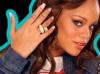 rihanna is sexy chocolate<3.  Group: Member Posts: 165 Joined: Aug 2005 Member No: 191,782  |
 tell me whatca think :] |
|
|
|




 |
Replies
(1 - 12)
|
Jun 22 2006, 09:00 PM
Post
#2
|
|
 & my dreams fall down Group: Member Posts: 1,173 Joined: Nov 2005 Member No: 291,336 |
hmmm...
edit: what?! |
|
|
|

|
Jun 22 2006, 09:00 PM
Post
#3
|
|
|
rihanna is sexy chocolate<3. Group: Member Posts: 165 Joined: Aug 2005 Member No: 191,782 |
"double post :]"
|
|
|
|
|
Jun 22 2006, 09:01 PM
Post
#4
|
|
 Krista. Group: Official Member Posts: 4,380 Joined: Apr 2006 Member No: 391,319 |
i think it looks great, but it seems too busy for me. i don't really like the bursts behind her.
|
|
|
|

|
Jun 22 2006, 09:14 PM
Post
#5
|
|
 the name is ada. Group: Official Member Posts: 4,688 Joined: Dec 2005 Member No: 334,608 |
Its okay I guess. The brushes are too random for me.I can still see white spots near her hair!
|
|
|
|
|
Jun 22 2006, 11:01 PM
Post
#6
|
|
 I intend to live forever-so far, so good. Group: Member Posts: 2,820 Joined: Mar 2005 Member No: 115,137 |
I'm sry in advance for the critism. but this needs some work..
I know you had good intentions but the random brushes arent working for me. The cut out of the image is smooth except, as Ada^ said, you can still see white from the original pic. Maybe if you had a white bg instead of a black background.. it would look neater. The brushes are random as marzipan said. The colors are nausiating. We are not 5, the green and purple ninja turtle colors just clash, majorly. And how does that match the image? The brushes dont even match eachouther. Hearts then spikes, then stars then music notes then x's ?! I suggest changing the background to white. Download some decent brushes that match eachother then start again. The brushes should never be the main part of your piece. Make a blend or something, then add brushes to enhance the blend and make it look special. |
|
|
|

|
Jun 22 2006, 11:08 PM
Post
#7
|
|
|
t-t-t-toyaaa Group: Official Member Posts: 19,821 Joined: Apr 2004 Member No: 11,270 |
^ I completely agree.
Your brushes are way to random, her image is bad quality. I find that none of the text really fits either. |
|
|
|


|
Jun 23 2006, 06:50 AM
Post
#8
|
|
 Senior Member Group: Official Member Posts: 7,149 Joined: Aug 2005 Member No: 213,509 |
i completely double agree with toya and maryland, the brushes are like whoa and the colors are like ehhh
|
|
|
|

|
Jun 23 2006, 11:37 AM
Post
#9
|
|
 Mais je ne l'aime pas Group: Member Posts: 971 Joined: Mar 2005 Member No: 108,135 |
The brushes..change them.
Bursts, change those too. And her elbow on the left is faded, making it look like it just manifested out of nowhere. |
|
|
|

|
Jun 23 2006, 11:48 AM
Post
#10
|
|
 :D Group: Member Posts: 530 Joined: Dec 2005 Member No: 337,031 |
QUOTE(mizz_americaz @ Jun 22 2006, 10:01 PM)  I'm sry in advance for the critism. but this needs some work.. I know you had good intentions but the random brushes arent working for me. The cut out of the image is smooth except, as Ada^ said, you can still see white from the original pic. Maybe if you had a white bg instead of a black background.. it would look neater. The brushes are random as marzipan said. The colors are nausiating. We are not 5, the green and purple ninja turtle colors just clash, majorly. And how does that match the image? The brushes dont even match eachouther. Hearts then spikes, then stars then music notes then x's ?! I suggest changing the background to white. Download some decent brushes that match eachother then start again. The brushes should never be the main part of your piece. Make a blend or something, then add brushes to enhance the blend and make it look special. I totally agree with Maryland. This peice should be about your work. Not somebody's brushes that you found on someones site. The white around the hair and in other places makes the image looked rushed and it downgrades the whole image. You should use a white background and colors that don't clash so much. And carefully plan out your brushes. I know the effect you were going for, but that effect makes the image look like a beginer's work. Also, more than one image would make this image look better, too. |
|
|
|

|
Jun 23 2006, 01:14 PM
Post
#11
|
|
 Senior Member Group: Member Posts: 793 Joined: Jun 2006 Member No: 425,250 |
aliased much?
Wow, no offense but that needs a lot of... Just start over. You just went completely wrong from the very beginning. The extraction of Rihanna is a mess, what did you use? And all the brushes are very tacky, and pixly/choppy. |
|
|
|

|
Jun 25 2006, 11:01 AM
Post
#12
|
|
 Professional Nerd Group: Official Designer Posts: 343 Joined: Apr 2006 Member No: 396,362 |
shes missing an arm!
|
|
|
|

|
Jun 25 2006, 12:57 PM
Post
#13
|
|
 Mannequin. Group: Member Posts: 213 Joined: Jun 2006 Member No: 423,178 |
Yeah. Shes completely missing her arm! Some of those brushes are random. Half of them are SUPER choppy. Looks like you resized them. But other than that I completely agree with Maryland on this.
|
|
|
|

 |
2 User(s) are reading this topic (2 Guests and 0 Anonymous Users)
0 Members: