Vertikl Productions 2006, New And Hopefully, The Final Name Switch For Our Company |
Resource Center Links
This Month's Contests | Hosts Looking for Hostees | Hostees looking for Hosts | BigBookofResources
Submission Guidelines

 Jun 20 2006, 03:11 PM Jun 20 2006, 03:11 PM
Post
#1
|
|
 Watch This  Group: Member Posts: 886 Joined: Mar 2005 Member No: 118,408 |
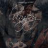
Hey, Im Working on an rpg and obviously it takes more than one thing to make the game together so me and the rest of the group. Made a studio/ Company. We have gone through three names. I think this is the last name switch. My reason for posting this is becuase I want some opinions on it.
 Iknow the thumb nail looks all messed up but that is because the background is transparent. Enjoy! |
|
|
|


 |
Replies
(1 - 10)
|
Jun 20 2006, 03:13 PM
Post
#2
|
|
 show me a garden thats bursting to life Group: Staff Alumni Posts: 12,303 Joined: Mar 2005 Member No: 115,987 |
Looks fairly typical....Maybe make it more unique?
|
|
|
|


|
Jun 20 2006, 03:18 PM
Post
#3
|
|
|
Watch This Group: Member Posts: 886 Joined: Mar 2005 Member No: 118,408 |
hmm.... well what should I add
im not great at thinking about unique Im always askin for help lol |
|
|
|
|
Jun 20 2006, 04:50 PM
Post
#4
|
|
 the name is ada. Group: Official Member Posts: 4,688 Joined: Dec 2005 Member No: 334,608 |
That looks nice. I like the corner of arrows.
|
|
|
|

|
Jun 20 2006, 05:31 PM
Post
#5
|
|
 I intend to live forever-so far, so good. Group: Member Posts: 2,820 Joined: Mar 2005 Member No: 115,137 |
I agree with Kristina
idk.. look at your sig for inspiration use more colors, an exiting background, more shapes.... ermm |
|
|
|

|
Jun 20 2006, 05:35 PM
Post
#6
|
|
 Senior Member Group: Staff Alumni Posts: 7,025 Joined: Feb 2004 Member No: 4,051 |
I think it looks a tad bit on the tacky side, those brushes are overused. Use pictures, add color. Make it your own
|
|
|
|

|
Jun 20 2006, 05:38 PM
Post
#7
|
|
 We are the cure. Group: Staff Alumni Posts: 4,936 Joined: Jan 2004 Member No: 1,456 |
Lots of brushes don't make a good picture.
|
|
|
|

|
Jun 21 2006, 12:28 AM
Post
#8
|
|
|
Watch This Group: Member Posts: 886 Joined: Mar 2005 Member No: 118,408 |
True, True. Lol thanks I was thinking to myself too.
Time to get back to the drawing board(literally) |
|
|
|
|
Jun 21 2006, 12:42 AM
Post
#9
|
|
 ./ Group: Member Posts: 467 Joined: Oct 2004 Member No: 53,533 |
add some yellow...or something,make it a tri-color theme.
|
|
|
|

|
Jun 21 2006, 06:20 AM
Post
#10
|
|
 Senior Member Group: Official Member Posts: 7,149 Joined: Aug 2005 Member No: 213,509 |
i agree with maryland,but it looks okay, a bit on the simple side
|
|
|
|

|
Jun 21 2006, 12:29 PM
Post
#11
|
|
|
RJL<3 Group: Member Posts: 1,194 Joined: Dec 2004 Member No: 71,019 |
i agree with lumpy. and hmm.. i'm not really feeling the font.
|
|
|
|

 |
1 User(s) are reading this topic (1 Guests and 0 Anonymous Users)
0 Members: