*~2nd Layout~* |
Resource Center Links
This Month's Contests | Hosts Looking for Hostees | Hostees looking for Hosts | BigBookofResources
Submission Guidelines

 Apr 16 2006, 09:27 PM Apr 16 2006, 09:27 PM
Post
#1
|
|
|
Member  Group: Member Posts: 19 Joined: Apr 2006 Member No: 394,413 |
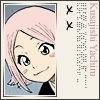
*~2nd Layout~*
This is Mayo*s Xanga A simple Layout wif loads of Chinese work* PHOTOS* Please click here to [My Diary]* |
|
|
|


 |
Replies
(1 - 5)
|
Apr 19 2006, 06:22 PM
Post
#2
|
|
 Death is a promise given to us at birth Group: Official Designer Posts: 4,757 Joined: Mar 2004 Member No: 7,459 |
the blend is nice, but it takes too long to load.
plus, i don't like how you got the double scrollbars. |
|
|
|


|
Apr 21 2006, 10:39 PM
Post
#3
|
|
 Peggy. Group: Member Posts: 2,508 Joined: Aug 2005 Member No: 214,025 |
I agree, the layout just takes too long to load, but I really like the blend too.
|
|
|
|


|
Apr 23 2006, 06:12 PM
Post
#4
|
|
|
Senior Member Group: Official Member Posts: 3,459 Joined: Dec 2005 Member No: 328,021 |
The blend is gorgeous, but other than the image, the layout is just.. blank. I'd suggest making a tiled background to add some color to the overall scheme.
|
|
|
|

|
Apr 26 2006, 07:16 PM
Post
#5
|
|
 Hello My Name Is INSERT HERE Group: Member Posts: 1,372 Joined: Apr 2006 Member No: 394,903 |
The blend is hawtx
but the rest of the layout is boring :[  I think the code looks like it needs fixing I think the code looks like it needs fixing
|
|
|
|
|
Apr 27 2006, 05:20 PM
Post
#6
|
|
 chire chire chire! Group: Member Posts: 170 Joined: Mar 2005 Member No: 118,614 |
Yeah, the whole border around the the text is kinda messy. There should be some kind of color or something behind the test. Too much white, but like they said, the blend is wonderful.
|
|
|
|
 |
1 User(s) are reading this topic (1 Guests and 0 Anonymous Users)
0 Members: