The Trashionista, collage anyone? |
Resource Center Links
This Month's Contests | Hosts Looking for Hostees | Hostees looking for Hosts | BigBookofResources
Submission Guidelines

 Feb 14 2006, 07:45 PM Feb 14 2006, 07:45 PM
Post
#1
|
|
 je hebt het niveau van een poffertje  Group: Member Posts: 512 Joined: May 2004 Member No: 15,934 |
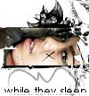
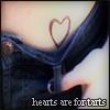
 *edit 021606  I changed some of the positioning on the pictures, added a grayscale, and went a little crazy. */edit okay, so I'm trying my hand at a collage, cuz i kinda suck. Anyway, this is the product of my labor for the last couple of hours. How does it look? I know its kinda choppy in some places, and the pictures dont have the smoothest edges. Please be honest, but dont say something like "you suck". kthnx. This post has been edited by Mooka009: Feb 16 2006, 06:20 PM |
|
|
|


 |
Replies
(1 - 24)
|
Feb 14 2006, 08:32 PM
Post
#2
|
|
 Senior Member Group: Staff Alumni Posts: 7,025 Joined: Feb 2004 Member No: 4,051 |
maybe change the position of some of the pictures (like rotate them, flip them) because they are all pointing the same way and it looks a bit plain compared to the brushes.
and maybe lower the saturation of the images, so they go with the color scheme a bit better. it's beautiful though. where did you get those brushes? |
|
|
|

|
Feb 14 2006, 09:19 PM
Post
#3
|
|
 My name is really Matt... if you care. Group: Member Posts: 1,442 Joined: Oct 2005 Member No: 258,234 |
thats an AMAZING blend... AMAZING!
woah theres so many pictures! u must have put a lot of work into it  GJ! |
|
|
|
|
Feb 14 2006, 09:26 PM
Post
#4
|
|
 Amberific. Group: Staff Alumni Posts: 12,913 Joined: Jul 2004 Member No: 29,772 |
Hm...I think it looks a little too blend-like for a collage. The images, which are gorgeous btw, are so closely cropped that the one in the blue hat and the one in the dark green hat look out of place. I really like what you have so far, it just doesn't look collaged.
|
|
|
|


|
Feb 14 2006, 09:36 PM
Post
#5
|
|
|
je hebt het niveau van een poffertje Group: Member Posts: 512 Joined: May 2004 Member No: 15,934 |
hmm, I suppose you're right about the collage thing. I was going for the collage-ey thing, but I guess it didnt end up that way =( oh well, better luck next time. I tried flipping the pictures around as you suggested, and don't know yet... it looked a little funky. I may try to do it again next time, and Im working on the saturation.
|
|
|
|
|
Feb 15 2006, 02:36 PM
Post
#6
|
|
 ;) Group: Staff Alumni Posts: 9,573 Joined: Feb 2005 Member No: 99,124 |
I'm going to have to agree with Carrie about it looking like a blend. You should try just putting things together, and seeing what you come up with. I like what you have for right now.
|
|
|
|


|
Feb 15 2006, 05:28 PM
Post
#7
|
|
|
je hebt het niveau van een poffertje Group: Member Posts: 512 Joined: May 2004 Member No: 15,934 |
I wanted to do something different than I've ever done. So this means... a no go? cuz, I wanted to code it and put it up, but it looks like its going to the recycle bin. =(
|
|
|
|
|
Feb 15 2006, 05:44 PM
Post
#8
|
|
 Senior Member Group: Member Posts: 3,055 Joined: Jul 2005 Member No: 174,796 |
Oh I think that looks awesome!!!!
I think you should make it into a layout 
|
|
|
|

|
Feb 15 2006, 05:53 PM
Post
#9
|
|
|
Amberific. Group: Staff Alumni Posts: 12,913 Joined: Jul 2004 Member No: 29,772 |
I think you should code it even though it wasn't exactly what you were looking for. It's still an excellent graphic and deserves to be used. Or you could save it for a rainy day.
|
|
|
|
|
Feb 15 2006, 05:57 PM
Post
#10
|
|
 Senior Member Group: Member Posts: 170 Joined: Jan 2006 Member No: 351,851 |
Wow i think that looks really good. just rotate some of the images in a different direction and it'll be perfect.
|
|
|
|
|
Feb 15 2006, 06:23 PM
Post
#11
|
|
 the name is ada. Group: Official Member Posts: 4,688 Joined: Dec 2005 Member No: 334,608 |
It looks alright.
The pictures you used are nice. I don`t like the transparent text. I think if it was a solid color in side the text.. it would look better. |
|
|
|
|
Feb 15 2006, 06:47 PM
Post
#12
|
|
|
je hebt het niveau van een poffertje Group: Member Posts: 512 Joined: May 2004 Member No: 15,934 |
the transparent text is only there so no one trys to use it. its not going to be on the actual layout.
|
|
|
|
|
Feb 15 2006, 08:22 PM
Post
#13
|
|
 Senior Member Group: Member Posts: 1,584 Joined: Dec 2004 Member No: 70,748 |
well..i think the cutting is a gj..cept..is that a real person? or r they plastic mannequins? b/c shes soo shiny its distracting
so i think...shes too shiny for the..grungy faded bg..O.o...she is VERY shiny..=\ |
|
|
|
|
Feb 16 2006, 01:58 AM
Post
#14
|
|
 Senior Member Group: Member Posts: 779 Joined: Jan 2005 Member No: 90,808 |
blue hat is choppy. but i LOVE the colors and the detail to the right. nice work.
|
|
|
|

|
Feb 16 2006, 02:57 PM
Post
#15
|
|
 Senior Member Group: Official Member Posts: 7,149 Joined: Aug 2005 Member No: 213,509 |
awesome images you used.i agree with jackie aka gypsy eyes,about changing the position of the images. i really like what you did.great brushes :]
|
|
|
|

|
Feb 16 2006, 06:21 PM
Post
#16
|
|
|
je hebt het niveau van een poffertje Group: Member Posts: 512 Joined: May 2004 Member No: 15,934 |
i changed some of the positioning and added a grayscale because of the shini-ness comment. yeah, lol, its a real person. not a mannequin.
|
|
|
|
|
Feb 16 2006, 06:22 PM
Post
#17
|
|
 ladybugs are hot <3 Group: Member Posts: 1,169 Joined: Jan 2005 Member No: 93,802 |
WOW its AMAZING! i loveee it
|
|
|
|
|
Feb 16 2006, 06:42 PM
Post
#18
|
|
 :D Group: Member Posts: 530 Joined: Dec 2005 Member No: 337,031 |
The second one is soooo good!
|
|
|
|

|
Feb 16 2006, 06:57 PM
Post
#19
|
|
 something more Group: Member Posts: 2,468 Joined: Mar 2004 Member No: 8,808 |
oooh. that's beautiful.

|
|
|
|
|
Feb 16 2006, 07:00 PM
Post
#20
|
|
 RAWR. Group: Member Posts: 2,585 Joined: Feb 2005 Member No: 102,641 |
you suck.
But seriously, like it. I think it could look a little more like a collage if you want to call it that. but I like them both. The second one has more attitude tho, and its a little more collage-y. So yeah good job. |
|
|
|

|
Feb 17 2006, 04:18 PM
Post
#21
|
|
|
Senior Member Group: Staff Alumni Posts: 7,025 Joined: Feb 2004 Member No: 4,051 |
the new one is perfect.
|
|
|
|
|
Feb 17 2006, 04:23 PM
Post
#22
|
|
|
RJL<3 Group: Member Posts: 1,194 Joined: Dec 2004 Member No: 71,019 |
i like it!! nice title. its way better than when i tried to collage the other day.
|
|
|
|

|
Feb 17 2006, 09:49 PM
Post
#23
|
|
|
je hebt het niveau van een poffertje Group: Member Posts: 512 Joined: May 2004 Member No: 15,934 |
thanks so much, I love the second one alot too. this is the reaction i was looking for =D
|
|
|
|
|
Feb 17 2006, 09:54 PM
Post
#24
|
|
 Senior Member Group: Member Posts: 545 Joined: Dec 2004 Member No: 70,103 |
that looks wonderful! the edges are a bit choppy here and there, but it's sort of covered up in the second one. i like that one better than the first one, i lovee the style you used!
|
|
|
|

|
Feb 18 2006, 12:36 PM
Post
#25
|
|
 XOTY*06 :D Group: Member Posts: 2,635 Joined: Mar 2004 Member No: 6,747 |
Both are really awesome, but the improved one is much better. The colors are great and the overall look. Nice title, btw. :D
|
|
|
|

 |
1 User(s) are reading this topic (1 Guests and 0 Anonymous Users)
0 Members: