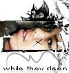
Blend, ft.Ashlee Simpson |
Resource Center Links
This Month's Contests | Hosts Looking for Hostees | Hostees looking for Hosts | BigBookofResources
Submission Guidelines

 Feb 12 2006, 09:53 AM Feb 12 2006, 09:53 AM
Post
#1
|
|
 Senior Member  Group: Member Posts: 3,055 Joined: Jul 2005 Member No: 174,796 |
I like this one
 The blending looks a bit weird b/c the pictures didn't have a lot of space for blending I like the pattern, and the font effect, but I have the same old swirlies on the corner b/c i couldn't find any better brushes, so suggestions for brsuhes would be nice. thumbed   c&c are welcome =] |
|
|
|


 |
Replies
(1 - 10)
|
Feb 12 2006, 11:08 AM
Post
#2
|
|
 the name is ada. Group: Official Member Posts: 4,688 Joined: Dec 2005 Member No: 334,608 |
She looks pretty! The bottom swirly stuff looks good
|
|
|
|
|
Feb 12 2006, 11:28 AM
Post
#3
|
|
|
Senior Member Group: Member Posts: 3,055 Joined: Jul 2005 Member No: 174,796 |
^Thanks =]
|
|
|
|
|
Feb 12 2006, 11:37 AM
Post
#4
|
|
 Senior Member Group: Member Posts: 170 Joined: Jan 2006 Member No: 351,851 |
i like the stroked text but idk about the brush u used in the corner.
|
|
|
|
|
Feb 12 2006, 11:59 AM
Post
#5
|
|
 lolz?! Group: Member Posts: 96 Joined: Feb 2006 Member No: 376,709 |
Awesome Job on the blend
but I just don't like the swirls. :P Good Job! 
|
|
|
|
|
Feb 12 2006, 12:14 PM
Post
#6
|
|
|
Senior Member Group: Member Posts: 3,055 Joined: Jul 2005 Member No: 174,796 |
^do you have any suggestions for brushes?
|
|
|
|
|
Feb 12 2006, 12:15 PM
Post
#7
|
|
|
lolz?! Group: Member Posts: 96 Joined: Feb 2006 Member No: 376,709 |
Mmm well I really like the scribbly heart.
Maybe more scribbles? |
|
|
|
|
Feb 12 2006, 12:29 PM
Post
#8
|
|
|
Senior Member Group: Member Posts: 3,055 Joined: Jul 2005 Member No: 174,796 |
^i mean for a brush in the corner
|
|
|
|
|
Feb 12 2006, 06:20 PM
Post
#9
|
|
 Senior Member Group: Official Member Posts: 7,149 Joined: Aug 2005 Member No: 213,509 |
:|.try not useing scribbly heart brushes for once. and no black in it.but other than that, i like the blend and pattern.and colors.goodjob
|
|
|
|

|
Feb 12 2006, 06:38 PM
Post
#10
|
|
 My name is really Matt... if you care. Group: Member Posts: 1,442 Joined: Oct 2005 Member No: 258,234 |
there's that same old font and the same old "too-thick" stroke around it....
*sigh* ur blends are good, but they all look exactly the same |
|
|
|
|
Feb 12 2006, 06:45 PM
Post
#11
|
|
|
RJL<3 Group: Member Posts: 1,194 Joined: Dec 2004 Member No: 71,019 |
good blending.. and i like the font. but swirlies.. i have a hate for them.
|
|
|
|

 |
1 User(s) are reading this topic (1 Guests and 0 Anonymous Users)
0 Members: