Freak, Feat. Mrs Zeta Jones |
Resource Center Links
This Month's Contests | Hosts Looking for Hostees | Hostees looking for Hosts | BigBookofResources
Submission Guidelines

 Jan 25 2006, 04:54 PM
Post
#1
|
|
 Senior Member  Group: Member Posts: 277 Joined: Jul 2005 Member No: 172,698  |
Clicky
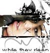
I don't like it....theres a line going down her face, and that is really annoying. The overall look isn't that great either. Be very, VERY harsh.... |
|
|
|




 |
Replies
(1 - 13)
|
Jan 25 2006, 04:56 PM
Post
#2
|
|
 Senior Member Group: Member Posts: 170 Joined: Jan 2006 Member No: 351,851 |
eh its ok.
|
|
|
|
|
Jan 25 2006, 07:03 PM
Post
#3
|
|
 My name is really Matt... if you care. Group: Member Posts: 1,442 Joined: Oct 2005 Member No: 258,234 |
woah thats weird... u cant even tell who it is...
but i am strangly in love with it 
|
|
|
|
|
Jan 25 2006, 07:19 PM
Post
#4
|
|
 who ma bitch? you ma bitch, bitch. Group: Member Posts: 1,920 Joined: Oct 2004 Member No: 55,278 |
^% ditto
i likeit. its really cool
|
|
|
|
|
Jan 25 2006, 07:58 PM
Post
#5
|
|
 the name is ada. Group: Official Member Posts: 4,688 Joined: Dec 2005 Member No: 334,608 |
Kinda scarey.but it`s good.
|
|
|
|
|
Jan 25 2006, 08:05 PM
Post
#6
|
|
 Senior Member Group: Member Posts: 3,055 Joined: Jul 2005 Member No: 174,796 |
Ohhhhh....strangly cool
 I love the gradient, but I'd tone it down on the texture. By the way the title goes w/ it well Good work 
|
|
|
|

|
Jan 25 2006, 08:38 PM
Post
#7
|
|
 ^ignore. read> Maria. Group: Member Posts: 710 Joined: Dec 2005 Member No: 323,799 |
im agreeing completely with steffie... except for the toning down part. i think it looks good just the way it is :P
and yeah. i agree with the title :P ...it reminds me of a song: "Freak In Me" by Boa......... guess why 
|
|
|
|
| *StanleyThePanda* |
Jan 25 2006, 09:31 PM
Post
#8
|
|
Guest |
Very interesting....
|
|
|
|
| *Zatanna* |
Jan 25 2006, 09:45 PM
Post
#9
|
|
Guest |
That could be part of a movie poster. =) I like it all! (Except for the color of the font).
|
|
|
|
|
Jan 25 2006, 10:58 PM
Post
#10
|
|
|
Senior Member Group: Member Posts: 277 Joined: Jul 2005 Member No: 172,698 |
Cool! I agree with the font colour, but it needed to stand out. And i tried to tone it down, but then it looked all weird. Thanks for the comments =)
|
|
|
|
|
Jan 25 2006, 11:54 PM
Post
#11
|
|
 Peggy. Group: Member Posts: 2,508 Joined: Aug 2005 Member No: 214,025 |
Eh, creepy. But nice work. =)
|
|
|
|


|
Jan 26 2006, 06:03 PM
Post
#12
|
|
 Senior Member Group: Member Posts: 1,584 Joined: Dec 2004 Member No: 70,748 |
oo its different ...i really like how u turned a really beautiful person into a "freak" its a really strong message..whatd u do to the picture?
|
|
|
|
|
Jan 26 2006, 07:46 PM
Post
#13
|
|
 Are You Kidding? Group: Member Posts: 1,714 Joined: Sep 2005 Member No: 237,747 |
ooo, red eyes. Looks weird, but cool.
|
|
|
|
|
Jan 27 2006, 02:51 PM
Post
#14
|
|
 Senior Member Group: Official Member Posts: 7,149 Joined: Aug 2005 Member No: 213,509 |
haha thats scary/yet weird/ yet cool
its not your best, but its good.you changed the whole look of it which is pretty awesome |
|
|
|

 |
1 User(s) are reading this topic (1 Guests and 0 Anonymous Users)
0 Members: