untitled layout, featuring marilyn monroe |
Resource Center Links
This Month's Contests | Hosts Looking for Hostees | Hostees looking for Hosts | BigBookofResources
Submission Guidelines

 Jan 3 2006, 11:04 PM Jan 3 2006, 11:04 PM
Post
#1
|
|
 Amberific.  Group: Staff Alumni Posts: 12,913 Joined: Jul 2004 Member No: 29,772  |
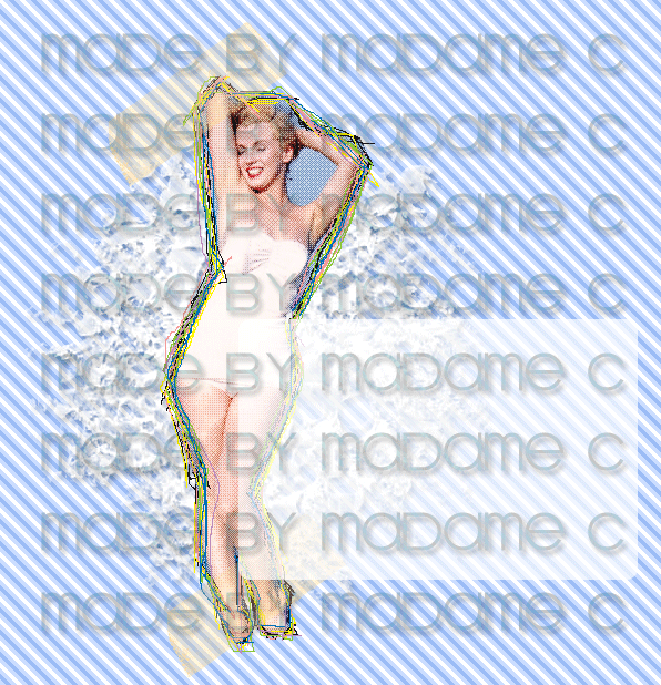 Either going to be for a website or xanga. I like it but I feel as though something is missing so any suggestions you guys might have would be greatly appreciated. Edit: Changed some stuff. 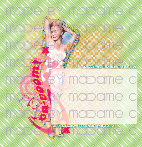
This post has been edited by Madame C: Jan 4 2006, 01:26 AM |
|
|
|


 |
Replies
(1 - 13)
|
Jan 3 2006, 11:15 PM
Post
#2
|
|
 You'll find me in your dreams. Group: Official Member Posts: 8,536 Joined: Mar 2005 Member No: 114,010 |
Meh. I think it's a little too grungy on the texture. That&the lines are kinda overpowering. &the title should be, like... Sex Symbol. XD Or something.
|
|
|
|


|
Jan 3 2006, 11:22 PM
Post
#3
|
|
 Senior Member Group: Member Posts: 3,055 Joined: Jul 2005 Member No: 174,796 |
Lovely so far
 I think the title should be..... "Natural Beauty" Then again Marilyn Monroe did wear a lot of make up. |
|
|
|

| *Zatanna* |
Jan 3 2006, 11:47 PM
Post
#4
|
|
Guest |
I like the concept. I'm not too sure about the blue in the background though. With the lines you have around Marilyn, I'm thinking maybe a bolder color for the bg. Oh, also, on her left boob, you can see some of the texturing, but the white on her suit is pretty much flat. I like the idea of contrasting the flat to texture, it's that little texture spot on her boob.
(Um, think I said 'boob' more this post than I ever have in any post). 
|
|
|
|
|
Jan 3 2006, 11:50 PM
Post
#5
|
|
 the name is ada. Group: Official Member Posts: 4,688 Joined: Dec 2005 Member No: 334,608 |
It`s nice.But i think you should take off a little lines off her.
 Good Job tho Good Job tho
|
|
|
|

|
Jan 3 2006, 11:53 PM
Post
#6
|
|
 ^ignore. read> Maria. Group: Member Posts: 710 Joined: Dec 2005 Member No: 323,799 |
i dont really like those rainbow lines, but overall, its great.
for title... idk. but it reminds me of laundry and linen :P |
|
|
|
|
Jan 4 2006, 12:04 AM
Post
#7
|
|
|
Amberific. Group: Staff Alumni Posts: 12,913 Joined: Jul 2004 Member No: 29,772 |
QUOTE(fishcake-y @ Jan 3 2006, 11:15 PM) Meh. I think it's a little too grungy on the texture. That&the lines are kinda overpowering. &the title should be, like... Sex Symbol. XD Or something.  QUOTE(Zatanna @ Jan 3 2006, 11:47 PM) I like the concept. I'm not too sure about the blue in the background though. With the lines you have around Marilyn, I'm thinking maybe a bolder color for the bg. Oh, also, on her left boob, you can see some of the texturing, but the white on her suit is pretty much flat. I like the idea of contrasting the flat to texture, it's that little texture spot on her boob. (Um, think I said 'boob' more this post than I ever have in any post). Thanks for your suggestions. I agree with you, the background isn't bold enough. I'm working on finding another pattern right now. Oh and how about "Va-Voom!" for a title? |
|
|
|
|
Jan 4 2006, 01:05 AM
Post
#8
|
|
|
You'll find me in your dreams. Group: Official Member Posts: 8,536 Joined: Mar 2005 Member No: 114,010 |
Oh. Yes. Much better title than mine! XD Sounds good.
|
|
|
|
|
Jan 4 2006, 07:07 PM
Post
#9
|
|
 I intend to live forever-so far, so good. Group: Member Posts: 2,820 Joined: Mar 2005 Member No: 115,137 |
lol vavoom, cute, i like it! haha the watermark everywhere is really throwing me off lol its hard to see the layout. haha the layout is pretty good tho =) nice job
|
|
|
|

|
Jan 4 2006, 07:13 PM
Post
#10
|
|
|
Newbie Group: Member Posts: 5 Joined: Jan 2006 Member No: 343,528 |
Yea I owuld love! if someone could either make or show me a free xanga layout with a clown in the background or whatever. Im new at all this stuff and Im not very good with it lol!
|
|
|
|
|
Jan 4 2006, 08:40 PM
Post
#11
|
|
|
Amberific. Group: Staff Alumni Posts: 12,913 Joined: Jul 2004 Member No: 29,772 |
^ Yo, this isn't the forum to do that. You want xanga requests. But you can't make a request until you've achieved 50 posts.
|
|
|
|
| *stephinika* |
Jan 4 2006, 10:57 PM
Post
#12
|
|
Guest |
very nice work carrie! i'm quite fond of it.
|
|
|
|
|
Jan 6 2006, 02:26 AM
Post
#13
|
|
 Froggie! Woof woof. :D Group: Member Posts: 1,423 Joined: Nov 2004 Member No: 66,146 |
the green one is beautiful. the colors look really good together
|
|
|
|

|
Jan 6 2006, 12:20 PM
Post
#14
|
|
 I love you Group: Member Posts: 194 Joined: Mar 2005 Member No: 116,447 |
the 2nd one is just gorgeous. I love it
|
|
|
|

 |
1 User(s) are reading this topic (1 Guests and 0 Anonymous Users)
0 Members: