confessions of a broken heart ft.lindsay lohan |
Resource Center Links
This Month's Contests | Hosts Looking for Hostees | Hostees looking for Hosts | BigBookofResources
Submission Guidelines

 Dec 28 2005, 10:41 PM Dec 28 2005, 10:41 PM
Post
#1
|
|
 Senior Member  Group: Member Posts: 132 Joined: Nov 2005 Member No: 305,184 |
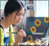
this is my very first icon...please please give critique...and also some pointers
ps....i used ms paint  pss...it kinda small dur its an icon but the words say confessions of a broken heart |
|
|
|


 |
Replies
(1 - 7)
|
Dec 28 2005, 11:35 PM
Post
#2
|
|
 the name is ada. Group: Official Member Posts: 4,688 Joined: Dec 2005 Member No: 334,608 |
Ohh very good for a first icon maker.You should cut out the icon out of the white background though

|
|
|
|
|
Dec 29 2005, 10:02 AM
Post
#3
|
|
 Senior Member Group: Official Member Posts: 7,149 Joined: Aug 2005 Member No: 213,509 |
coolz.add a nice border..black border.
and maybe change the font color or you can also add some zing to it.. a torn border.. [http://www.createblog.com/forums/index.php?showtopic=96498] from that tutorial there :] btw..pretty good for the first. |
|
|
|

|
Dec 29 2005, 10:23 AM
Post
#4
|
|
 Senior Member Group: Member Posts: 3,055 Joined: Jul 2005 Member No: 174,796 |
Yea, it is kinda small, you should make it bigger, so you can at least see the text.
|
|
|
|

|
Dec 29 2005, 03:44 PM
Post
#5
|
|
 I intend to live forever-so far, so good. Group: Member Posts: 2,820 Joined: Mar 2005 Member No: 115,137 |
is it to the right porportions?
lol i dunno, its really good for paint and for a first as said above a border would be nice
|
|
|
|

|
Dec 29 2005, 03:47 PM
Post
#6
|
|
 You'll find me in your dreams. Group: Official Member Posts: 8,536 Joined: Mar 2005 Member No: 114,010 |
Remove all the white space&use a color for the font that MATCHES the icon. Hey eyes are a strange color, make them blue maybe? A border would be splendid, and it's okay for MS Paint. I know you could do better.
|
|
|
|

|
Dec 29 2005, 09:20 PM
Post
#7
|
|
 ^ignore. read> Maria. Group: Member Posts: 710 Joined: Dec 2005 Member No: 323,799 |
^teeny weeny? haha. luv that word usage =]
anyway, its okay and definetly good for paint. push harder though! |
|
|
|
|
Dec 30 2005, 04:20 PM
Post
#8
|
|
 who ma bitch? you ma bitch, bitch. Group: Member Posts: 1,920 Joined: Oct 2004 Member No: 55,278 |
its okey for ms paint. good job

|
|
|
|
 |
1 User(s) are reading this topic (1 Guests and 0 Anonymous Users)
0 Members: