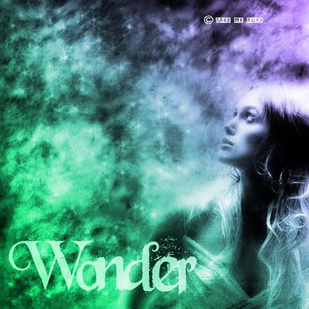
Wonder, ft. keira knightley...feedback please |
Resource Center Links
This Month's Contests | Hosts Looking for Hostees | Hostees looking for Hosts | BigBookofResources
Submission Guidelines

 Dec 4 2005, 12:12 AM Dec 4 2005, 12:12 AM
Post
#1
|
|
 Senior Member  Group: Member Posts: 1,373 Joined: Jun 2004 Member No: 24,505 |
i wanted to make this the header for my xanga since i haven't made a layout for there for...months. i was wondering if i could have some feedback on it. thanks
|
|
|
|


 |
Replies
(1 - 10)
|
Dec 4 2005, 12:23 AM
Post
#2
|
|
 i lost weight with Mulder! Group: Official Designer Posts: 4,070 Joined: Jan 2005 Member No: 79,019 |
i dont like the wonder part..(im a little biased, seeing as my sites called wonder.foreverbliss.org..).
you should lower the opacity of the gradient. its still very nice though. |
|
|
|

|
Dec 4 2005, 01:36 AM
Post
#3
|
|
 Pocketful of Sunshine Group: Staff Alumni Posts: 8,690 Joined: Nov 2005 Member No: 289,004 |
I like it, but I don't really like the font. But besides that, it's nice.

|
|
|
|


|
Dec 4 2005, 03:36 AM
Post
#4
|
|
 Senior Member Group: Member Posts: 545 Joined: Dec 2004 Member No: 70,103 |
it's nice. i like the colors and the simple look of it all. i'm not a big fan of the font, but the title really fits the picture!
|
|
|
|

|
Dec 4 2005, 04:29 AM
Post
#5
|
|
 yan lin♥ Group: Staff Alumni Posts: 14,129 Joined: Apr 2004 Member No: 13,627 |
QUOTE(insomniac @ Dec 4 2005, 1:23 PM) you should lower the opacity of the gradient. its still very nice though.  mm..i agree. and, i think the "take me away" thing should be put...some place else. it just takes away from the whole "wonder" idea. "takesaway"....ohmy what a horrible unintended pun. |
|
|
|

|
Dec 4 2005, 07:14 AM
Post
#6
|
|
 Senior Member Group: Official Member Posts: 7,149 Joined: Aug 2005 Member No: 213,509 |
o0o!
the colors are awesome. the font is okay..not a big fan of it though but overall, its good :] |
|
|
|

|
Dec 4 2005, 12:11 PM
Post
#7
|
|
|
Senior Member Group: Member Posts: 1,373 Joined: Jun 2004 Member No: 24,505 |
thanks for the contribution(i couldn't think of another word). it helped me alot.
|
|
|
|
|
Dec 4 2005, 02:14 PM
Post
#8
|
|
 crushed. Group: Staff Alumni Posts: 9,432 Joined: Jun 2004 Member No: 20,026 |
Like others have mentioned, I love the colors, but not a big fan of the font. Oh, you should also add a border :)
|
|
|
|

|
Dec 4 2005, 02:49 PM
Post
#9
|
|
 I intend to live forever-so far, so good. Group: Member Posts: 2,820 Joined: Mar 2005 Member No: 115,137 |
i think the take me away should be less noticeable, or moved, the "wonder" a lil smaller and moved to the corner
and a nice thin border would be nice too haha i juss restated everything said abovem but thats my opinion. i like the overall feel of it, and the picture is nice too 
|
|
|
|

|
Dec 5 2005, 12:08 AM
Post
#10
|
|
 Senior Member Group: Member Posts: 1,584 Joined: Dec 2004 Member No: 70,748 |
i dont like the font..the colors r ok..lol she really looks like shes wondering
|
|
|
|
|
Dec 5 2005, 08:16 AM
Post
#11
|
|
 Oreo Nazi >=) Group: Member Posts: 234 Joined: Oct 2005 Member No: 281,794 |
i agree, the take me away part should be moved somewhere less noticeable. the font could maybe be changed but i like it.
|
|
|
|
 |
1 User(s) are reading this topic (1 Guests and 0 Anonymous Users)
0 Members: