Tried Again, Alright I tried again... |
Resource Center Links
This Month's Contests | Hosts Looking for Hostees | Hostees looking for Hosts | BigBookofResources
Submission Guidelines

 Nov 13 2005, 09:54 PM Nov 13 2005, 09:54 PM
Post
#1
|
|
|
Member  Group: Member Posts: 17 Joined: Nov 2005 Member No: 291,719 |
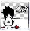
These though are Love pictures and they have me and my bf in them...
All these are me and my bf Two Three |
|
|
|


 |
Replies
(1 - 9)
|
Nov 13 2005, 09:58 PM
Post
#2
|
|
 My name is really Matt... if you care. Group: Member Posts: 1,442 Joined: Oct 2005 Member No: 258,234 |
um... ur just a floating head
i dont get it |
|
|
|
|
Nov 13 2005, 09:58 PM
Post
#3
|
|
|
Member Group: Member Posts: 17 Joined: Nov 2005 Member No: 291,719 |
QUOTE(add1cted2f1re @ Nov 13 2005, 10:58 PM) um... ur just a floating head i dont get it  Cuz i used a webcam and its hard for me to take a picture of me standing at the same time.. |
|
|
|
|
Nov 13 2005, 10:02 PM
Post
#4
|
|
|
My name is really Matt... if you care. Group: Member Posts: 1,442 Joined: Oct 2005 Member No: 258,234 |
when u cut images out, try not to use too much feathering, otherwise, it looks bad...
just a suggestion (which photoshop do u use? try to go to filter>noise>despeckle, to get rid of some of that noise) |
|
|
|
|
Nov 13 2005, 10:04 PM
Post
#5
|
|
|
Member Group: Member Posts: 17 Joined: Nov 2005 Member No: 291,719 |
Photo Explosion doesn't have htat...
|
|
|
|
|
Nov 14 2005, 01:18 AM
Post
#6
|
|
 Senior Member Group: Member Posts: 1,584 Joined: Dec 2004 Member No: 70,748 |
well..its weird..like..the font is nice..but doesnt go w/ the rest..neither does its color..and the choice of bg doesnt really make sense but i guess i like the 2nd better than the 1st..just keep practicing tho! =]
|
|
|
|
| *grrfield* |
Nov 14 2005, 01:32 AM
Post
#7
|
|
Guest |
There is no other wya to put it: THEY'RE NOT GOOD.
1. work on the font. 2. work ont he pictures. 3. work on the blending. 4. work on the coloring. |
|
|
|
|
Nov 14 2005, 03:23 AM
Post
#8
|
|
 sang loves hayden. Group: Staff Alumni Posts: 3,373 Joined: Feb 2004 Member No: 5,687 |
Hmm. I agree with ecargnmyst about the choice of bg and colors. Also, add1cted2f1re, on the too much feathering. You should have some kind of effect on the text, like stroke. Stroke makes it looks nice cept not to much. Other then that, it's all good. The more practice, the better it will be. (=
|
|
|
|

|
Nov 14 2005, 06:51 PM
Post
#9
|
|
 I intend to live forever-so far, so good. Group: Member Posts: 2,820 Joined: Mar 2005 Member No: 115,137 |
its so much easier when you blend pics off of the internet lol yep juss not too much feathering
|
|
|
|

|
Nov 21 2005, 02:49 PM
Post
#10
|
|
 When the sun sleeps. Group: Member Posts: 532 Joined: Nov 2005 Member No: 289,628 |
Yeah...Uhhh I dont want my picture in a blend agian. For example number 2. Thats my forest picture.
|
|
|
|
 |
1 User(s) are reading this topic (1 Guests and 0 Anonymous Users)
0 Members: