Plano Hogwarts Layout, Check it out! |
Resource Center Links
This Month's Contests | Hosts Looking for Hostees | Hostees looking for Hosts | BigBookofResources
Submission Guidelines
  |

 Jun 14 2005, 06:40 PM Jun 14 2005, 06:40 PM
Post
#1
|
|
 *lurks around*  Group: Member Posts: 624 Joined: May 2004 Member No: 15,932  |
|
|
|
|




|
Jun 14 2005, 08:47 PM
Post
#2
|
|
 Death is a promise given to us at birth Group: Official Designer Posts: 4,757 Joined: Mar 2004 Member No: 7,459 |
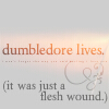
i love it. so simple and the banner.
|
|
|
|


|
Jun 14 2005, 09:29 PM
Post
#3
|
|
|
*lurks around* Group: Member Posts: 624 Joined: May 2004 Member No: 15,932 |
Thank you! I appreciate it.
|
|
|
|
|
Jun 18 2005, 08:48 PM
Post
#4
|
|
|
mood: content Group: Member Posts: 2,063 Joined: Aug 2004 Member No: 42,325 |
I love the simplicity and the blend though you could jazz up the font colors if you wanted. :)
|
|
|
|
|
Jun 25 2005, 04:42 AM
Post
#5
|
|
 i'm susan Group: Official Member Posts: 13,875 Joined: Feb 2004 Member No: 5,029 |
very plain. but i love the banner a lot! it's like simple and clean, nice job! i give you ratings of 10 out of 10!
|
|
|
|

|
Jun 25 2005, 12:52 PM
Post
#6
|
|
 This bitch better work! Group: Staff Alumni Posts: 13,681 Joined: Jul 2004 Member No: 28,095 |
i think that it's cute. i personally think that the banner should of been blended more but it's good anyway.
 i also think you should add more colors to the links and dates and just the blog in general. x] |
|
|
|

|
Jun 28 2005, 01:46 PM
Post
#7
|
|
 Senior Member Group: Member Posts: 384 Joined: Jul 2004 Member No: 32,595 |
cute! the banners kinda plain..but i like it =]
|
|
|
|

|
Jun 28 2005, 02:32 PM
Post
#8
|
|
 Senior Member Group: Member Posts: 59 Joined: May 2005 Member No: 140,987 |
me? what do i think?juz one word"GREAT"

|
|
|
|

|
Jun 28 2005, 09:01 PM
Post
#9
|
|
|
*lurks around* Group: Member Posts: 624 Joined: May 2004 Member No: 15,932 |
thanks everyone. =).
|
|
|
|
|
Jun 28 2005, 09:16 PM
Post
#10
|
|
|
Senior Member Group: Member Posts: 3,551 Joined: Feb 2005 Member No: 102,857 |
Very simple, and nice like the banner it be nice if there was more color but thats what I think.
|
|
|
|
|
Jun 29 2005, 02:08 PM
Post
#11
|
|
 What a hypocrite. Group: Member Posts: 2,754 Joined: Apr 2005 Member No: 128,150 |
Aw, the banner is so cool, and I'm basically being redudant when I say that the layout is simple, but it suggests simplicity in a good way.
|
|
|
|

|
1 User(s) are reading this topic (1 Guests and 0 Anonymous Users)
0 Members: