
fall out boy layout, not finished, need input!! |
Resource Center Links
This Month's Contests | Hosts Looking for Hostees | Hostees looking for Hosts | BigBookofResources
Submission Guidelines
  |
 May 12 2005, 06:26 PM May 12 2005, 06:26 PM
Post
#1
|
|
 mosh.  Group: Member Posts: 1,841 Joined: Dec 2004 Member No: 73,114 |
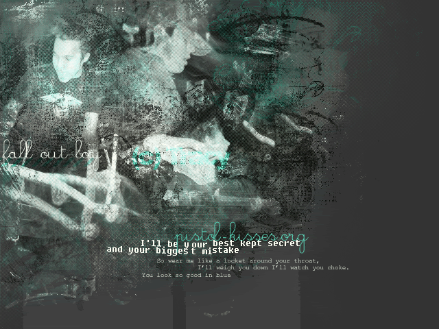 It's not quite done because there's something missing... Anyone have suggestions on how I can make this better? 
|
|
|
|


|
May 12 2005, 06:27 PM
Post
#2
|
|
|
t-t-t-toyaaa Group: Official Member Posts: 19,821 Joined: Apr 2004 Member No: 11,270 |
i think it looks great rite now i dont think you really need to change anything.
|
|
|
|


|
May 12 2005, 06:37 PM
Post
#3
|
|
 something more Group: Member Posts: 2,468 Joined: Mar 2004 Member No: 8,808 |
It looks great. I dont know what you should add. But on the blog and menu part, you should add something to that. Maybe some effects or something, but i like it the way it is.
|
|
|
|
|
May 12 2005, 06:48 PM
Post
#4
|
|
 that heaven is overrated Group: Member Posts: 5,096 Joined: Oct 2004 Member No: 53,124 |
I just don't really like the font. I think everything else looks great!!
 Oh, and that's a great song, too. Oh, and that's a great song, too. 
|
|
|
|

|
May 12 2005, 06:53 PM
Post
#5
|
|
 when the sun sleeps. Group: Member Posts: 210 Joined: May 2005 Member No: 138,079 |
its kewl wiht the blendin effect and the brushes but i dont lyke that band. i head them at a underoath or silverstein concert i went to and they wernt that great but great layout.
|
|
|
|
|
May 12 2005, 06:55 PM
Post
#6
|
|
 Senior Member Group: Staff Alumni Posts: 7,025 Joined: Feb 2004 Member No: 4,051 |
your brushwork never ceases to amaze me. great job
|
|
|
|

|
May 12 2005, 07:19 PM
Post
#7
|
|
|
Senior Member Group: Member Posts: 359 Joined: Feb 2005 Member No: 101,275 |
Its 0pretty good, to bad i hate falloutboy>_<.
|
|
|
|
|
May 12 2005, 09:40 PM
Post
#8
|
|
 whaaaaaaat? Group: Member Posts: 2,293 Joined: May 2004 Member No: 16,660 |
<3 fall out boy. i can't wait to see it once it's finished.
|
|
|
|

| *FreeStickers* |
May 12 2005, 09:52 PM
Post
#9
|
|
Guest |
Very nice. The only thing I don't like is the font that says "I'll be your best kept secret...mistake." Everything else is perfecto, in my opinion.
|
|
|
|
| *stephinika* |
May 12 2005, 10:25 PM
Post
#10
|
|
Guest |
QUOTE(FreeStickers @ May 12 2005, 7:52 PM) Very nice. The only thing I don't like is the font that says "I'll be your best kept secret...mistake." Everything else is perfecto, in my opinion.  agreed. i really like what you did with the images though. great colours too.
|
|
|
|
|
May 12 2005, 10:30 PM
Post
#11
|
|
 Purrfection... Group: Member Posts: 545 Joined: Mar 2004 Member No: 7,178 |
i love it how it is.
i think if you added more it would turn out oo cluttered. that color combination is hawt!! |
|
|
|
|
May 13 2005, 03:12 AM
Post
#12
|
|
 The Stoic Critic Group: Member Posts: 1,113 Joined: Nov 2004 Member No: 65,274 |
looks good Tracy........ try adjusting the Hue and see if any other colors work better.
|
|
|
|

|
May 13 2005, 04:26 AM
Post
#13
|
|
 yan lin♥ Group: Staff Alumni Posts: 14,129 Joined: Apr 2004 Member No: 13,627 |
i'm not too sure about the font that says "fall out boy"
|
|
|
|

|
May 13 2005, 04:48 AM
Post
#14
|
|
 boo Group: Member Posts: 5,512 Joined: Dec 2004 Member No: 71,765 |
Awesome so far.
IMO, you shouldn't change anything. |
|
|
|
|
Jun 4 2005, 10:44 PM
Post
#15
|
|
 Go to Tahiti, and make out with a native. Group: Duplicate Posts: 914 Joined: Apr 2004 Member No: 10,267 |
i like it...i think its worth submitting
|
|
|
|
|
Dec 28 2005, 10:24 PM
Post
#16
|
|
 Senior Member Group: Member Posts: 3,055 Joined: Jul 2005 Member No: 174,796 |
That's soo cool!!!
I can't wait to see it finished!!! Great job 
|
|
|
|

|
Dec 29 2005, 12:07 AM
Post
#17
|
|
 I love you Group: Member Posts: 194 Joined: Mar 2005 Member No: 116,447 |
I love all the random grunge. Great job
I also love fall out boy |
|
|
|

|
Dec 29 2005, 12:19 AM
Post
#18
|
|
 Senior Member Group: Posts: 8,274 Joined: Mar 2004 Member No: 8,001 |
What the heck ? It's already good. What's there missing, fellow member?
|
|
|
|
|
Dec 29 2005, 12:40 AM
Post
#19
|
|
 Milo Kamalani Group: Human Posts: 954 Joined: Oct 2005 Member No: 274,798 |
It's really good, but since you posted this thread 7 months ago I'm pretty sure you've been done for a long time....
Who is bringing back all these old threads? |
|
|
|

|
Dec 29 2005, 12:42 AM
Post
#20
|
|
 i've never wanted anything rationale. Group: Staff Alumni Posts: 8,449 Joined: May 2004 Member No: 19,045 |
QUOTE(skp86 @ Dec 28 2005, 9:24 PM) That's soo cool!!! I can't wait to see it finished!!! Great job WTF, this is from god damn May. If she didn't finish it, too bad. Stop trying to boost your post count by bringing back old topics losar. |
|
|
|

|
Dec 29 2005, 12:54 AM
Post
#21
|
|
|
Senior Member Group: Member Posts: 3,551 Joined: Feb 2005 Member No: 102,857 |
^Thank you.
skp86 this is your verbal warning for bumping old topics just for more posts. |
|
|
|
| *Retro_Love* |
Dec 29 2005, 01:25 AM
Post
#22
|
|
Guest |
Wow. Oldness but anyways. It looks great. Good job |
|
|
|
|
Dec 29 2005, 04:24 AM
Post
#23
|
|
 the name is ada. Group: Official Member Posts: 4,688 Joined: Dec 2005 Member No: 334,608 |
Wow nice!!
|
|
|
|
|
Dec 29 2005, 05:01 AM
Post
#24
|
|
 :hammer: Group: Staff Alumni Posts: 9,849 Joined: Mar 2004 Member No: 7,700 |
MMM Peter Wentz. It's hot, Tracy. The colors are awesome. And hot.
|
|
|
|

|
Dec 29 2005, 09:52 AM
Post
#25
|
|
 Senior Member Group: Official Member Posts: 7,149 Joined: Aug 2005 Member No: 213,509 |
i agree about the font part,try using other ones,those dont seem to fit
anyways...THATS AWESOME.  edit//eh so this is old i seee.. 
|
|
|
|

|
1 User(s) are reading this topic (1 Guests and 0 Anonymous Users)
0 Members: