
America's Next Top Model |
Resource Center Links
This Month's Contests | Hosts Looking for Hostees | Hostees looking for Hosts | BigBookofResources
Submission Guidelines
  |
 Mar 17 2005, 04:19 PM Mar 17 2005, 04:19 PM
Post
#1
|
|
 Amberific.  Group: Staff Alumni Posts: 12,913 Joined: Jul 2004 Member No: 29,772 |
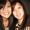
I made this for a friend, but I'm not sure I like it the way it is. Any suggestions would be appreciated.
FYI, the background is supposed to look like one of those light tables. http://xanga.com/shesFRSH |
|
|
|


|
Mar 17 2005, 04:28 PM
Post
#2
|
|
|
yerp! Group: Member Posts: 3,489 Joined: Nov 2004 Member No: 66,454 |
I think it's very well put together. I like the pictures and the colors. Great job.
|
|
|
|

|
Mar 17 2005, 04:39 PM
Post
#3
|
|
 Yea Yea. Group: Member Posts: 837 Joined: Jan 2005 Member No: 79,366 |
i think you should make it smaller so u dont have to scroll to see the whole skin. otherwise, wonderful!
|
|
|
|

|
Mar 17 2005, 04:59 PM
Post
#4
|
|
|
I'm a sexy beast Group: Member Posts: 410 Joined: Jan 2005 Member No: 78,103 |
I like the theme and how it's all based on film stuff. It's really nice looking, good job!
|
|
|
|
|
Mar 17 2005, 06:01 PM
Post
#5
|
|
 boa loyal fans 4eva!!!! Group: Member Posts: 533 Joined: Feb 2005 Member No: 100,738 |
look very nice
so creative!!!!!!!! it better if use image mapping for navigation becasue it take so long to scroll down to navigate. took me awhile to find it. |
|
|
|
|
Mar 17 2005, 06:15 PM
Post
#6
|
|
 rawr. Group: Member Posts: 304 Joined: Jan 2004 Member No: 1,529 |
its awesome, great pictures! i like how you put the blog in the film strip

|
|
|
|
|
Mar 17 2005, 07:44 PM
Post
#7
|
|
 crushed. Group: Staff Alumni Posts: 9,432 Joined: Jun 2004 Member No: 20,026 |
that is HOT..the film strip is a real nice touch.
|
|
|
|

|
Mar 17 2005, 08:05 PM
Post
#8
|
|
|
Tu es laid. Group: Official Member Posts: 3,913 Joined: Feb 2005 Member No: 106,675 |
OMG totally nice. i love the theme u used American next top model which is really good and original.. keep up the good work

|
|
|
|
|
Mar 17 2005, 08:13 PM
Post
#9
|
|
|
questions make me blue. Group: Member Posts: 2,608 Joined: Feb 2004 Member No: 3,796 |
that`s HAWT!
 america`s next top model. one of my favorite shows. america`s next top model. one of my favorite shows.
|
|
|
|
|
Mar 17 2005, 10:52 PM
Post
#10
|
|
|
Amberific. Group: Staff Alumni Posts: 12,913 Joined: Jul 2004 Member No: 29,772 |
QUOTE(BOAmusics @ Mar 17 2005, 6:01 PM) look very nice so creative!!!!!!!! it better if use image mapping for navigation becasue it take so long to scroll down to navigate. took me awhile to find it.  I think I might do that, thanks for the advice and the compliment. |
|
|
|
|
Mar 18 2005, 01:06 AM
Post
#11
|
|
 Happy Person Group: Member Posts: 1,729 Joined: Feb 2004 Member No: 4,674 |
you're attempt at a light table succeded, I must say
the info box should be seperate though, in case your friend has a lot of subscriptions. |
|
|
|
|
Mar 18 2005, 12:05 PM
Post
#12
|
|
 Senior Member Group: Member Posts: 106 Joined: Feb 2005 Member No: 97,846 |
i like it~ :)
|
|
|
|
|
Mar 18 2005, 12:41 PM
Post
#13
|
|
 hello : ) Group: Official Member Posts: 4,227 Joined: Apr 2004 Member No: 13,139 |
I love it. You always make amazing layouts. I like the film strip (how do you do it!? haha) and I like the colors you used as well. Good job =] Oh and I agree with someone else, I think the navigation shouldn't be where it is and it should be image mapped. Because I thought that little box just had info about the person so I probably never would have scrolled through it to find the navigation.
|
|
|
|

|
Mar 18 2005, 02:21 PM
Post
#14
|
|
|
Amberific. Group: Staff Alumni Posts: 12,913 Joined: Jul 2004 Member No: 29,772 |
QUOTE(M1SSxCHR1SSY @ Mar 18 2005, 12:41 PM) I love it. You always make amazing layouts. I like the film strip (how do you do it!? haha) and I like the colors you used as well. Good job =] Oh and I agree with someone else, I think the navigation shouldn't be where it is and it should be image mapped. Because I thought that little box just had info about the person so I probably never would have scrolled through it to find the navigation. I learned from some tutorial site. It takes A LOT of work, believe me. I forgot where I got it from though, sorry. I'm sure you can find one if you google it or maybe it's somewhere in the BBOR. I probably will change the navigation. |
|
|
|
|
Mar 19 2005, 05:33 AM
Post
#15
|
|
 boo Group: Member Posts: 5,512 Joined: Dec 2004 Member No: 71,765 |
It's nice but I don't really like the font.
That's just IMO |
|
|
|
|
Mar 19 2005, 05:37 AM
Post
#16
|
|
 i'm a d0rk =) Group: Member Posts: 209 Joined: Jan 2005 Member No: 88,870 |
i appluad you -clapclap- 1. great job! 2. you used April! shes my all time fave antm model. 3. i love the effects.
|
|
|
|
|
Mar 19 2005, 12:13 PM
Post
#17
|
|
|
mood: content Group: Member Posts: 2,063 Joined: Aug 2004 Member No: 42,325 |
OH DEAR, I think that's terribly clever! :D Seriously, 10/10. Cute profile in the box.
|
|
|
|
|
Mar 19 2005, 12:52 PM
Post
#18
|
|
 Look its... Group: Official Member Posts: 5,817 Joined: Feb 2004 Member No: 4,767 |
damn thats nice. i like the whole effect with the table thing!!
|
|
|
|
|
Mar 19 2005, 01:01 PM
Post
#19
|
|
 Senior Member Group: Member Posts: 81 Joined: Jan 2005 Member No: 84,021 |
awesome!!!but i dont like those girlll
|
|
|
|
|
Mar 19 2005, 06:54 PM
Post
#20
|
|
 that heaven is overrated Group: Member Posts: 5,096 Joined: Oct 2004 Member No: 53,124 |
Wow, I really like it. Good job! :D
|
|
|
|

|
Mar 19 2005, 10:33 PM
Post
#21
|
|
 This bitch better work! Group: Staff Alumni Posts: 13,681 Joined: Jul 2004 Member No: 28,095 |
i like it alot. i don't watch that show but i like the skin.
 i like the background brushes. i like the background brushes. 
|
|
|
|


|
Mar 20 2005, 01:23 AM
Post
#22
|
|
 dakishimetainoni... Group: Staff Alumni Posts: 4,322 Joined: Dec 2004 Member No: 75,318 |
wow, that's so creative, using the light table. i haven't seen that before
|
|
|
|

|
Mar 20 2005, 01:43 AM
Post
#23
|
|
 yan lin♥ Group: Staff Alumni Posts: 14,129 Joined: Apr 2004 Member No: 13,627 |
cute...but i dont really like the font that says "info"
|
|
|
|

|
Mar 20 2005, 11:33 AM
Post
#24
|
|
|
Amberific. Group: Staff Alumni Posts: 12,913 Joined: Jul 2004 Member No: 29,772 |
QUOTE(Arimalka @ Mar 20 2005, 11:11 AM) Very cute! I'm sure she'll love it. It's actually for a boy. He's obsessed with ANTM. |
|
|
|
|
Mar 20 2005, 05:11 PM
Post
#25
|
|
 Newbie Group: Member Posts: 1 Joined: Mar 2005 Member No: 115,459 |
hehe i love it too. i am a crazed ANTM fan as well
check out my xanga. it has a messed up layout. But a new better one will be up shortly |
|
|
|
|
Mar 21 2005, 06:00 PM
Post
#26
|
|
|
dmnfckr Group: Member Posts: 101 Joined: Feb 2005 Member No: 103,475 |
u should add galeryimg='no' to you image just so those icons on the top left (save, print email) wont appear. <img src="url" galleryimg='no'>

|
|
|
|
|
Mar 21 2005, 06:03 PM
Post
#27
|
|
 just chillin Group: Member Posts: 429 Joined: Jan 2005 Member No: 88,562 |
the div layers are a bit off on IE. or maybe thats me. good job, tho!
|
|
|
|
|
Mar 21 2005, 06:59 PM
Post
#28
|
|
 mmm hmmm Group: Member Posts: 1,591 Joined: Sep 2004 Member No: 47,325 |
QUOTE(tobeyum @ Mar 21 2005, 6:00 PM) u should add galeryimg='no' to you image just so those icons on the top left (save, print email) wont appear. <img src="url" galleryimg='no'> ^ yah. Hot layout though, the light table is very cool.. lovin the colors. The layout would look better stationary also. =o] |
|
|
|
|
Mar 25 2005, 03:32 PM
Post
#29
|
|
 lee dongwook <33 Group: Member Posts: 65 Joined: Jan 2005 Member No: 92,119 |
4 a boy?? wow~~ i would've thought it was 4 a girl..
but i love the layout~!!! is that naima @ the bottom???? pretttyyy~~~ <33 the 2nd pic looked like paris hilton. just darker QUOTE(DjDeluxay @ Mar 20 2005, 6:11 PM) hehe i love it too. i am a crazed ANTM fan as well check out my xanga. it has a messed up layout. But a new better one will be up shortly hey~ i like ur layout 2... amanda~~ :D her son is so cute [Posts merged. Please don't double post, thanks ]
This post has been edited by MissMata: Mar 25 2005, 04:32 PM |
|
|
|
|
Mar 25 2005, 03:37 PM
Post
#30
|
|
 ¢¾ Wanting it. ¢¾ Group: Member Posts: 2,060 Joined: Aug 2004 Member No: 39,234 |
wow its cool!!! maybe you could submit it? your work is beautiful
|
|
|
|
|
Mar 25 2005, 04:32 PM
Post
#31
|
|
|
Amberific. Group: Staff Alumni Posts: 12,913 Joined: Jul 2004 Member No: 29,772 |
QUOTE(Angel_Cece @ Mar 25 2005, 3:37 PM) wow its cool!!! maybe you could submit it? your work is beautiful I definitely will, as soon as the person I made it for is done with it. And thanks for the wonderful compliment
|
|
|
|
|
1 User(s) are reading this topic (1 Guests and 0 Anonymous Users)
0 Members: