grungy ft. cursive, an overused style but a great band |
Resource Center Links
This Month's Contests | Hosts Looking for Hostees | Hostees looking for Hosts | BigBookofResources
Submission Guidelines
  |

 Feb 26 2005, 03:19 PM Feb 26 2005, 03:19 PM
Post
#1
|
|
 rockstar  Group: Member Posts: 54 Joined: Jul 2004 Member No: 34,140 |
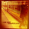
click the link in the sub, and let me know what you think
this is skin number...5 i think? im not sure...but yay for photoshop, im getting there, have fun. |
|
|
|


|
Feb 26 2005, 03:40 PM
Post
#2
|
|
 This bitch better work! Group: Staff Alumni Posts: 13,681 Joined: Jul 2004 Member No: 28,095 |
the background is alright. a little plain and boring but pretty good. the rest is pretty default. try adding more color
|
|
|
|


|
Feb 26 2005, 03:42 PM
Post
#3
|
|
|
rockstar Group: Member Posts: 54 Joined: Jul 2004 Member No: 34,140 |
so whats your description of default? the side modules? i like them...lol..so call me "default" i guess
|
|
|
|
|
Feb 26 2005, 08:33 PM
Post
#4
|
|
|
This bitch better work! Group: Staff Alumni Posts: 13,681 Joined: Jul 2004 Member No: 28,095 |
QUOTE(derek_drums @ Feb 26 2005, 2:42 PM) so whats your description of default? the side modules? i like them...lol..so call me "default" i guess  default is just like what they gave you. 
|
|
|
|
|
Feb 26 2005, 08:37 PM
Post
#5
|
|
|
Senior Member Group: Member Posts: 1,575 Joined: Jan 2005 Member No: 93,957 |
it's really default, and the background makes it hard to read your blogs or what the lyrics say on the background. cursive is such an awesome band.
|
|
|
|
|
Feb 27 2005, 12:26 AM
Post
#6
|
|
|
rockstar Group: Member Posts: 54 Joined: Jul 2004 Member No: 34,140 |
"its really defaul" blah blah blah go shove it up your butt and get over your layouts. nothing about it ios default, so i kept the modules, i like them *gasp* oh no. i changed everything on there to my likeing, if its so "default" get that with out the code buddy. yeahhh.
|
|
|
|
| *tweeak* |
Feb 27 2005, 11:18 AM
Post
#7
|
|
Guest |
its not a great layout, hard to read and even tell its relating to cursive at all, but they are a great band. i absolutely adore the recluse
|
|
|
|
|
Feb 27 2005, 11:41 AM
Post
#8
|
|
|
WWMD?! - i am from the age of BM 2 Group: Member Posts: 5,308 Joined: Mar 2004 Member No: 8,848 |
QUOTE(derek_drums @ Feb 26 2005, 11:26 PM) "its really defaul" blah blah blah go shove it up your butt and get over your layouts. nothing about it ios default, so i kept the modules, i like them *gasp* oh no. i changed everything on there to my likeing, if its so "default" get that with out the code buddy. yeahhh. excuse me, you might wanna watch your attitude. you asked people for their opinions by posting it here, and you got them. you have to learn to deal with that, or you'll be warned. this is your warning of a warning. it IS too default. you used just what they gave you, put a background, playlist (that you probably didn't code yourself), and changed colors. that doesn't take a lot of skill. |
|
|
|
|
Feb 27 2005, 12:56 PM
Post
#9
|
|
 rainy days fade away.. Group: Member Posts: 566 Joined: Oct 2004 Member No: 58,261 |
^^ i agree
but its still a cute xanga |
|
|
|

|
Feb 27 2005, 01:15 PM
Post
#10
|
|
|
Senior Member Group: Member Posts: 91 Joined: Feb 2005 Member No: 106,896 |
The background makes it a little hard to read.
|
|
|
|
|
Feb 27 2005, 09:53 PM
Post
#11
|
|
 ;) Group: Staff Alumni Posts: 9,573 Joined: Feb 2005 Member No: 99,124 |
Your background seems a little off. But nice try though.
|
|
|
|

|
Feb 27 2005, 11:32 PM
Post
#12
|
|
|
rockstar Group: Member Posts: 54 Joined: Jul 2004 Member No: 34,140 |
waa what is it with you and default...i cahnged the entire CSS, the borders, the txt, herm ok
|
|
|
|
|
Mar 2 2005, 06:08 PM
Post
#13
|
|
 Senior Member Group: Member Posts: 130 Joined: Oct 2004 Member No: 55,559 |
It's okay. The background is pretty good but it's kind of small and the blog entries and sidebar hides it, so we really don't see much. Um. The red is kind of a bit too harsh. Maybe something a bit darker. Uh. Overall it's kind of... Blah.
Yeah. I like your Broken and Napoleon 2 layouts better. :P |
|
|
|
| *StanleyThePanda* |
Mar 2 2005, 06:33 PM
Post
#14
|
|
Guest |
QUOTE(touch my monkey @ Feb 27 2005, 11:41 AM) excuse me, you might wanna watch your attitude. you asked people for their opinions by posting it here, and you got them. you have to learn to deal with that, or you'll be warned. this is your warning of a warning. it IS too default. you used just what they gave you, put a background, playlist (that you probably didn't code yourself), and changed colors. that doesn't take a lot of skill. Totally agree, you posted it here for opinions did you not? it is default and if you dont think so, oh well thats the opinion of people. so get over it. The colors are really overused to. |
|
|
|
|
Mar 2 2005, 06:45 PM
Post
#15
|
|
|
questions make me blue. Group: Member Posts: 2,608 Joined: Feb 2004 Member No: 3,796 |
what they mean about default is the modules & top navigation (ex: reviews, events, subscribe!). mostly people like seeing div layouts. i`m not saying that you SHOULD make div layouts, but if you want positive comments about your layout, you`d have to make a div layout to make everyone satisfied. you`ll improve over time, don`t worry. it just takes patience.
|
|
|
|
|
Mar 2 2005, 07:30 PM
Post
#16
|
|
 Senior Member Group: Member Posts: 218 Joined: Jan 2005 Member No: 83,398 |
its pretty cool even though its default. a lot of my first klayouts were default too.nothing wrong with that. div layer layouts are really cool,but they take a while to learn how to do
|
|
|
|
|
Mar 2 2005, 09:17 PM
Post
#17
|
|
 mosh. Group: Member Posts: 1,841 Joined: Dec 2004 Member No: 73,114 |
it sucks... in my opinon
|
|
|
|
|
Mar 2 2005, 09:19 PM
Post
#18
|
|
 =) Group: Member Posts: 570 Joined: Jan 2004 Member No: 2,305 |
haha it reminds me of a skin i made for my friend.
i dont like the gray.. it throws it off. everything else looks defaultish |
|
|
|
|
Mar 2 2005, 10:07 PM
Post
#19
|
|
|
Senior Member Group: Member Posts: 130 Joined: Oct 2004 Member No: 55,559 |
QUOTE(ThePrincessofTKD @ Mar 2 2005, 6:45 PM) what they mean about default is the modules & top navigation (ex: reviews, events, subscribe!). mostly people like seeing div layouts. i`m not saying that you SHOULD make div layouts, but if you want positive comments about your layout, you`d have to make a div layout to make everyone satisfied. you`ll improve over time, don`t worry. it just takes patience. I disagree. There are some default layouts that actually look good (souldreamer did one for her friend) and there are some div ones that look pretty bad. Then there are the div and default blended into one... So you know, either way. |
|
|
|
|
Mar 5 2005, 01:39 AM
Post
#20
|
|
|
Senior Member Group: Member Posts: 988 Joined: Feb 2005 Member No: 98,884 |
It's ok, but really defaultish. Nice try tho
|
|
|
|
|
Mar 6 2005, 08:51 PM
Post
#21
|
|
 Member Group: Member Posts: 16 Joined: Feb 2005 Member No: 104,756 |
QUOTE(D1SMANTLED @ Mar 2 2005, 9:17 PM) it sucks... in my opinon his layout is a lot better than yours. -jess |
|
|
|
| *tweeak* |
Mar 6 2005, 08:58 PM
Post
#22
|
|
Guest |
no it isnt. and tracys is only defaultish temporarily. typically, her layouts could kick his, mine, and yours asses
(assuming that i were actually using a layout i made, and that yours wasnt even more default) |
|
|
|
|
1 User(s) are reading this topic (1 Guests and 0 Anonymous Users)
0 Members: