new layout.. THE USED, song: It's Hard To Say |
Resource Center Links
This Month's Contests | Hosts Looking for Hostees | Hostees looking for Hosts | BigBookofResources
Submission Guidelines
  |

 Nov 26 2004, 08:36 PM Nov 26 2004, 08:36 PM
Post
#1
|
|
 it's what i believe in.  Group: Member Posts: 187 Joined: Aug 2004 Member No: 43,523 |
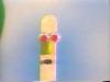
hey guys. i just made a new layout for my xanga. it`s "It`s Hard To Say" by The Used. it`s in their new album [In Love & Death].
Xanga comments please 
|
|
|
|


|
Nov 26 2004, 09:18 PM
Post
#2
|
|
 Senior Member Group: Member Posts: 3,077 Joined: Feb 2004 Member No: 3,904 |
Defaultish and your banner is too simple.
|
|
|
|
|
Nov 26 2004, 10:52 PM
Post
#3
|
|
 Um....Its meeee Group: Member Posts: 2,218 Joined: Mar 2004 Member No: 8,264 |
I like the color, though i think you should algin to the picture? Nice job though.
|
|
|
|
|
Nov 26 2004, 10:55 PM
Post
#4
|
|
 skaters gonna skate. Group: Official Member Posts: 6,861 Joined: Mar 2004 Member No: 6,336 |
I like it. ^^ You should align the picture
|
|
|
|


|
Nov 27 2004, 12:03 AM
Post
#5
|
|
|
Senior Member Group: Member Posts: 903 Joined: Mar 2004 Member No: 6,665 |
It`s a bit plain.. Colors are nice..
But.. it`s defaulty but MAJOR props for The Used Fricken` LOVE that band. <333333333333 |
|
|
|
|
Nov 27 2004, 10:14 AM
Post
#6
|
|
|
WWMD?! - i am from the age of BM 2 Group: Member Posts: 5,308 Joined: Mar 2004 Member No: 8,848 |
<3333 the used.
i'm not a fan of a banner with just lyrics and such, but whatever floats your boat. you obviously like it, so there's no problem with it being on your xanga. |
|
|
|
|
Nov 27 2004, 12:46 PM
Post
#7
|
|
|
Smile Like a Retard =D Group: Member Posts: 1,350 Joined: Nov 2004 Member No: 63,186 |
yeah, defaultish and maybe add something to the banner... i like the animation a lot though =)
|
|
|
|
|
Nov 27 2004, 02:13 PM
Post
#8
|
|
 ©shesdiztinQtive Group: Member Posts: 562 Joined: Oct 2004 Member No: 56,389 |
the animation is nice and it looks a little weird how your banner is aligned to the left and your blog is centered.. maybe just keep it on way?
|
|
|
|

|
Nov 27 2004, 02:19 PM
Post
#9
|
|
 hi, my name is brianna! =] Group: Official Member Posts: 5,764 Joined: Jun 2004 Member No: 22,114 |
It's really default, but it's nice. =] I think you should center your banner, it would look better.
|
|
|
|
| *_jelly_bean_* |
Nov 27 2004, 06:01 PM
Post
#10
|
|
Guest |
love the colors and the animation, but a little too default.
|
|
|
|
|
Nov 28 2004, 12:30 AM
Post
#11
|
|
|
it's what i believe in. Group: Member Posts: 187 Joined: Aug 2004 Member No: 43,523 |
hey guys. thanks for the comments. the alignment`s fixed and the defaultishness is what i wanted. i wanted it to be simple with some simple banner with animation. i would`ve made a mapped layout but i didn`t have time.

|
|
|
|
|
Nov 28 2004, 05:04 PM
Post
#12
|
|
 Senior Member Group: Member Posts: 429 Joined: Nov 2004 Member No: 66,993 |
The banner is really good. Everything looks nice, and a nice color of green
|
|
|
|
|
Nov 28 2004, 05:07 PM
Post
#13
|
|
 DANG forgot to add a border XD Group: Member Posts: 324 Joined: Nov 2004 Member No: 66,973 |
ooo good job i love the colors ^__^
|
|
|
|
|
1 User(s) are reading this topic (1 Guests and 0 Anonymous Users)
0 Members: