Concept Piece |
Resource Center Links
This Month's Contests | Hosts Looking for Hostees | Hostees looking for Hosts | BigBookofResources
Submission Guidelines
  |
 Aug 23 2009, 04:49 PM Aug 23 2009, 04:49 PM
Post
#1
|
|
|
BBM: 310ED181      Group: Member Posts: 613 Joined: Jul 2008 Member No: 671,976 |
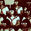
I originally designed it for a poster in school (for protest), and then downsized it to fit on the screen. It's supposed to be minimalistic and conceptual. Yes I did steal the "Don't Taze me, bro" Idea. Stock Photo: http://www.sxc.hu/photo/1214436 |
|
|
|
 Aug 23 2009, 04:54 PM Aug 23 2009, 04:54 PM
Post
#2
|
|
 사랑해 ~ 我愛你 ♥      Group: Design Staff Posts: 825 Joined: Jan 2007 Member No: 492,587 |
It took forever to load. I'd work on the placement of the text.
|
|
|
|
 Aug 23 2009, 05:02 PM Aug 23 2009, 05:02 PM
Post
#3
|
|
|
BBM: 310ED181      Group: Member Posts: 613 Joined: Jul 2008 Member No: 671,976 |
ok. where would you suggest I put it?
|
|
|
|
 Aug 23 2009, 05:05 PM Aug 23 2009, 05:05 PM
Post
#4
|
|
 Sex, Blood, & RocknRoll        Group: People Staff Posts: 5,305 Joined: Nov 2007 Member No: 596,480 |
I can't see it
|
|
|
|
 Aug 23 2009, 05:19 PM Aug 23 2009, 05:19 PM
Post
#5
|
|
 Senior Member        Group: Official Designer Posts: 5,880 Joined: Nov 2007 Member No: 593,382 |
Looks to me like you did some parts like a vector but did some parts with that old technique that makes it black and white and only shows some parts. Forgot what it is called. Cheap.
Its ok. Make it smaller. ANd work on the fonts used and the text placement. |
|
|
|
 Aug 23 2009, 05:47 PM Aug 23 2009, 05:47 PM
Post
#6
|
|
 I'm Jc         Group: Mentor Posts: 13,619 Joined: Jul 2006 Member No: 437,556 |
what makes you say this is a "concept" piece? just because it has a message to it?
i think it looks bad. i don't get how the background texture fits into the theme. the colors in general could be better. i don't get how that photo specifically ads anything or why you chose it. the effect applied looks bad. she has no visible arms or anything like that. it looks like you just posterized it in photoshop. the font isn't good and the arrangement of the text is confusing and unbalanced. "bro" going down vertical looks bad. there is too much space in between it. fonts aren't built to be typed vertically that way and you can see why, the spacing is awful and needs to always be hand adjusted to fix the spacing. |
|
|
|
 Aug 23 2009, 06:26 PM Aug 23 2009, 06:26 PM
Post
#7
|
|
 Senior Member       Group: Staff Alumni Posts: 1,815 Joined: Jun 2006 Member No: 423,396 |
From far away, I thought you vectored the girl, and was gonna give you major props for that. But yeah, I can't see anything good about the text placement. You could have at least used a better font or two.
|
|
|
|
 Aug 23 2009, 06:58 PM Aug 23 2009, 06:58 PM
Post
#8
|
|
 kthxbai       Group: Official Designer Posts: 2,832 Joined: Feb 2008 Member No: 621,203 |
I agree with JC.
|
|
|
|
 Aug 23 2009, 07:17 PM Aug 23 2009, 07:17 PM
Post
#9
|
|
 AIDS at RAVES.       Group: Official Designer Posts: 2,386 Joined: Dec 2007 Member No: 598,878 |
I agree with JC. Im sorry but your useless posts in showcase are sort of pissing me off now, but besides that, the image literally froze my comp for about 2 seconds, but moving beyond that, the concept you are trying to portray is very confusing. I'm guessing someone cut off her arms because she used foul language? The background texture dosent fit well and I suggest adding more colors and using different fonts. It seems like you are using Arial Bold, but if you are going for a grungy dark feel, use grungy dark text. Arial is usually a very clean font, used for clean and very simplistic designs. Also the colors clash a tad bit. try adding some red into the font or something. The black is a bit to conservative and overrated. Use up more canvas space, but dont go overboard, there is nothing to look at except a girl and some text. Details stand out more that the general concept, which is why details are important (especially to createbloggers). I still havent been able to figure out the message portrayed in this piece. But Im guessing it's a protest to prevent censoring of bad words? It's really important to make the message stand out in a concept piece, no one is going to stand there all there to look at your photo. At most a person will usually look at this piece for about 2 seconds and not mind it afterwards. Sorry for the long read |
|
|
|
 Aug 23 2009, 08:22 PM Aug 23 2009, 08:22 PM
Post
#10
|
|
 Senior Member        Group: Administrator Posts: 8,629 Joined: Jan 2007 Member No: 498,468 |
I agree with JC 100%. She definitely needs arms and the font/font placement need some major work.
|
|
|
|
 Aug 24 2009, 03:13 AM Aug 24 2009, 03:13 AM
Post
#11
|
|
 Live long and prosper.         Group: Staff Alumni Posts: 10,142 Joined: Apr 2007 Member No: 514,926 |
The quality is reallllllly shitty. The message, is not conceived well by the image, if the text wasn't right there in your face, the image has no purpose. Without the girl the piece still has the message.
I'm sorry if I repeated anything from anyone else, I just didn't want to read everyone else's responses. |
|
|
|
 Aug 24 2009, 10:19 PM Aug 24 2009, 10:19 PM
Post
#12
|
|
 Fellatio.       Group: Official Member Posts: 2,122 Joined: Mar 2007 Member No: 511,775 |
I don't care for the way her mouth is censored, because it looks like choppy layering technique.
|
|
|
|
  |
1 User(s) are reading this topic (1 Guests and 0 Anonymous Users)
0 Members:


