personal div |
Resource Center Links
This Month's Contests | Hosts Looking for Hostees | Hostees looking for Hosts | BigBookofResources
Submission Guidelines
  |

 Jun 2 2009, 08:04 PM Jun 2 2009, 08:04 PM
Post
#1
|
|
 Senior Member  Group: Member Posts: 351 Joined: Jul 2007 Member No: 543,127 |
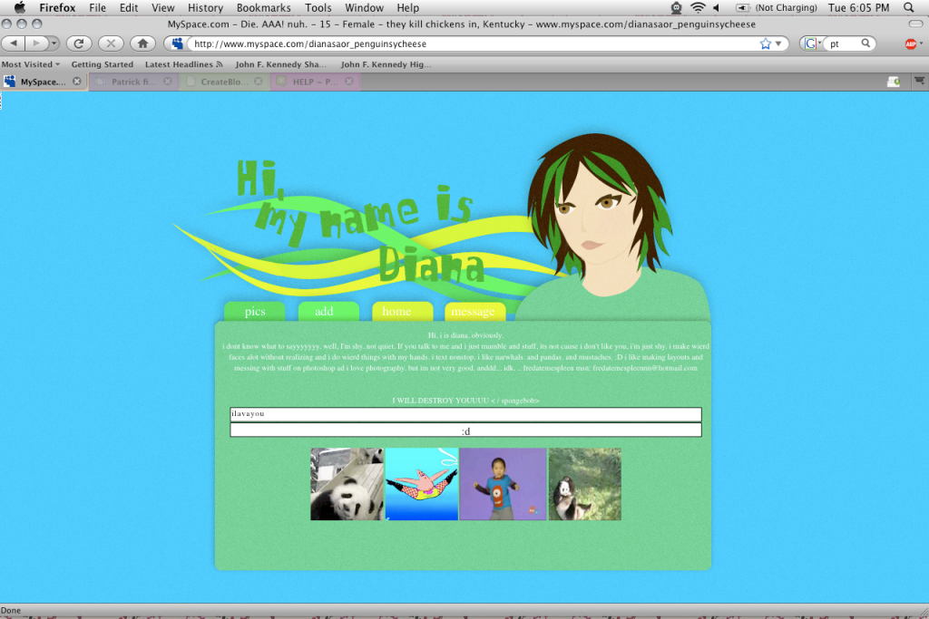
just want some critiques on it. (:
http://www.myspace.com/littlesharpiehorrors so i sorta copied rickysaurus's style with the texture over. D: im sorry. it just looks so cooool. if you want me to change it i will though. |
|
|
|


|
Jun 2 2009, 08:05 PM
Post
#2
|
|
 Senior Member Group: Official Member Posts: 2,936 Joined: Sep 2008 Member No: 683,235 |
the add cuts off the top.
at least for me. |
|
|
|


|
Jun 2 2009, 08:08 PM
Post
#3
|
|
 Senior Member Group: Administrator Posts: 8,629 Joined: Jan 2007 Member No: 498,468 |
Yeah same here to the ad thing. But I think it's nice. Everything looks proportional. The text sticks out a tad in Safari though. Oh and one your icon's bandwidth has exceeded. But it's a cool layout. :)
|
|
|
|

|
Jun 2 2009, 08:15 PM
Post
#4
|
|
|
Senior Member Group: Member Posts: 351 Joined: Jul 2007 Member No: 543,127 |
poo. haha. i have adblock on so i forget about the ads.
|
|
|
|
|
Jun 2 2009, 10:48 PM
Post
#5
|
|
 Senior Member Group: Staff Alumni Posts: 2,435 Joined: Feb 2007 Member No: 506,205 |
The links are a bit off for me and something is a little funky about your vector's head, but it's vector and you have the Nathaniel animation. That makes up for it.
|
|
|
|

|
Jun 3 2009, 06:39 PM
Post
#6
|
|
 Mel Blanc was allergic to carrots. Group: Official Designer Posts: 6,371 Joined: Aug 2008 Member No: 676,291 |
^Agreed. I think it looks alright. Good job.

|
|
|
|


|
Jun 9 2009, 09:17 PM
Post
#7
|
|
 i like boobies, yes I do. I like boobies - how 'bout you? Group: Member Posts: 620 Joined: Jun 2008 Member No: 662,457 |
I think the tabs should be images instead of text, otherwise it's good. Nice, simple vector.
|
|
|
|

|
Jun 9 2009, 09:24 PM
Post
#8
|
|
|
Senior Member Group: Official Member Posts: 1,028 Joined: Sep 2007 Member No: 579,129 |
I like it. The only thing I'm not crazy about is the colors you chose.
|
|
|
|

|
1 User(s) are reading this topic (1 Guests and 0 Anonymous Users)
0 Members: