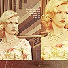
Some things i made in GIMP, C&C |
Resource Center Links
This Month's Contests | Hosts Looking for Hostees | Hostees looking for Hosts | BigBookofResources
Submission Guidelines
  |
 Apr 15 2009, 08:37 PM Apr 15 2009, 08:37 PM
Post
#1
|
|
|
Irrisistable Cabbages.      Group: Member Posts: 549 Joined: Nov 2007 Member No: 589,355 |
Well, I've made some things in GIMP like you guys/gals asked me to and here they are! C&C
Harry Potter Layout Fergie Layout ^^ In between all of the small boxes it is transparent. This started off as a blend in photofiltre and ended up as a layout in GIMP. Happy Birthday w/Jessica Simpson Hermione ^^ To Big of an Image. When I make more I'll edit this post and add them! :-) Thanks Guys/Gals! |
|
|
|
 Apr 15 2009, 08:44 PM Apr 15 2009, 08:44 PM
Post
#2
|
|
 Senior Member        Group: Administrator Posts: 8,629 Joined: Jan 2007 Member No: 498,468 |
1) Too plain, low in image quality, & your cobbing is weird.
2) Too plain. 3) Too plain & low in image quality. "/ Add more to your designs, Erin. But not too much. |
|
|
|
 Apr 15 2009, 08:47 PM Apr 15 2009, 08:47 PM
Post
#3
|
|
|
Irrisistable Cabbages.      Group: Member Posts: 549 Joined: Nov 2007 Member No: 589,355 |
1) Too plain, low in image quality, & your cobbing is weird. 2) Too plain. 3) Too plain & low in image quality. "/ Add more to your designs, Erin. But not too much. What else should I add? I don't understand. Especially for the Happy Birthday one. You didn't look at the last one. it has the link because the image was too big for me to put on here without the link. |
|
|
|
 Apr 15 2009, 08:57 PM Apr 15 2009, 08:57 PM
Post
#4
|
|
 Senior Member        Group: Administrator Posts: 8,629 Joined: Jan 2007 Member No: 498,468 |
But if an image is too big, that's why you put them in between thumb tags.
But again, the cobbing is weird & the transparent bar is too thick. Usually, the text is suppose to fit like barely within it. |
|
|
|
 Apr 15 2009, 09:02 PM Apr 15 2009, 09:02 PM
Post
#5
|
|
 Mel Blanc was allergic to carrots.        Group: Official Designer Posts: 6,371 Joined: Aug 2008 Member No: 676,291 |
Again, these are too plain and basic. You need to add more maybe like textures and/or brushes.
|
|
|
|
 Apr 15 2009, 09:03 PM Apr 15 2009, 09:03 PM
Post
#6
|
|
|
show me a garden thats bursting to life         Group: Staff Alumni Posts: 12,303 Joined: Mar 2005 Member No: 115,987 |
GIMP is, for a free program, capable of doing quite a lot. Check out some online tutorials and see what else is possible to create. Then, use this new found knowledge, and incorporate it into your designs because I agree with Nat; they're way too plain.
|
|
|
|
 Apr 15 2009, 09:13 PM Apr 15 2009, 09:13 PM
Post
#7
|
|
|
Irrisistable Cabbages.      Group: Member Posts: 549 Joined: Nov 2007 Member No: 589,355 |
I've already looked at ALL of the tutorials on here and these are what I published.
|
|
|
|
 Apr 15 2009, 09:17 PM Apr 15 2009, 09:17 PM
Post
#8
|
|
 Senior Member      Group: Member Posts: 786 Joined: Dec 2006 Member No: 488,341 |
Don't just look at the tutorials on here...there's only a few that's good (no offense) on this site. Google them. I found some really good tutorials for GIMP a while back but I forgot the link.
|
|
|
|
 Apr 15 2009, 09:20 PM Apr 15 2009, 09:20 PM
Post
#9
|
|
|
Irrisistable Cabbages.      Group: Member Posts: 549 Joined: Nov 2007 Member No: 589,355 |
ok
|
|
|
|
 Apr 15 2009, 09:36 PM Apr 15 2009, 09:36 PM
Post
#10
|
|
 Senior Member     Group: Member Posts: 254 Joined: Aug 2008 Member No: 682,007 |
yea...not the best at all but def not the worst.
but they are to plain, like i do like plain stuff but they is way to boring ugh you do need to add more brushes or textures or anything would do wonders. & on the last image its decent again boring but the hair makes it not the best looking. ***fonts will be your friend too, jus sayin! |
|
|
|
 Apr 15 2009, 09:37 PM Apr 15 2009, 09:37 PM
Post
#11
|
|
|
Irrisistable Cabbages.      Group: Member Posts: 549 Joined: Nov 2007 Member No: 589,355 |
yea...not the best at all but def not the worst. but they are to plain, like i do like plain stuff but they is way to boring ugh you do need to add more brushes or textures or anything would do wonders. & on the last image its decent again boring but the hair makes it not the best looking. which one the happy birthday or hermione? and how is it boring? What textures should I add to the first layout? What should I add to the second one? |
|
|
|
 Apr 15 2009, 09:56 PM Apr 15 2009, 09:56 PM
Post
#12
|
|
 Senior Member        Group: Official Designer Posts: 5,880 Joined: Nov 2007 Member No: 593,382 |
Do this tutorial and work till you can do it.
Tutorial Im giving you this cause its not too hard and when you do it you'll learn how to use shadows, use transparency, gradient, and some other things. Try this too. Tutorial 2 |
|
|
|
 Apr 15 2009, 10:30 PM Apr 15 2009, 10:30 PM
Post
#13
|
|
 Senior Member       Group: Staff Alumni Posts: 2,435 Joined: Feb 2007 Member No: 506,205 |
I think they look like what you usually do.
Play around with the program before you start putting layouts together. Press every button and try every command if you have to. That's what I do when I get a new program. |
|
|
|
 Apr 15 2009, 10:33 PM Apr 15 2009, 10:33 PM
Post
#14
|
|
|
Irrisistable Cabbages.      Group: Member Posts: 549 Joined: Nov 2007 Member No: 589,355 |
I think they look like what you usually do. Play around with the program before you start putting layouts together. Press every button and try every command if you have to. That's what I do when I get a new program. I just did and I made my signature. Do you like it? |
|
|
|
 Apr 15 2009, 10:42 PM Apr 15 2009, 10:42 PM
Post
#15
|
|
 Senior Member       Group: Staff Alumni Posts: 2,435 Joined: Feb 2007 Member No: 506,205 |
To be honest, not really. It's pretty basic, and I can barely read the second line of text.
As I said in your last thread, take some time off from making graphics. Studying other designs can really help. Maybe even attempt to replicate a design from a popular graphic site (Rewindd, Saruna, Outspoken-Kate). Never publish it because stealing is the worst thing you could possibly do, but it could be good practice. |
|
|
|
 Apr 15 2009, 11:20 PM Apr 15 2009, 11:20 PM
Post
#16
|
|
 Senior Member        Group: Official Designer Posts: 5,880 Joined: Nov 2007 Member No: 593,382 |
What we mean by basic is basically too few colors! And you have got to stop stretching and twisting images! They lose there proportions! You need to look at good designs and if they your designe doesnt look as good, its not good.
Start using textures in backgrounds and trying to make things look professional! |
|
|
|
 Apr 15 2009, 11:23 PM Apr 15 2009, 11:23 PM
Post
#17
|
|
|
Irrisistable Cabbages.      Group: Member Posts: 549 Joined: Nov 2007 Member No: 589,355 |
To be honest, not really. It's pretty basic, and I can barely read the second line of text. As I said in your last thread, take some time off from making graphics. Studying other designs can really help. Maybe even attempt to replicate a design from a popular graphic site (Rewindd, Saruna, Outspoken-Kate). Never publish it because stealing is the worst thing you could possibly do, but it could be good practice. I am taking time off. I'm not publishing anything I'm just asking you guys/gals your opinions. What we mean by basic is basically too few colors! And you have got to stop stretching and twisting images! They lose there proportions! You need to look at good designs and if they your designe doesnt look as good, its not good. Start using textures in backgrounds and trying to make things look professional! I'll re-make my signature and then tell me what you guys think. ______________________________________________________________________ I'm making a layout in GIMP. It is here. IT IS NOT PUBLISHED. I use that page to test and make ALL of my layouts. |
|
|
|
 Apr 15 2009, 11:27 PM Apr 15 2009, 11:27 PM
Post
#18
|
|
 Senior Member        Group: Official Designer Posts: 5,880 Joined: Nov 2007 Member No: 593,382 |
I am taking time off. I'm not publishing anything I'm just asking you guys/gals your opinions. I'll re-make my signature and then tell me what you guys think. ______________________________________________________________________ I'm making a layout in GIMP. It is here. IT IS NOT PUBLISHED. I use that page to test and make ALL of my layouts. Again, listen to Gabi! Don't even show us stuff for a while! Wait to show us something good! |
|
|
|
 Apr 15 2009, 11:31 PM Apr 15 2009, 11:31 PM
Post
#19
|
|
|
Irrisistable Cabbages.      Group: Member Posts: 549 Joined: Nov 2007 Member No: 589,355 |
|
|
|
|
 Apr 16 2009, 12:17 AM Apr 16 2009, 12:17 AM
Post
#20
|
|
 Senior Member     Group: Member Posts: 254 Joined: Aug 2008 Member No: 682,007 |
which one the happy birthday or hermione? and how is it boring? What textures should I add to the first layout? What should I add to the second one? I think i could've ment the Herminoe one im not sure at the moment & far 2 lazy 2 go back & look. i'm not going to tell you what to add, as your going to have to lean yourself. but yea dont show off anymore tell its beyond perfect & on the last layout, crap. |
|
|
|
 Apr 16 2009, 12:19 AM Apr 16 2009, 12:19 AM
Post
#21
|
|
|
Irrisistable Cabbages.      Group: Member Posts: 549 Joined: Nov 2007 Member No: 589,355 |
|
|
|
|
 Apr 16 2009, 07:37 AM Apr 16 2009, 07:37 AM
Post
#22
|
|
 Onen i-Estel Edain, ú-chebin estel anim.      Group: Official Designer Posts: 425 Joined: May 2008 Member No: 653,128 |
Okay, I'm gonna try be really honest
If you're just gonna post the same kind of thing over and over again, don't bother posting it. Everything's too simple and looks like an image with text slapped on it. The text isn't even blended in and there's no evidence to show that you've even tried to make it blend in. If you want to do something, how about teaming up with someone and coding their designs? You'll gain a lot more knowledge about good designs if you team up with someone good. And try to stay out of using big boxes - that's Mike's trademark And DOWNLOAD MORE FONTS. You should try getting an idea of what kind of font to use and where. As well as that, find tutorials on blending text into an image well because if it looks like the text doesn't belong in a particular place, it takes away quality from the image. And please try to manipulate the image. The images that you've used look like there's nothing been done to them other than putting them into shapes or cobbing them. PUTTING TRANSLUCENT BARS OF WHITE AND PLACING TEXT ON THEM DOESN'T COUNT. Have you heard of the brightness/contrast, levels and curves tools? They can do wonders to an image. And have you tried colourizing? The right colours in the right places can make an image amazing. Download more brushes and textures - there's a heck load of them online. If I'm not mistaken, you can also download and use some Photoshop brushes/textures as well. If you think your graphics on your site are amazing, you need to get out of your little bubble and look at other designs. And please try to take some of what we're saying into your head. It doesn't seem like it's sinking in. Try to get out of your comfort zone - if it looks screwed up, it's fine, just try again. |
|
|
|
 Apr 16 2009, 04:34 PM Apr 16 2009, 04:34 PM
Post
#23
|
|
 Mel Blanc was allergic to carrots.        Group: Official Designer Posts: 6,371 Joined: Aug 2008 Member No: 676,291 |
^I so agree.
Also, on your layout for your site, it still looks really plain. You need to get some better fonts and you really need to check out some tutorials. Try searching 'best gimp tutorials' on google or something so that you can practice. |
|
|
|
 Apr 16 2009, 09:56 PM Apr 16 2009, 09:56 PM
Post
#24
|
|
 Senior Member     Group: Member Posts: 254 Joined: Aug 2008 Member No: 682,007 |
|
|
|
|
 Apr 16 2009, 10:52 PM Apr 16 2009, 10:52 PM
Post
#25
|
|
 Senior Member        Group: Official Member Posts: 6,349 Joined: Aug 2006 Member No: 455,274 |
GIMP is, for a free program, capable of doing quite a lot. Check out some online tutorials and see what else is possible to create. Then, use this new found knowledge, and incorporate it into your designs because I agree with Nat; they're way too plain. I have to admit.. I've been so deeply involved with photoshop that I just.. dislike the different terms and the different layout of the menus on GIMP. I even run photoshop via wine on ubuntu. |
|
|
|
  |
1 User(s) are reading this topic (1 Guests and 0 Anonymous Users)
0 Members:


