Robot People :D |
Resource Center Links
This Month's Contests | Hosts Looking for Hostees | Hostees looking for Hosts | BigBookofResources
Submission Guidelines
  |

 Mar 30 2009, 07:59 AM Mar 30 2009, 07:59 AM
Post
#1
|
|
 Onen i-Estel Edain, ú-chebin estel anim.  Group: Official Designer Posts: 425 Joined: May 2008 Member No: 653,128 |
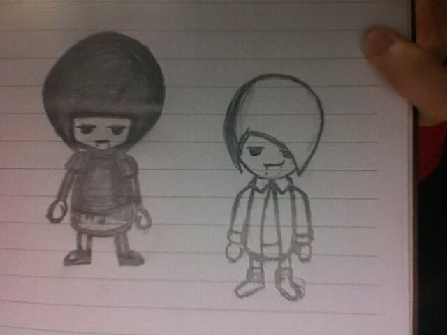
What do you think I should do with this? ._. (It looked sooo much better on paper xD) |
|
|
|


|
Mar 30 2009, 09:20 AM
Post
#2
|
|
 AIDS at RAVES. Group: Official Designer Posts: 2,386 Joined: Dec 2007 Member No: 598,878 |
I love the illustrations, but the blue and the black seem to clash a bit :] Otherwise I think it's great :]
|
|
|
|

|
Mar 30 2009, 02:13 PM
Post
#3
|
|
 Senior Member Group: Human Posts: 525 Joined: Nov 2008 Member No: 695,913 |
ya the blue and the black make the image way 2 dark . . try using some different colors . .otherwise looks pretty cool
Stay Up -1- Subliminal |
|
|
|

|
Mar 30 2009, 02:15 PM
Post
#4
|
|
|
Senior Member Group: Staff Alumni Posts: 4,665 Joined: Aug 2008 Member No: 676,364 |
I don't really understand how these people are "robotic". Maybe their poise?
The navy blue and black did crash. Maybe try another color scheme that's easier to see and does not make the whole image busy. |
|
|
|

|
Mar 30 2009, 04:11 PM
Post
#5
|
|
 Senior Member Group: Staff Alumni Posts: 2,435 Joined: Feb 2007 Member No: 506,205 |
I'm not really getting the robot vibe, but it's kinda cute.
I agree about the blue though. Maybe pick a blue that's a bit lighter and less saturated? |
|
|
|


|
Mar 30 2009, 05:37 PM
Post
#6
|
|
 사랑해 ~ 我愛你 ♥ Group: Design Staff Posts: 825 Joined: Jan 2007 Member No: 492,587 |
this is cute (: i'd clean up the edges a bit and use a lighter blue. maybe change the skin tone and make the edges more angular to give off the feeling of robotic?
|
|
|
|

| *Janette* |
Mar 30 2009, 05:48 PM
Post
#7
|
|
Guest |
The illustration is cute. I agree about the colors, but I also think the border thickness of the characters themselves are a bit too thick. It seems to add to the crowded-ness of the whole thing imo.
|
|
|
|
|
Mar 30 2009, 06:31 PM
Post
#8
|
|
 Mel Blanc was allergic to carrots. Group: Official Designer Posts: 6,371 Joined: Aug 2008 Member No: 676,291 |
I think it's cute but I don't get that robot looking feeling. They kind of look like some kind of emo kids.
 Anyways, yeah maybe lighten the blue a bit and try adding little 'bolts' or 'nails' around the inside of the body, like an inside stroke. Also, maybe kind of make their eyes sort of red? and the skin a little more 'metallic'. Idk. Good job though. Anyways, yeah maybe lighten the blue a bit and try adding little 'bolts' or 'nails' around the inside of the body, like an inside stroke. Also, maybe kind of make their eyes sort of red? and the skin a little more 'metallic'. Idk. Good job though. 
|
|
|
|


|
Mar 30 2009, 09:04 PM
Post
#9
|
|
|
Onen i-Estel Edain, ú-chebin estel anim. Group: Official Designer Posts: 425 Joined: May 2008 Member No: 653,128 |
Hahaha
I don't know why I named them robot people ._." I guess I was high on boredom or something I'll do something about the colour scheme =] |
|
|
|
|
Mar 30 2009, 10:00 PM
Post
#10
|
|
 Senior Member Group: Administrator Posts: 8,629 Joined: Jan 2007 Member No: 498,468 |
I agree about the clashing of the colors. Interesting idea though. You may want to go over the edges because they're a bit choppy like someone said. But it's cute. :)
|
|
|
|

|
1 User(s) are reading this topic (1 Guests and 0 Anonymous Users)
0 Members: