Wallpaper + Header, Angelina Jolie and Gillian Anderson |
Resource Center Links
This Month's Contests | Hosts Looking for Hostees | Hostees looking for Hosts | BigBookofResources
Submission Guidelines
  |

 Aug 5 2008, 06:51 AM Aug 5 2008, 06:51 AM
Post
#1
|
|
|
Senior Member  Group: Member Posts: 33 Joined: May 2008 Member No: 648,286 |
feedback, tips, suggestions, etc are all welcome
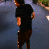
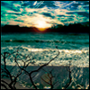
thanks *nod* Angelina Jolie wallpaper --  Gillian Anderson header --  |
|
|
|


|
Aug 5 2008, 10:24 AM
Post
#2
|
|
 poison Group: Official Member Posts: 4,806 Joined: Mar 2008 Member No: 629,020 |
I really like the second one.
Im not so sure about the first one though. Otherwise keep up the good work : D |
|
|
|


|
Aug 5 2008, 10:45 AM
Post
#3
|
|
|
Senior Member Group: Member Posts: 33 Joined: May 2008 Member No: 648,286 |
QUOTE(Tomates @ Aug 5 2008, 08:24 AM)  I really like the second one. Im not so sure about the first one though. Otherwise keep up the good work : D thanks I wasn't sure about the first one either, but it was my first time playing with textured papers and yeah, I'm kind of in love with the second one heh it's currently being used as the header on my livejournal thanks again :) |
|
|
|
|
Aug 5 2008, 11:04 AM
Post
#4
|
|
|
poison Group: Official Member Posts: 4,806 Joined: Mar 2008 Member No: 629,020 |
QUOTE(museical @ Aug 5 2008, 11:45 AM) thanks I wasn't sure about the first one either, but it was my first time playing with textured papers and yeah, I'm kind of in love with the second one heh it's currently being used as the header on my livejournal thanks again :) Ah thats really cool! I would love to see what it looks like on your livejournal. |
|
|
|
|
Aug 5 2008, 12:15 PM
Post
#5
|
|
 <(^_^<) DANCE!(>^_^)> Group: Official Member Posts: 1,304 Joined: Nov 2007 Member No: 586,621 |
i like both. i like the stack/paper clip effect & the colors on the first one & the neatness of the second one. good work!

|
|
|
|

|
Aug 5 2008, 12:21 PM
Post
#6
|
|
 asdfghjkl; Group: Official Designer Posts: 1,121 Joined: Jul 2008 Member No: 665,416 |
im not sure if i like the first pic. i mean, i think you could find better pics of her. &i think the paperclip is kind of distracting..?
but its really nice. &i really like the second one. its really nice[: she looks beautiful.
|
|
|
|


|
Aug 5 2008, 01:31 PM
Post
#7
|
|
|
Senior Member Group: Member Posts: 33 Joined: May 2008 Member No: 648,286 |
QUOTE(Tomates @ Aug 5 2008, 09:04 AM) Ah thats really cool! I would love to see what it looks like on your livejournal. OoOoo here ya go -- http://fragileentity.livejournal.com/ the rest of the layout is pretty basic, I had trouble getting the colors to match the ones in the header without making it look like too... much |
|
|
|
|
Aug 5 2008, 01:52 PM
Post
#8
|
|
 DDR \\ I'm Dee :) Group: Mentor Posts: 8,662 Joined: Mar 2006 Member No: 384,020 |
I think the first one would look better if the picture covered the textures a little more. Or if they textures were a little smaller. It seems like the focus is on the background more than the picture.
|
|
|
|

|
Aug 6 2008, 01:00 PM
Post
#9
|
|
 Senior Member Group: Member Posts: 51 Joined: Aug 2008 Member No: 674,491 |
I really like the lighting in the second one, it's very mellow!
|
|
|
|

|
1 User(s) are reading this topic (1 Guests and 0 Anonymous Users)
0 Members: