Myspace Layout-Rightway, quickie layout. be nice. |
Resource Center Links
This Month's Contests | Hosts Looking for Hostees | Hostees looking for Hosts | BigBookofResources
Submission Guidelines
  |

 Aug 4 2008, 02:45 PM Aug 4 2008, 02:45 PM
Post
#1
|
|
 Senior Member  Group: Member Posts: 60 Joined: May 2004 Member No: 17,154 |
kind of a quickie thing. i'm not really a professional so take it easy.
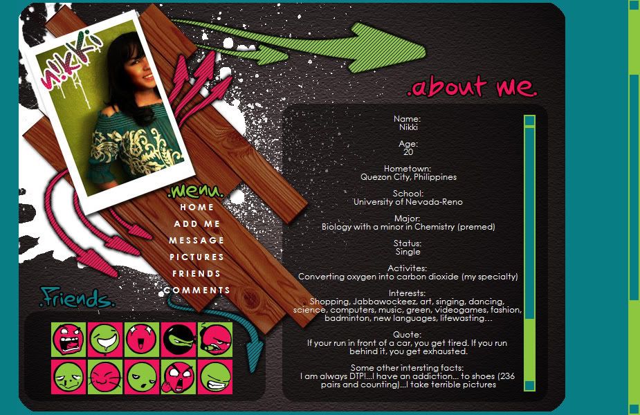 it's simple on purpose. lol. i don't like cluttered boxes. live: Click Here To View ~nikki |
|
|
|


|
Aug 4 2008, 03:05 PM
Post
#2
|
|
 Jooleeah <3 Group: Official Designer Posts: 687 Joined: Jun 2008 Member No: 662,481 |
You underestimate yourself, this is really cute!

|
|
|
|


|
Aug 4 2008, 03:15 PM
Post
#3
|
|
|
Senior Member Group: Member Posts: 60 Joined: May 2004 Member No: 17,154 |
aww thanks.

|
|
|
|
|
Aug 4 2008, 03:21 PM
Post
#4
|
|
 /人◕‿‿◕人\ Group: Official Member Posts: 8,283 Joined: Dec 2007 Member No: 602,927 |
In FireFox, I can't read the text, and the links are still blue.
The extended network still shows up, and it's very off center. |
|
|
|


|
Aug 4 2008, 03:22 PM
Post
#5
|
|
 DDR \\ I'm Dee :) Group: Mentor Posts: 8,662 Joined: Mar 2006 Member No: 384,020 |
I like it. It's not that simple. The image is nice, not too busy. The only thing that sticks out to me is the scrollbar. I probably would've went with different colors.
|
|
|
|

|
Aug 4 2008, 03:42 PM
Post
#6
|
|
|
Senior Member Group: Member Posts: 60 Joined: May 2004 Member No: 17,154 |
i feel ya on the scrollbar, but i tried different colors it just wasn't that pretty. i guess with a bright layout i can kinda get away with the random neon scrollbar.
abt the firefox, sorry, i don't use firefox so idk how to even approach that problem. all that matters to me is that it works for my purposes. thanks for the comments. |
|
|
|
|
Aug 4 2008, 04:47 PM
Post
#7
|
|
 Senior Member Group: Staff Alumni Posts: 2,435 Joined: Feb 2007 Member No: 506,205 |
I think it looks really nice. Love the color scheme. I prefer when layouts like that are centered, but that's really the only thing I don't like.
|
|
|
|

|
Aug 4 2008, 05:48 PM
Post
#8
|
|
 poison Group: Official Member Posts: 4,806 Joined: Mar 2008 Member No: 629,020 |
I really like it : D
now i feel like making a layout |
|
|
|

|
Aug 4 2008, 11:29 PM
Post
#9
|
|
|
Senior Member Group: Member Posts: 60 Joined: May 2004 Member No: 17,154 |
hahah go for it. make a layout.
|
|
|
|
|
Aug 4 2008, 11:37 PM
Post
#10
|
|
 Oh Wow ... Group: Official Designer Posts: 688 Joined: Sep 2006 Member No: 468,522 |
whoa! Love the colors. love the little paint splatter things.
& i love the overall layout style. |
|
|
|

|
Aug 6 2008, 07:15 AM
Post
#11
|
|
 Senior Member Group: Member Posts: 55 Joined: Mar 2007 Member No: 513,490 |
i really like it! havent made a layout in a long time and this has inspired me.
sent a add. |
|
|
|

|
Aug 6 2008, 07:57 AM
Post
#12
|
|
 the name's mario Group: Official Member Posts: 1,270 Joined: Jun 2008 Member No: 656,520 |
it looks good
|
|
|
|

|
Aug 6 2008, 12:51 PM
Post
#13
|
|
 Senior Member Group: Member Posts: 51 Joined: Aug 2008 Member No: 674,491 |
That's so cute! I love the smiley faces and the color scheme.
|
|
|
|

|
Aug 8 2008, 06:13 PM
Post
#14
|
|
|
Senior Member Group: Member Posts: 60 Joined: May 2004 Member No: 17,154 |
hahaha thanks for all the positive comments.
and thanks for the add. |
|
|
|
|
Aug 9 2008, 01:14 AM
Post
#15
|
|
 Amberific. Group: Staff Alumni Posts: 12,913 Joined: Jul 2004 Member No: 29,772 |
Simple my booty. It's gorgeous. In Firefox though the text shows up as black and not white like in the screenshot, so I can't read anything in that div. And the menu shows up as default blue links.
|
|
|
|

|
Aug 9 2008, 04:59 PM
Post
#16
|
|
|
Newbie Group: Member Posts: 8 Joined: Aug 2008 Member No: 675,225 |
It's really nice, would look better if it was centered and connected to the nav. Make the nav all black and round off the bottom edges more. Just my opinion though
|
|
|
|

|
Aug 9 2008, 05:30 PM
Post
#17
|
|
 asdfghjkl; Group: Official Designer Posts: 1,121 Joined: Jul 2008 Member No: 665,416 |
QUOTE(XTC @ Aug 4 2008, 01:21 PM)  In FireFox, I can't read the text, and the links are still blue. The extended network still shows up, and it's very off center. ^double that but the thumb is really nice[: like seriously, GOOD JOB[: its awesome. |
|
|
|

|
1 User(s) are reading this topic (1 Guests and 0 Anonymous Users)
0 Members: