
Technology Blow Up, Experimental Work |
Resource Center Links
This Month's Contests | Hosts Looking for Hostees | Hostees looking for Hosts | BigBookofResources
Submission Guidelines
  |
 Jun 8 2008, 04:38 PM Jun 8 2008, 04:38 PM
Post
#1
|
|
 talent on another level  Group: Member Posts: 746 Joined: Oct 2006 Member No: 475,735 |
Here is my most recent piece. I drew a different concept out on paper and thought of this concept instead. Just improving my creativity and trying styles I have never done. This is not even close to being finish, but would like to know what you think I could improve on.
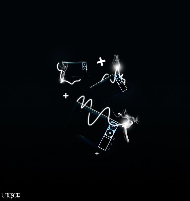 P.S: The original is much bigger and sharper than what is shown. EDITED VERSION BELOW! |
|
|
|


|
Jun 8 2008, 04:39 PM
Post
#2
|
|
 ٩(͡๏̯͡๏)۶ Group: Staff Alumni Posts: 14,309 Joined: Nov 2004 Member No: 65,593 |
dis ok...
|
|
|
|


|
Jun 8 2008, 04:45 PM
Post
#3
|
|
 Kissing for yesterday. Group: Official Designer Posts: 465 Joined: Sep 2007 Member No: 569,813 |
this is excellent, you've really come through leaps and bounds since you first came here and presented your work.
this is stylish and corporate. only thing i would say bothers me is how the twisting line on the bottom television is very very blurry and kind of hurts my eyes. however this is definitely your best piece of work. |
|
|
|

|
Jun 8 2008, 04:52 PM
Post
#4
|
|
|
talent on another level Group: Member Posts: 746 Joined: Oct 2006 Member No: 475,735 |
you are speaking the truth with leaps and bounds, lol. thanks for recognizing my growth.
i will play around with the lighting; the last thing i want is someones eyes hurting from my work. thanks for the feedback. |
|
|
|
|
Jun 8 2008, 04:52 PM
Post
#5
|
|
|
٩(͡๏̯͡๏)۶ Group: Staff Alumni Posts: 14,309 Joined: Nov 2004 Member No: 65,593 |
^ how cum i don't get no thanksss....??
|
|
|
|
|
Jun 8 2008, 04:54 PM
Post
#6
|
|
|
Kissing for yesterday. Group: Official Designer Posts: 465 Joined: Sep 2007 Member No: 569,813 |
^^ how comes you stopped with the BIG RED FONT?
oh and probably because you didn't give much feedback! but thanks for trying to work on the fuzziness, i don't know if anyone found that a bit of an issue! ------------------------- edit ------------------------- i can't be bothered to PM, i feel too lazy tonight. |
|
|
|
|
Jun 8 2008, 04:58 PM
Post
#7
|
|
|
talent on another level Group: Member Posts: 746 Joined: Oct 2006 Member No: 475,735 |
lol don't argue. but yeah Tungster, you didn't offer any useful feedback that could help me out. thanks for taking the time to comment though.
okay i'll keep on the lookout. edit: lol, okay. |
|
|
|
|
Jun 8 2008, 06:07 PM
Post
#8
|
|
|
talent on another level Group: Member Posts: 746 Joined: Oct 2006 Member No: 475,735 |
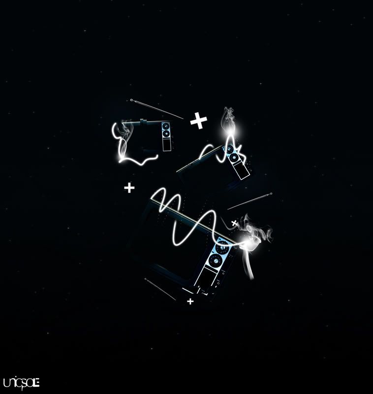
EDITED VERSION
|
|
|
|
|
Jun 8 2008, 06:11 PM
Post
#9
|
|
|
Kissing for yesterday. Group: Official Designer Posts: 465 Joined: Sep 2007 Member No: 569,813 |
awesome, im still finding it a little fuzzy but that may be due to it being gone midnight here and i've been up since 8am..i will check again tomorrow.
it could look better by being opaque around the sides or something, rather than glowing to a fuzz. but i dont know if that would look odd or not. the smokey bits are my favourite part, they work extremely well. |
|
|
|
|
Jun 8 2008, 07:28 PM
Post
#10
|
|
|
talent on another level Group: Member Posts: 746 Joined: Oct 2006 Member No: 475,735 |
thanks, i'll keep that in mind.
|
|
|
|
|
Jun 8 2008, 07:56 PM
Post
#11
|
|
|
talent on another level Group: Member Posts: 746 Joined: Oct 2006 Member No: 475,735 |
thanks.
the brushes are there because i like them and i feel they fit with my design. |
|
|
|
|
Jun 8 2008, 08:19 PM
Post
#12
|
|
 torn Group: Official Designer Posts: 953 Joined: Oct 2004 Member No: 55,718 |
Maybe I'm just dumb, but I can't for the life of me figure out what it is/what it's supposed to be. Or if it's even supposed to be anything at all.
That aside, I have to say it looks extremely cool. I also like the smoky bits, and the touches of blue on what may or may not be the main subject of the piece. (Like I said, I'm dumb.) [moment of revelation coming up] OHHHH THEY'RE TVS!!! (I think?) haha okay wow now I feel really dumb. For the white swirly things (not the smoky bits, but the kind of uneven spirals?), I think it would look better if the ends tapered out. Like, if I were in photoshop and had traced the path using the pen tool, I'd stroke the path with a brush using the....... whatsitcalled..... shoot, forgot. There's a checkbox option...... use pressure or something? Anyway, I'd use that, but it might just be a personal preference. I also like the +'s throughout. They're interesting. XD |
|
|
|

|
Jun 9 2008, 05:31 AM
Post
#13
|
|
|
talent on another level Group: Member Posts: 746 Joined: Oct 2006 Member No: 475,735 |
QUOTE(highwayto4355 @ Jun 8 2008, 08:00 PM)  lol thats coo' at first i thought that it was a chick standing on the tv. i was like WHY DID YOU EVAPORATE HE- oh. lol oh QUOTE Maybe I'm just dumb, but I can't for the life of me figure out what it is/what it's supposed to be. Or if it's even supposed to be anything at all. That aside, I have to say it looks extremely cool. I also like the smoky bits, and the touches of blue on what may or may not be the main subject of the piece. (Like I said, I'm dumb.) [moment of revelation coming up] OHHHH THEY'RE TVS!!! (I think?) haha okay wow now I feel really dumb. For the white swirly things (not the smoky bits, but the kind of uneven spirals?), I think it would look better if the ends tapered out. Like, if I were in photoshop and had traced the path using the pen tool, I'd stroke the path with a brush using the....... whatsitcalled..... shoot, forgot. There's a checkbox option...... use pressure or something? Anyway, I'd use that, but it might just be a personal preference. lol there is no particular subject, just an extent of my imagination. thanks for the feedback. i'll keep all tips in mind. QUOTE I think it's a early microwave oven. I could be wrong though It looks nice, with a catchy quote or something it'd make a cool banner lol their tv's but since this is one from back in the day, it could have been easily mistaken for a microwave. |
|
|
|
|
Jun 9 2008, 05:49 AM
Post
#14
|
|
|
talent on another level Group: Member Posts: 746 Joined: Oct 2006 Member No: 475,735 |
lol good.
i don't ever remember microwaves with 2 big turning dials. lmao |
|
|
|
|
Jun 9 2008, 07:18 AM
Post
#15
|
|
 (′ ・ω・`) Group: Official Designer Posts: 6,179 Joined: Dec 2004 Member No: 72,477 |
i thought they were slim cameras. looks like they're stuck on the sky or something. really strange concept, but the work is good.
|
|
|
|

|
Jun 9 2008, 07:26 AM
Post
#16
|
|
|
talent on another level Group: Member Posts: 746 Joined: Oct 2006 Member No: 475,735 |
thats a good thing.
thanks |
|
|
|
|
Jun 9 2008, 09:10 AM
Post
#17
|
|
|
talent on another level Group: Member Posts: 746 Joined: Oct 2006 Member No: 475,735 |
EDITED VERSION 2
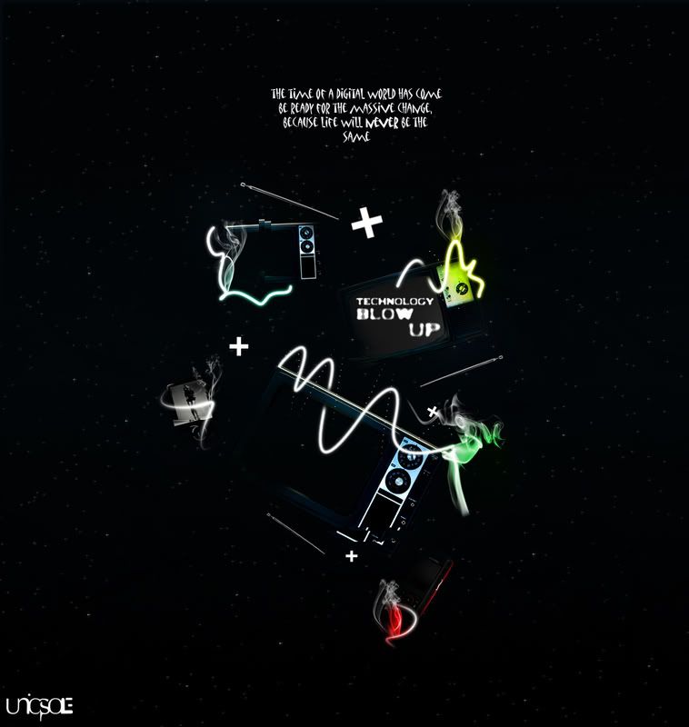 any suggestions? |
|
|
|
|
Jun 9 2008, 09:58 AM
Post
#18
|
|
 Senior Member Group: Member Posts: 292 Joined: Jul 2007 Member No: 545,047 |
I REALLY don't like that text at top. It just looks so out of place.
Everything else looks really nice. Especially the colored smoke, that looks awesome. You did a really good job on this. |
|
|
|

|
Jun 9 2008, 10:23 AM
Post
#19
|
|
|
talent on another level Group: Member Posts: 746 Joined: Oct 2006 Member No: 475,735 |
yeah i agree on the text at the top. i'll find another way to clearly explain the concept.
thanks for the feedback. |
|
|
|
|
Jun 9 2008, 11:50 AM
Post
#20
|
|
 <(^_^<) DANCE!(>^_^)> Group: Official Member Posts: 1,304 Joined: Nov 2007 Member No: 586,621 |
i think this looks cool. unique & different. i agree about the text thing though... it looks odd. other than that it looks good.

|
|
|
|

|
Jun 9 2008, 11:55 AM
Post
#21
|
|
|
talent on another level Group: Member Posts: 746 Joined: Oct 2006 Member No: 475,735 |
okay text is out. i'll just explain the concept on deviant art, lol.
|
|
|
|
|
Jun 9 2008, 03:08 PM
Post
#22
|
|
|
torn Group: Official Designer Posts: 953 Joined: Oct 2004 Member No: 55,718 |
I think you could still work the text in there without it looking strange. My biggest issue with the text was that I really don't like the font you chose. I would pick a default-ish serif font like times, palantino, centaur, sylfaen, perpetua..... yeah, just something default. It's not a good idea to have two "special" or unique fonts on the same thing. I would also, I dunno, lower the opacity of the that text or something to make it not stand out so much. You want people to look at the image first, then read the text (or that's the way it works in my mind), so kind of make the not-main text subtler.
Sorry for the essay <_< I'm not good at explaining things. |
|
|
|
|
Jun 9 2008, 04:12 PM
Post
#23
|
|
|
talent on another level Group: Member Posts: 746 Joined: Oct 2006 Member No: 475,735 |
i know what you mean.
i'll keep that in mind. |
|
|
|
|
Jun 9 2008, 07:12 PM
Post
#24
|
|
|
talent on another level Group: Member Posts: 746 Joined: Oct 2006 Member No: 475,735 |
its not an eraser, its a soft brush. i feel it fits well altogether, but thanks for your input. i really like the smoke as well!
thanks for the feedback. |
|
|
|
|
Jun 9 2008, 07:23 PM
Post
#25
|
|
|
talent on another level Group: Member Posts: 746 Joined: Oct 2006 Member No: 475,735 |
here is the final product....well until i think of something else. i am satisfied with the way it looks, but i can always come back to it.
Technology Blow Up on Deviantart |
|
|
|
|
Jun 10 2008, 10:50 AM
Post
#26
|
|
|
Senior Member Group: Member Posts: 174 Joined: Apr 2007 Member No: 517,502 |
Reminds me of 2012, the text, not the imagery.
|
|
|
|
|
Jun 10 2008, 06:57 PM
Post
#27
|
|
|
talent on another level Group: Member Posts: 746 Joined: Oct 2006 Member No: 475,735 |
i have no idea what that means, lol.
|
|
|
|
|
Jun 11 2008, 01:23 AM
Post
#28
|
|
|
torn Group: Official Designer Posts: 953 Joined: Oct 2004 Member No: 55,718 |
Mm, lovely. Like the use of color, smoky bits (haha my favorite), the bits of the tvs that aren't perfectly in place (dunno how else to phrase that), and lots more that I can't be bothered to type out. I see you didn't go ahead with the text :( Oh well. Looks great without it.
What, no comments? If I had an active dA, I would totally comment. <_< |
|
|
|
|
Jun 11 2008, 02:09 AM
Post
#29
|
|
|
Senior Member Group: Member Posts: 174 Joined: Apr 2007 Member No: 517,502 |
QUOTE(bigtrey90 @ Jun 11 2008, 12:57 AM) i have no idea what that means, lol. http://en.wikipedia.org/wiki/Mesoamerican_..._Count_calendar |
|
|
|
|
Jun 11 2008, 09:59 AM
Post
#30
|
|
|
talent on another level Group: Member Posts: 746 Joined: Oct 2006 Member No: 475,735 |
thanks so much dreamstar7
thanks xTHExDUDEx i changed it up a bit: 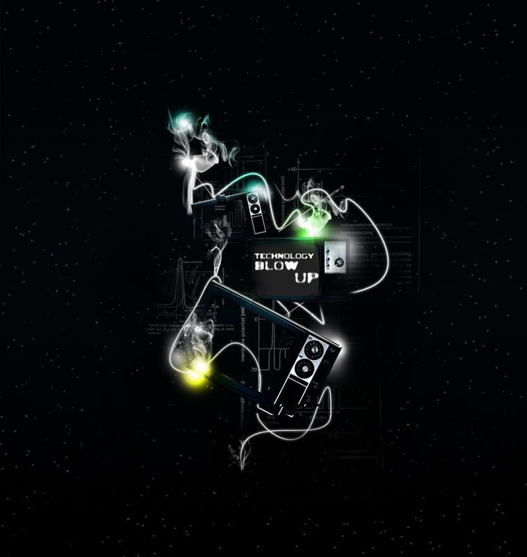
|
|
|
|
|
Jun 11 2008, 01:54 PM
Post
#31
|
|
 Hello Newman. Group: Member Posts: 912 Joined: Sep 2007 Member No: 578,620 |
I really like this.
good job. |
|
|
|


|
Jun 11 2008, 02:37 PM
Post
#32
|
|
|
talent on another level Group: Member Posts: 746 Joined: Oct 2006 Member No: 475,735 |
thanks.

|
|
|
|
|
Jun 11 2008, 05:07 PM
Post
#33
|
|
|
talent on another level Group: Member Posts: 746 Joined: Oct 2006 Member No: 475,735 |
OFFICIAL FINAL EDIT!
go to my deviantart account if you want to comment, or comment on here. thanks for all the help and feedback. uniqsole.deviantart.com |
|
|
|
|
Jun 16 2008, 03:55 PM
Post
#34
|
|
|
Senior Member Group: Member Posts: 174 Joined: Apr 2007 Member No: 517,502 |
Are those graphs etc about the sun's magnetic poles flipping in 2012?
I ask because I mentioned the link before and I see the word "hyperpolarizing". |
|
|
|
|
Jun 17 2008, 02:47 AM
Post
#35
|
|
 i've never wanted anything rationale. Group: Staff Alumni Posts: 8,449 Joined: May 2004 Member No: 19,045 |
wooooah, i really dig it. sooo glad you got rid of the quote, mostly because i didn't like the font. i think it looks great, love the colors and smoke etc.
btw, the rest of your stuff looks nice too. |
|
|
|

|
Jun 17 2008, 06:48 AM
Post
#36
|
|
|
talent on another level Group: Member Posts: 746 Joined: Oct 2006 Member No: 475,735 |
thanks.
& no it has nothing to do with space, lol. |
|
|
|
|
1 User(s) are reading this topic (1 Guests and 0 Anonymous Users)
0 Members: