
is this okay?, i just want some opinions(= i don't care if you're harsh! |
Resource Center Links
This Month's Contests | Hosts Looking for Hostees | Hostees looking for Hosts | BigBookofResources
Submission Guidelines
  |
 Apr 5 2008, 06:11 PM Apr 5 2008, 06:11 PM
Post
#1
|
|
|
Member  Group: Member Posts: 24 Joined: Apr 2008 Member No: 637,980  |
 Any thoughts? |
|
|
|




|
Apr 5 2008, 06:14 PM
Post
#2
|
|
 Kissing for yesterday. Group: Official Designer Posts: 465 Joined: Sep 2007 Member No: 569,813 |
im really confused as to what this is! but that's just me being stupid
 i think the colours are too bright, it hurts my eyes a bit..but maybe thats because its gone midnight here and im tired with two broken toes! OFF TOPIC. the chewy productions is nice..but the two fonts don't work together at all. it would be better without the aqua font over the grey font? i just think it needs a lot more work, but its a nice starting point.. |
|
|
|


|
Apr 5 2008, 06:14 PM
Post
#3
|
|
 Senior Member Group: Head Staff Posts: 18,173 Joined: Mar 2005 Member No: 108,478 |
It's not too bad, but the bright green and blue that you chose to emphasize certain words are hard to read.
|
|
|
|
|
Apr 5 2008, 06:16 PM
Post
#4
|
|
|
Member Group: Member Posts: 24 Joined: Apr 2008 Member No: 637,980 |
I don't want to bother you or anything, but if it needs a lot of work do you think you could tell me what I need to work on?
I guess I could darken the font colors. Thanks so much for your advice (: |
|
|
|
|
Apr 5 2008, 06:16 PM
Post
#5
|
|
 yo yo yiggidy yo. Group: Official Member Posts: 1,606 Joined: Mar 2005 Member No: 108,591 |
this is nice but its very bright. try to darken the words that you want to stand out. i really like the effects behind the 'Chewy Productions' though.
 and i agree with vintage-toile, the two fonts used for 'Chewy Productions' doesn't work well together. |
|
|
|

|
Apr 5 2008, 06:22 PM
Post
#6
|
|
|
Kissing for yesterday. Group: Official Designer Posts: 465 Joined: Sep 2007 Member No: 569,813 |
QUOTE(ChewyProductions @ Apr 6 2008, 12:16 AM)  I don't want to bother you or anything, but if it needs a lot of work do you think you could tell me what I need to work on? I guess I could darken the font colors. Thanks so much for your advice (: sorry, i really wasn't specific at all! my bad  basically, you need to move things about a bit. remove that blue bit from the chewy products, i'd say its ruining it. then move the banner bit with chewy productions and all that up to the top, and bring the credit down. so it goes: image. texty stuff. (i like what you've written btw!) credit. now. get the credit, and make it smaller. re-type it if you have to alling it to the right. now put it in the corner. darken the colours a bit. this would be really nice in greys purples and pinks..but i guess that's a bit girly, and i dislike over the top girliness.. but play about with the colours, and definitely move things about a bit. |
|
|
|
|
Apr 5 2008, 06:24 PM
Post
#7
|
|
 Senior Member Group: Staff Alumni Posts: 1,815 Joined: Jun 2006 Member No: 423,396 |
If you're going to use pixel fonts, make sure that anti-aliasing is off.
|
|
|
|


|
Apr 5 2008, 06:29 PM
Post
#8
|
|
|
Member Group: Member Posts: 24 Joined: Apr 2008 Member No: 637,980 |
 okay I darkened the colors (= Sorry I did this before reading your comments, so I'll move things around later. |
|
|
|
|
Apr 5 2008, 06:30 PM
Post
#9
|
|
|
Member Group: Member Posts: 24 Joined: Apr 2008 Member No: 637,980 |
I'm sorry I'm not good with words.
What does anti-aliasing mean? |
|
|
|
|
Apr 5 2008, 06:32 PM
Post
#10
|
|
|
Kissing for yesterday. Group: Official Designer Posts: 465 Joined: Sep 2007 Member No: 569,813 |
uhhm definitely better.
but the extra "chewy productions" in blue is still really bugging me, because it looks so out of place. i mean, people who look at it who don't have a clue arent going to be like "OH MY GOSH, HOW COULD THEY DO SUCH A THING *clicks off site*" but still..its just a thing i guess  its nice seeing people take things others say into consideration rather than arguing about it as well! so kudos 
|
|
|
|
|
Apr 5 2008, 06:53 PM
Post
#11
|
|
|
Member Group: Member Posts: 24 Joined: Apr 2008 Member No: 637,980 |
 I hope this is better. It was difficult to flip it and stuff, but I think it's okay. (: |
|
|
|
|
Apr 5 2008, 06:57 PM
Post
#12
|
|
|
Kissing for yesterday. Group: Official Designer Posts: 465 Joined: Sep 2007 Member No: 569,813 |
wow
 this is actually a lot better  well done. well done.all you need to do is make the text at the top (chewy productions) slightly more opaque..as it's a little too harsh. but other than that nice job if you need anymore help just ask, i'd be happy to help. and are you using photoshop? (silly..i ask the important stuff after giving advice..way too eager to help.) |
|
|
|
|
Apr 5 2008, 07:03 PM
Post
#13
|
|
|
yo yo yiggidy yo. Group: Official Member Posts: 1,606 Joined: Mar 2005 Member No: 108,591 |
wow, this came out really good.
job well done. :] great tips from vintage-toile.
|
|
|
|
|
Apr 5 2008, 07:12 PM
Post
#14
|
|
|
Member Group: Member Posts: 24 Joined: Apr 2008 Member No: 637,980 |
 I added more changes. Thanks SO much for your help. You're extremely talented (: |
|
|
|
|
Apr 5 2008, 07:14 PM
Post
#15
|
|
 Pocketful of Sunshine Group: Staff Alumni Posts: 8,690 Joined: Nov 2005 Member No: 289,004 |
I think it looks quite amateur. The font on the top is too thick, and throws it all off. Maybe a
This just doesn't really convince me that my friends would be jealous of your layouts. Does thinner looking font make sense?
|
|
|
|

|
Apr 5 2008, 07:15 PM
Post
#16
|
|
|
Kissing for yesterday. Group: Official Designer Posts: 465 Joined: Sep 2007 Member No: 569,813 |
firstly: my name is holly.
yeah the prickly bush with red berries. i just had to be named after foliage  secondly: this actually looks really, really good now, and if i saw it on a layout site i wouldn't see much wrong with it. all i've got to say is (one last thing then i promise to leave you alone!)..on the left side of the image, the "p" in productions (oh man..that sounds so patronising ) hitches onto the border slightly, so maybe extend the canvas width slightly so it doesn't.but that's just to be really picky..its really good as it is. |
|
|
|
|
Apr 5 2008, 07:17 PM
Post
#17
|
|
|
Kissing for yesterday. Group: Official Designer Posts: 465 Joined: Sep 2007 Member No: 569,813 |
QUOTE(tininja @ Apr 6 2008, 01:14 AM) This just doesn't really convince me that my friends would be jealous of your layouts. and hahahaha! depends if you're someone whos like OMG WOW LAYOUTS though  . .
|
|
|
|
|
Apr 5 2008, 07:19 PM
Post
#18
|
|
 ٩(●̮̮̃•̃)۶ Group: Official Member Posts: 1,403 Joined: Apr 2004 Member No: 12,173 |
It's good for a beginner, really. I guess people are just more harsh cause it's not something that's a collaboration of images, which is what the general crowd is more used to seeing. Maybe you should do something creative with the "Chewy Productions" title. Make it a dark grayish opaque (such as what someone mentioned earlier) and stroke the words with a thin black outline.
|
|
|
|

|
Apr 5 2008, 07:21 PM
Post
#19
|
|
|
Pocketful of Sunshine Group: Staff Alumni Posts: 8,690 Joined: Nov 2005 Member No: 289,004 |
QUOTE(vintage-toile @ Apr 5 2008, 05:17 PM) and hahahaha! depends if you're someone whos like OMG WOW LAYOUTS though .Haha, well to each their own opinion, right? And I guess I agree with Sally. I couldn't even figure out how to change the anti-aliasing stuff when I was beginning. Edit// v What? 
|
|
|
|
|
Apr 5 2008, 07:24 PM
Post
#20
|
|
|
Kissing for yesterday. Group: Official Designer Posts: 465 Joined: Sep 2007 Member No: 569,813 |
QUOTE(tininja @ Apr 6 2008, 01:21 AM) Haha, well to each their own opinion, right? to add, im not like that! |
|
|
|
|
Apr 5 2008, 07:30 PM
Post
#21
|
|
|
Member Group: Member Posts: 24 Joined: Apr 2008 Member No: 637,980 |
I'm sorry.
I am a beginner so what does opaque mean? |
|
|
|
|
Apr 5 2008, 07:31 PM
Post
#22
|
|
|
Pocketful of Sunshine Group: Staff Alumni Posts: 8,690 Joined: Nov 2005 Member No: 289,004 |
It's cool.
 Opaque means really dark. It's the opposite of transparent. Opaque means really dark. It's the opposite of transparent.
|
|
|
|
|
Apr 5 2008, 07:31 PM
Post
#23
|
|
|
Kissing for yesterday. Group: Official Designer Posts: 465 Joined: Sep 2007 Member No: 569,813 |
QUOTE(ChewyProductions @ Apr 6 2008, 01:30 AM) I'm sorry. I am a beginner so what does opaque mean? how much it stands out. what program are you using, then its easier to explain how to do it? |
|
|
|
|
Apr 5 2008, 07:35 PM
Post
#24
|
|
|
Member Group: Member Posts: 24 Joined: Apr 2008 Member No: 637,980 |
imageready
I should be using photoshop, but it's sort of a long story(= |
|
|
|
|
Apr 5 2008, 07:38 PM
Post
#25
|
|
|
Pocketful of Sunshine Group: Staff Alumni Posts: 8,690 Joined: Nov 2005 Member No: 289,004 |
I forgot how Imageready looks like, but it was pretty much the same as Photoshop from what I can remember, so.. On the top of your layers window, there's that thing that says "normal" (or whatever mode you may be using.) and the other one says Opacity. The fewer the percent, the less opaque your layer is going to be. The higher, the more opaque it is.
Wow, I spend so much time in this topic. 
|
|
|
|
|
Apr 5 2008, 07:39 PM
Post
#26
|
|
|
Kissing for yesterday. Group: Official Designer Posts: 465 Joined: Sep 2007 Member No: 569,813 |
okay, well..it's pretty much the same as photoshop but with less tools...however i love image ready, as you can make things move.
but thats a totally different story..however i would like to see this image with some glowing dots..  on the layer box, there should basically be a small switch which says "opacity" or something along those lines, you just move the switch along to how you like it. also, as you're new, have you introduced yourself in the introductions forum? i havn't really looked there for that yet so mightaswell ask. if not, introduce yourself there so that people know what you can do and what you may need help with, so you can basically get the best out of everyone
|
|
|
|
|
Apr 5 2008, 07:41 PM
Post
#27
|
|
|
Member Group: Member Posts: 24 Joined: Apr 2008 Member No: 637,980 |
 The opacity was on 100%. I don't know what you mean by glowing dots. sorryy. Is this okay? |
|
|
|
|
Apr 5 2008, 07:42 PM
Post
#28
|
|
|
Kissing for yesterday. Group: Official Designer Posts: 465 Joined: Sep 2007 Member No: 569,813 |
the text looks a bit too blurry now.
and glowing dots is another story, don't worry about that yet. im spending wayy too much time here. sorry! |
|
|
|
|
Apr 5 2008, 07:43 PM
Post
#29
|
|
|
Pocketful of Sunshine Group: Staff Alumni Posts: 8,690 Joined: Nov 2005 Member No: 289,004 |
I think what you did would look much better if you changed the actual text to white and had the black outline.
|
|
|
|
|
Apr 5 2008, 07:44 PM
Post
#30
|
|
|
Member Group: Member Posts: 24 Joined: Apr 2008 Member No: 637,980 |
Sorry I'm taking up so much of your time |x
I'll lower the glow so it won't be blurry. Thanks for your help! I think I'll go introduce myself now. (: |
|
|
|
|
Apr 5 2008, 07:47 PM
Post
#31
|
|
|
Member Group: Member Posts: 24 Joined: Apr 2008 Member No: 637,980 |
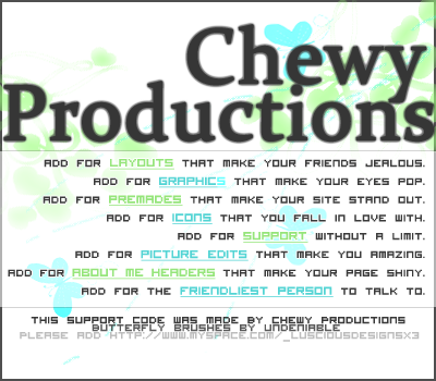 I think this is final. Thanks for your help again(= |
|
|
|
|
Apr 5 2008, 07:54 PM
Post
#32
|
|
 drama is so intising i might just bite a mothaf**ka like tyson Group: Member Posts: 266 Joined: Mar 2008 Member No: 636,361 |
what an introduction though.
this is a good entrance, haha you did a good job at first but the other one when you flipped the chewy productions at the top looked so good like now, just fix the text thats it for a beginner. just like i dont know keep trying more and more and you'll get better.  edit; oh god, the text looks mad blurry! try using a different black? different text? what is on that text outer glow or some shit? |
|
|
|

|
Apr 5 2008, 07:59 PM
Post
#33
|
|
|
٩(●̮̮̃•̃)۶ Group: Official Member Posts: 1,403 Joined: Apr 2004 Member No: 12,173 |
Yeah, it's a glow. Since the rest of the text looks so sharp, you should take that out. Add a thin dark stroke instead. It'll look much better, promise (:
Good job with taking the critique so far btw. |
|
|
|
|
Apr 5 2008, 08:00 PM
Post
#34
|
|
|
Member Group: Member Posts: 24 Joined: Apr 2008 Member No: 637,980 |
I'll fix the glow right now.
Thanks for telling me how it looked (= |
|
|
|
|
Apr 5 2008, 08:02 PM
Post
#35
|
|
|
Member Group: Member Posts: 24 Joined: Apr 2008 Member No: 637,980 |
I'm sorry!
I would fix it, but I'm leaving right now. Bye!! Everyone is so awesome on createblog(= |
|
|
|
|
Apr 5 2008, 08:52 PM
Post
#36
|
|
 kthxbai Group: Official Designer Posts: 2,832 Joined: Feb 2008 Member No: 621,203 |
all the images are broken.
|
|
|
|

|
Apr 6 2008, 02:27 PM
Post
#37
|
|
|
Member Group: Member Posts: 24 Joined: Apr 2008 Member No: 637,980 |
I deleted them off my photobucket.
I didn't even think about the images on this topic. I'm so sorry. |
|
|
|
|
Apr 6 2008, 02:35 PM
Post
#38
|
|
|
Kissing for yesterday. Group: Official Designer Posts: 465 Joined: Sep 2007 Member No: 569,813 |
QUOTE(ChewyProductions @ Apr 6 2008, 08:27 PM) I deleted them off my photobucket. I didn't even think about the images on this topic. I'm so sorry. don't be sorry! aw bless. ignore people who havn't got anything constructive to say  did you finish it? |
|
|
|
|
Apr 7 2008, 10:29 PM
Post
#39
|
|
|
kthxbai Group: Official Designer Posts: 2,832 Joined: Feb 2008 Member No: 621,203 |
^ LOL
 edit // 
|
|
|
|
|
1 User(s) are reading this topic (1 Guests and 0 Anonymous Users)
0 Members: